FabCon is coming to Atlanta
Join us at FabCon Atlanta from March 16 - 20, 2026, for the ultimate Fabric, Power BI, AI and SQL community-led event. Save $200 with code FABCOMM.
Register now!- Power BI forums
- Get Help with Power BI
- Desktop
- Service
- Report Server
- Power Query
- Mobile Apps
- Developer
- DAX Commands and Tips
- Custom Visuals Development Discussion
- Health and Life Sciences
- Power BI Spanish forums
- Translated Spanish Desktop
- Training and Consulting
- Instructor Led Training
- Dashboard in a Day for Women, by Women
- Galleries
- Data Stories Gallery
- Themes Gallery
- Contests Gallery
- QuickViz Gallery
- Quick Measures Gallery
- Visual Calculations Gallery
- Notebook Gallery
- Translytical Task Flow Gallery
- TMDL Gallery
- R Script Showcase
- Webinars and Video Gallery
- Ideas
- Custom Visuals Ideas (read-only)
- Issues
- Issues
- Events
- Upcoming Events
Learn from the best! Meet the four finalists headed to the FINALS of the Power BI Dataviz World Championships! Register now
- Power BI forums
- Forums
- Get Help with Power BI
- Desktop
- Counting data between two date ranges
- Subscribe to RSS Feed
- Mark Topic as New
- Mark Topic as Read
- Float this Topic for Current User
- Bookmark
- Subscribe
- Printer Friendly Page
- Mark as New
- Bookmark
- Subscribe
- Mute
- Subscribe to RSS Feed
- Permalink
- Report Inappropriate Content
Counting data between two date ranges
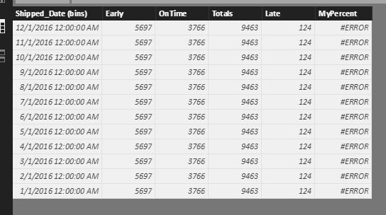
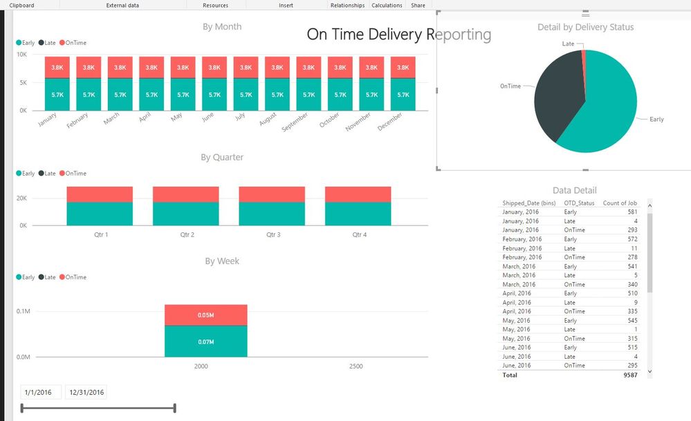
I have a delivery table that contains a date column and a status column. I'm looking to graph that data by status by month and rolling week. The data appears correctly on the Data Detail table I made (pictured), but will not graph accordingly. I've created a table (OTD) that bins the data by month, but does not sum the status correctly by month as it should. Being new to DAX, I'm not sure how to capture both the date range and the status in my column. Any help would be gratefully appreciated.


- Mark as New
- Bookmark
- Subscribe
- Mute
- Subscribe to RSS Feed
- Permalink
- Report Inappropriate Content
- Mark as New
- Bookmark
- Subscribe
- Mute
- Subscribe to RSS Feed
- Permalink
- Report Inappropriate Content
@Phil_Seamark Here's my code for the OTD table.
OTD = DISTINCT('vw_PBI-OnTimeDelivery'[Shipped_Date (bins)])
- Mark as New
- Bookmark
- Subscribe
- Mute
- Subscribe to RSS Feed
- Permalink
- Report Inappropriate Content
Hi @kyleldi,
If you want to get the distinct count of selected date range, you can try to use below formula:
Count of Selected DateRange=
var selectedMin=FIRSTDATE(ALLSELECTED('Table'[Date]))
var selectedMax=LASTDATE(ALLSELECTED('Table'[Date]))
return
CALCULATE(DISTINCTCOUNT('vw_PBI-OnTimeDelivery'[Shipped_Date (bins)]),FILTER(ALL('Table'),[Date]>=selectedMin&&[Date]<=selectedMax))
Notice: table is the source table of the date slicer.
Regards,
Xiaoxin Sheng
Helpful resources

Join our Fabric User Panel
Share feedback directly with Fabric product managers, participate in targeted research studies and influence the Fabric roadmap.

Power BI Monthly Update - February 2026
Check out the February 2026 Power BI update to learn about new features.

| User | Count |
|---|---|
| 61 | |
| 54 | |
| 41 | |
| 17 | |
| 13 |
| User | Count |
|---|---|
| 105 | |
| 99 | |
| 38 | |
| 29 | |
| 29 |
