cancel
Showing results for 
Search instead for 
Did you mean: 

July 28 - August 9 | Final Round of the Power BI Dataviz World Championships. This is your chance. Learn more

Reply
Meryam
New Member

Control Chart - All data

Hello,


I would like to create a control chart with the PBI.

My data are temperatures measurmrnts  according to the date.

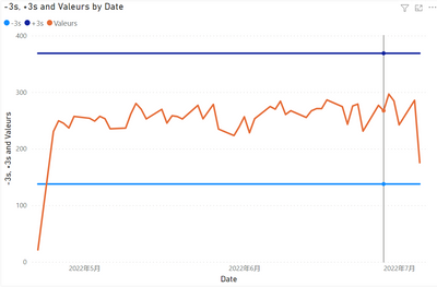
I succeeded in creating the maximum line +3s and the minimum line -3s.

But the problem is that i can't get all the point on the chat (x=temperature).

1.png


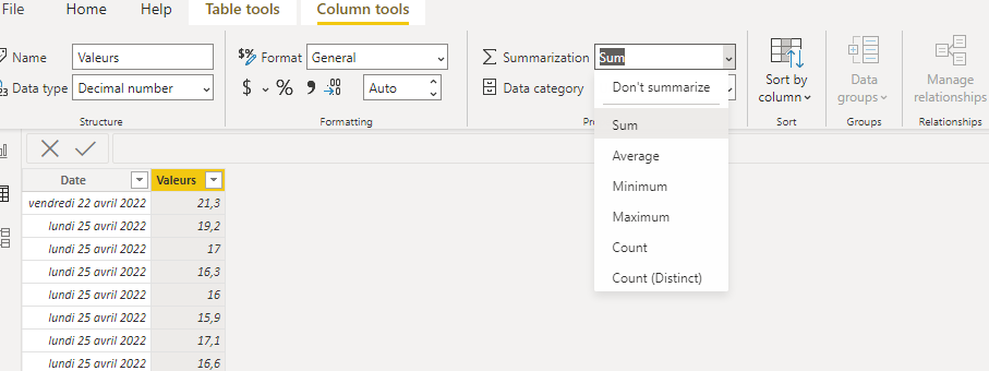
PBI propose to plot the sum, the min, the max, the mediane...etc.

2.png


I triered to modify in the "Data" tab and put don't summarize in place of sum but nothing changes.

3.png


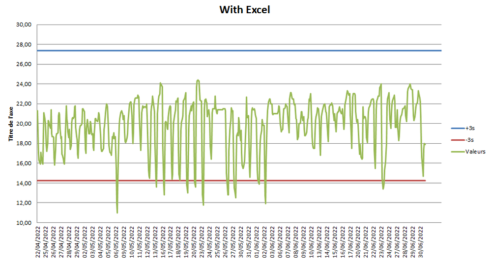
I did the test with Excel ans i get the disired result, but with PBI i can't get it.

Please find here my BI file: https://www.dropbox.com/s/tdh1w0mywp78h12/Test%20PBI.pbix?dl=0 


I think you for your help.

1 ACCEPTED SOLUTION
v-yalanwu-msft
Community Support
Community Support

Hi, @Meryam ;

Try to modify it,

STD = //CALCULATE(STDEV.S(Feuil1[Valeurs]),REMOVEFILTERS(Feuil1[Date ]))
VAR _TABLE=SUMMARIZE(ALL('Feuil1'),[Date ],"1",SUM([Valeurs]))
return STDEVX.S(_TABLE,[1])
Mean = DIVIDE( CALCULATE(SUM([Valeurs]),ALL(Feuil1)),CALCULATE(DISTINCTCOUNT('Feuil1'[Date ]),ALL(Feuil1)))

The final show:

vyalanwumsft_0-1658310732469.png


Best Regards,
Community Support Team _ Yalan Wu
If this post helps, then please consider Accept it as the solution to help the other members find it more quickly.

View solution in original post

3 REPLIES 3
v-yalanwu-msft
Community Support
Community Support

Hi, @Meryam ;

Try to modify it,

STD = //CALCULATE(STDEV.S(Feuil1[Valeurs]),REMOVEFILTERS(Feuil1[Date ]))
VAR _TABLE=SUMMARIZE(ALL('Feuil1'),[Date ],"1",SUM([Valeurs]))
return STDEVX.S(_TABLE,[1])
Mean = DIVIDE( CALCULATE(SUM([Valeurs]),ALL(Feuil1)),CALCULATE(DISTINCTCOUNT('Feuil1'[Date ]),ALL(Feuil1)))

The final show:

vyalanwumsft_0-1658310732469.png


Best Regards,
Community Support Team _ Yalan Wu
If this post helps, then please consider Accept it as the solution to help the other members find it more quickly.

Meryam
New Member

Test with Excel, i want the same graphic on PBI

4.png

@Meryam , Create measures like these and use that in y-axis constant line using analytics pane


M1 = maxx(allselected(Table), Table[temperature]) +3


M1 = minx(allselected(Table), Table[temperature]) - 3

Share with Power BI Enthusiasts: Full Power BI Video (20 Hours) YouTube
Microsoft Fabric Series 60+ Videos YouTube
Microsoft Fabric Hindi End to End YouTube

Helpful resources

Announcements
Fabric Community Sticker Design Challenge Barcelona Carousel

Fabric Community Sticker Challenge - Barcelona 2026

If you love stickers, then you will definitely want to check out our community sticker challenge, Barcelona edition!

July Power BI Update Carousel

Power BI Monthly Update - July 2026

Check out the July 2026 Power BI update to learn about new features.

Power BI DataViz World Championships carousel

Power BI DataViz World Championships - June 2026

A new Power BI DataViz World Championship is coming this June! Don't miss out on submitting your entry.

Top Solution Authors