A new Data Days event is coming soon!
This time we’re going bigger than ever. Fabric, Power BI, SQL, AI and more. We're covering it all. You won't want to miss it.
Learn more- Power BI forums
- Get Help with Power BI
- Desktop
- Service
- Report Server
- Power Query
- Mobile Apps
- Developer
- DAX Commands and Tips
- Custom Visuals Development Discussion
- Health and Life Sciences
- Power BI Spanish forums
- Translated Spanish Desktop
- Training and Consulting
- Instructor Led Training
- Dashboard in a Day for Women, by Women
- Galleries
- Data Stories Gallery
- Themes Gallery
- Contests Gallery
- QuickViz Gallery
- Quick Measures Gallery
- Visual Calculations Gallery
- Notebook Gallery
- Translytical Task Flow Gallery
- TMDL Gallery
- R Script Showcase
- Webinars and Video Gallery
- Ideas
- Custom Visuals Ideas (read-only)
- Issues
- Issues
- Events
- Upcoming Events
Did you hear? There's a new SQL AI Developer certification (DP-800). Start preparing now and be one of the first to get certified. Register now
- Power BI forums
- Forums
- Get Help with Power BI
- Desktop
- Control Chart - All data
- Subscribe to RSS Feed
- Mark Topic as New
- Mark Topic as Read
- Float this Topic for Current User
- Bookmark
- Subscribe
- Printer Friendly Page
- Mark as New
- Bookmark
- Subscribe
- Mute
- Subscribe to RSS Feed
- Permalink
- Report Inappropriate Content
Control Chart - All data
Hello,
I would like to create a control chart with the PBI.
My data are temperatures measurmrnts according to the date.
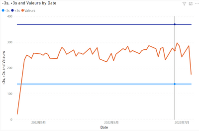
I succeeded in creating the maximum line +3s and the minimum line -3s.
But the problem is that i can't get all the point on the chat (x=temperature).
PBI propose to plot the sum, the min, the max, the mediane...etc.
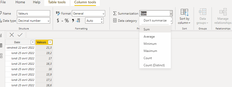
I triered to modify in the "Data" tab and put don't summarize in place of sum but nothing changes.
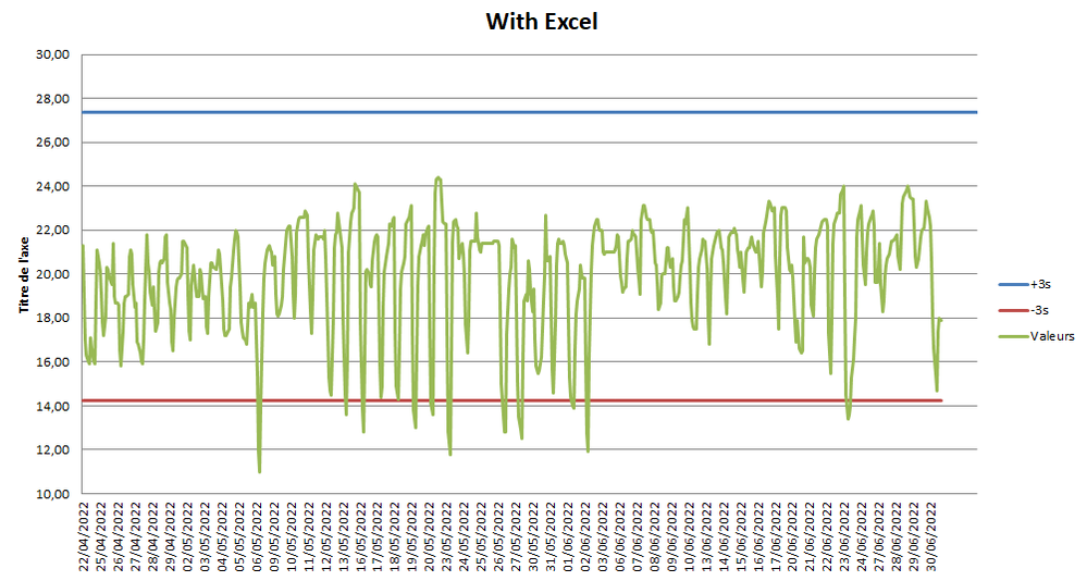
I did the test with Excel ans i get the disired result, but with PBI i can't get it.
Please find here my BI file: https://www.dropbox.com/s/tdh1w0mywp78h12/Test%20PBI.pbix?dl=0
I think you for your help.
Solved! Go to Solution.
- Mark as New
- Bookmark
- Subscribe
- Mute
- Subscribe to RSS Feed
- Permalink
- Report Inappropriate Content
Hi, @Meryam ;
Try to modify it,
STD = //CALCULATE(STDEV.S(Feuil1[Valeurs]),REMOVEFILTERS(Feuil1[Date ]))
VAR _TABLE=SUMMARIZE(ALL('Feuil1'),[Date ],"1",SUM([Valeurs]))
return STDEVX.S(_TABLE,[1])
Mean = DIVIDE( CALCULATE(SUM([Valeurs]),ALL(Feuil1)),CALCULATE(DISTINCTCOUNT('Feuil1'[Date ]),ALL(Feuil1)))The final show:
Best Regards,
Community Support Team _ Yalan Wu
If this post helps, then please consider Accept it as the solution to help the other members find it more quickly.
- Mark as New
- Bookmark
- Subscribe
- Mute
- Subscribe to RSS Feed
- Permalink
- Report Inappropriate Content
Test with Excel, i want the same graphic on PBI
- Mark as New
- Bookmark
- Subscribe
- Mute
- Subscribe to RSS Feed
- Permalink
- Report Inappropriate Content
@Meryam , Create measures like these and use that in y-axis constant line using analytics pane
M1 = maxx(allselected(Table), Table[temperature]) +3
M1 = minx(allselected(Table), Table[temperature]) - 3
Helpful resources

Power BI Monthly Update - April 2026
Check out the April 2026 Power BI update to learn about new features.

Data Days 2026 coming soon!
Sign up to receive a private message when registration opens and key events begin.

New to Fabric Survey
If you have recently started exploring Fabric, we'd love to hear how it's going. Your feedback can help with product improvements.

| User | Count |
|---|---|
| 34 | |
| 31 | |
| 30 | |
| 21 | |
| 16 |
| User | Count |
|---|---|
| 61 | |
| 50 | |
| 30 | |
| 23 | |
| 23 |


