Get Fabric certified for FREE!
Don't miss your chance to take the Fabric Data Engineer (DP-600) exam for FREE! Find out how by watching the DP-600 session on-demand now through April 28th.
Learn more- Power BI forums
- Get Help with Power BI
- Desktop
- Service
- Report Server
- Power Query
- Mobile Apps
- Developer
- DAX Commands and Tips
- Custom Visuals Development Discussion
- Health and Life Sciences
- Power BI Spanish forums
- Translated Spanish Desktop
- Training and Consulting
- Instructor Led Training
- Dashboard in a Day for Women, by Women
- Galleries
- Data Stories Gallery
- Themes Gallery
- Contests Gallery
- QuickViz Gallery
- Quick Measures Gallery
- Visual Calculations Gallery
- Notebook Gallery
- Translytical Task Flow Gallery
- TMDL Gallery
- R Script Showcase
- Webinars and Video Gallery
- Ideas
- Custom Visuals Ideas (read-only)
- Issues
- Issues
- Events
- Upcoming Events
Join the FabCon + SQLCon recap series. Up next: Power BI, Real-Time Intelligence, IQ and AI, and Data Factory take center stage. All sessions are available on-demand after the live show. Register now
- Power BI forums
- Forums
- Get Help with Power BI
- Desktop
- Confusing bar chart behaviour
- Subscribe to RSS Feed
- Mark Topic as New
- Mark Topic as Read
- Float this Topic for Current User
- Bookmark
- Subscribe
- Printer Friendly Page
- Mark as New
- Bookmark
- Subscribe
- Mute
- Subscribe to RSS Feed
- Permalink
- Report Inappropriate Content
Confusing bar chart behaviour
Hi there
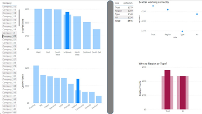
My customer would like to select a Customer and then display 4 summary values from different tables in the same hierarchy. I've written measures for these and a very simle function that returns the relevant measure depending on the selected axis element. When I display the results in a matrix or a scatterchart, it works. However, when I apply the same data to a bar chart, two of the measures are not being displayed.
In a previous version of my model this worked perfectly. Since then I've added another couple of reference tables and it broke. I've tried to disassemble it to no avail. I did, however, have to change the relationship direction to Both.
On selecting the company on the left, the visuals on the right of the grey bar display the measures. The matrix and scatter are correct but Region & Type are missing from the bar chart.
These are the measures:
1. CostPerTonne = calculate(sum('SiteYear Treatment'[Cost])/sum('SiteYear Treatment'[Weight]),'SiteYear Treatment'[Weight]<>0)
2. cptRegion = CALCULATE([CostPerTonne], ALLEXCEPT(TrustYear,TrustYear[FY]), 'Commissioning Region'[CommissioningRegion_ID]= SELECTEDVALUE('Commissioning Region'[CommissioningRegion_ID]))
3. cptType = CALCULATE([CostPerTonne], ALLEXCEPT(TrustYear,TrustYear[FY]), TrustType[TrustType_ID]=SELECTEDVALUE(TrustType[TrustType_ID]))
4. cptAll = CALCULATE([CostPerTonne], ALLEXCEPT(TrustYear,TrustYear[FY]))
and this is the 'switch' measure:
- Mark as New
- Bookmark
- Subscribe
- Mute
- Subscribe to RSS Feed
- Permalink
- Report Inappropriate Content
Resolved. Please see https://community.fabric.microsoft.com/t5/Desktop/Bar-chart-behaviour/m-p/3538875
Helpful resources

Power BI Monthly Update - April 2026
Check out the April 2026 Power BI update to learn about new features.

New to Fabric Survey
If you have recently started exploring Fabric, we'd love to hear how it's going. Your feedback can help with product improvements.

Power BI DataViz World Championships - June 2026
A new Power BI DataViz World Championship is coming this June! Don't miss out on submitting your entry.

| User | Count |
|---|---|
| 41 | |
| 37 | |
| 34 | |
| 21 | |
| 16 |
| User | Count |
|---|---|
| 64 | |
| 58 | |
| 31 | |
| 25 | |
| 25 |

