Get Fabric certified for FREE!
Don't miss your chance to take the Fabric Data Engineer (DP-700) exam on us!
Learn more- Power BI forums
- Get Help with Power BI
- Desktop
- Service
- Report Server
- Power Query
- Mobile Apps
- Developer
- DAX Commands and Tips
- Custom Visuals Development Discussion
- Health and Life Sciences
- Power BI Spanish forums
- Translated Spanish Desktop
- Training and Consulting
- Instructor Led Training
- Dashboard in a Day for Women, by Women
- Galleries
- Data Stories Gallery
- Themes Gallery
- Contests Gallery
- QuickViz Gallery
- Quick Measures Gallery
- Visual Calculations Gallery
- Notebook Gallery
- Translytical Task Flow Gallery
- TMDL Gallery
- R Script Showcase
- Webinars and Video Gallery
- Ideas
- Custom Visuals Ideas (read-only)
- Issues
- Issues
- Events
- Upcoming Events
Next up in the FabCon + SQLCon recap series: The roadmap for Microsoft SQL and Maximizing Developer experiences in Fabric. All sessions are available on-demand after the live show. Register now
- Power BI forums
- Forums
- Get Help with Power BI
- Desktop
- Configuring a Waterfall Graph
- Subscribe to RSS Feed
- Mark Topic as New
- Mark Topic as Read
- Float this Topic for Current User
- Bookmark
- Subscribe
- Printer Friendly Page
- Mark as New
- Bookmark
- Subscribe
- Mute
- Subscribe to RSS Feed
- Permalink
- Report Inappropriate Content
Configuring a Waterfall Graph
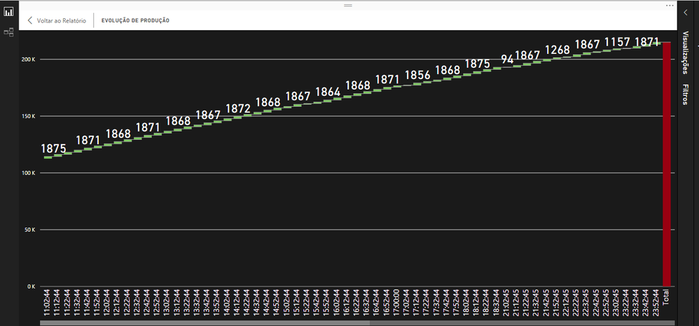
I have a cascade chart where the axis is a datetime field that informs the day and the last 24 hours of a machine's production.
It presents the correct information of the indicator the problem is that it is presenting the information every 10 minutes causing the graph to be very large and this graph will be displayed on a TV and no one will operate the dashboard and it will be updated every 15 minutes.
How can I configure this chart to display information on the datetime axis from hourly, for example 06:00:00, 07:00:00, and so on.
Note: this dashboard was developed via directquery
- Mark as New
- Bookmark
- Subscribe
- Mute
- Subscribe to RSS Feed
- Permalink
- Report Inappropriate Content
Hi @Anonymous,
>>How can I configure this chart to display information on the datetime axis from hourly, for example 06:00:00, 07:00:00, and so on.
I'd like to suggest you add some calculate columns to store the year, month, day, hour values, then use these columns to create the custom hierarchy. After these steps you can use drill down feature to switch the display unit.
>>And another thing, is it possible to set the TOTAL value to be displayed on the chart?
Normally it will show the label value when you turn on the data label, I not so sure why your visual not show the current value.
Regards,
Xiaoxin Sheng
- Mark as New
- Bookmark
- Subscribe
- Mute
- Subscribe to RSS Feed
- Permalink
- Report Inappropriate Content
And another thing, is it possible to set the TOTAL value to be displayed on the chart? At the moment I only know the accumulated TOTAL by selecting the TOTAL column
Helpful resources

New to Fabric Survey
If you have recently started exploring Fabric, we'd love to hear how it's going. Your feedback can help with product improvements.

Power BI DataViz World Championships - June 2026
A new Power BI DataViz World Championship is coming this June! Don't miss out on submitting your entry.

Join our Fabric User Panel
Share feedback directly with Fabric product managers, participate in targeted research studies and influence the Fabric roadmap.

| User | Count |
|---|---|
| 54 | |
| 46 | |
| 44 | |
| 20 | |
| 19 |
| User | Count |
|---|---|
| 73 | |
| 71 | |
| 34 | |
| 33 | |
| 31 |


