Huge last-minute discounts for FabCon Vienna from September 15-18, 2025
Supplies are limited. Contact info@espc.tech right away to save your spot before the conference sells out.
Get your discount- Power BI forums
- Get Help with Power BI
- Desktop
- Service
- Report Server
- Power Query
- Mobile Apps
- Developer
- DAX Commands and Tips
- Custom Visuals Development Discussion
- Health and Life Sciences
- Power BI Spanish forums
- Translated Spanish Desktop
- Training and Consulting
- Instructor Led Training
- Dashboard in a Day for Women, by Women
- Galleries
- Data Stories Gallery
- Themes Gallery
- Contests Gallery
- Quick Measures Gallery
- Notebook Gallery
- Translytical Task Flow Gallery
- TMDL Gallery
- R Script Showcase
- Webinars and Video Gallery
- Ideas
- Custom Visuals Ideas (read-only)
- Issues
- Issues
- Events
- Upcoming Events
Score big with last-minute savings on the final tickets to FabCon Vienna. Secure your discount
- Power BI forums
- Forums
- Get Help with Power BI
- Desktop
- Re: Conditional Formatting bar chart in update mar...
- Subscribe to RSS Feed
- Mark Topic as New
- Mark Topic as Read
- Float this Topic for Current User
- Bookmark
- Subscribe
- Printer Friendly Page
- Mark as New
- Bookmark
- Subscribe
- Mute
- Subscribe to RSS Feed
- Permalink
- Report Inappropriate Content
Conditional Formatting bar chart in update march 2022
Hi,
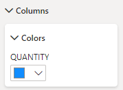
sorry if i missed this, but is it possible to change the color with Condtional Formatting in an bar chart with the new panel?
because i didn't find any way to change the color if the bar chart is in the negative area.
Is there any solution to change the color of the bar? I know in the past it was possible!
Thanks for your help and greetings from Germany 🙂
KR
Anna
Solved! Go to Solution.
- Mark as New
- Bookmark
- Subscribe
- Mute
- Subscribe to RSS Feed
- Permalink
- Report Inappropriate Content
@AnnaAliera18 , Fx icon will not come if you are using legend or two measures.
If this not the case and still it is not coming, Go to -> File -> Options & Settings -> Options -> preview -> New format pane , uncheck that and try
- Mark as New
- Bookmark
- Subscribe
- Mute
- Subscribe to RSS Feed
- Permalink
- Report Inappropriate Content
I saw the same issue but I realize that if you add any legend to the bar chart, the conditional formatting dissapear. You can use the conditional formatting if you don't add legends.
Try this maybe you can solve the problem
- Mark as New
- Bookmark
- Subscribe
- Mute
- Subscribe to RSS Feed
- Permalink
- Report Inappropriate Content
Hi there,
I have the same issue. There is no option to conditionally format the colors in the clusterd bar chart. This was a basic feature in older versions, and appears to have been removed.
Why is that the case? Is there another solution available?
- Mark as New
- Bookmark
- Subscribe
- Mute
- Subscribe to RSS Feed
- Permalink
- Report Inappropriate Content
@AnnaAliera18 , Fx icon will not come if you are using legend or two measures.
If this not the case and still it is not coming, Go to -> File -> Options & Settings -> Options -> preview -> New format pane , uncheck that and try
- Mark as New
- Bookmark
- Subscribe
- Mute
- Subscribe to RSS Feed
- Permalink
- Report Inappropriate Content
Hello,
I have exactly the same issue, no more conditional formatting visble for the bar chart.
For your solution, I cannot uncheck the New format panel as it is no more visible in the list.
I started with a very light report but the issue is still there.
Do you have another solution 😕 ?
Helpful resources
| User | Count |
|---|---|
| 66 | |
| 60 | |
| 47 | |
| 33 | |
| 32 |
| User | Count |
|---|---|
| 86 | |
| 75 | |
| 56 | |
| 50 | |
| 45 |


