FabCon is coming to Atlanta
Join us at FabCon Atlanta from March 16 - 20, 2026, for the ultimate Fabric, Power BI, AI and SQL community-led event. Save $200 with code FABCOMM.
Register now!- Power BI forums
- Get Help with Power BI
- Desktop
- Service
- Report Server
- Power Query
- Mobile Apps
- Developer
- DAX Commands and Tips
- Custom Visuals Development Discussion
- Health and Life Sciences
- Power BI Spanish forums
- Translated Spanish Desktop
- Training and Consulting
- Instructor Led Training
- Dashboard in a Day for Women, by Women
- Galleries
- Data Stories Gallery
- Themes Gallery
- Contests Gallery
- QuickViz Gallery
- Quick Measures Gallery
- Visual Calculations Gallery
- Notebook Gallery
- Translytical Task Flow Gallery
- TMDL Gallery
- R Script Showcase
- Webinars and Video Gallery
- Ideas
- Custom Visuals Ideas (read-only)
- Issues
- Issues
- Events
- Upcoming Events
Get Fabric Certified for FREE during Fabric Data Days. Don't miss your chance! Request now
- Power BI forums
- Forums
- Get Help with Power BI
- Desktop
- Re: Compare and visualize several means
- Subscribe to RSS Feed
- Mark Topic as New
- Mark Topic as Read
- Float this Topic for Current User
- Bookmark
- Subscribe
- Printer Friendly Page
- Mark as New
- Bookmark
- Subscribe
- Mute
- Subscribe to RSS Feed
- Permalink
- Report Inappropriate Content
Compare and visualize several means
hi,
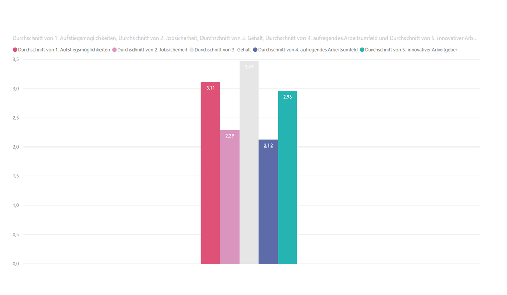
i've got survey data with different questions. Now i want to get several means of these questions on a chart.
if i put the items on a bar chart, then there is no space between the bars. and i can't use another visualization, a line chart won't work.
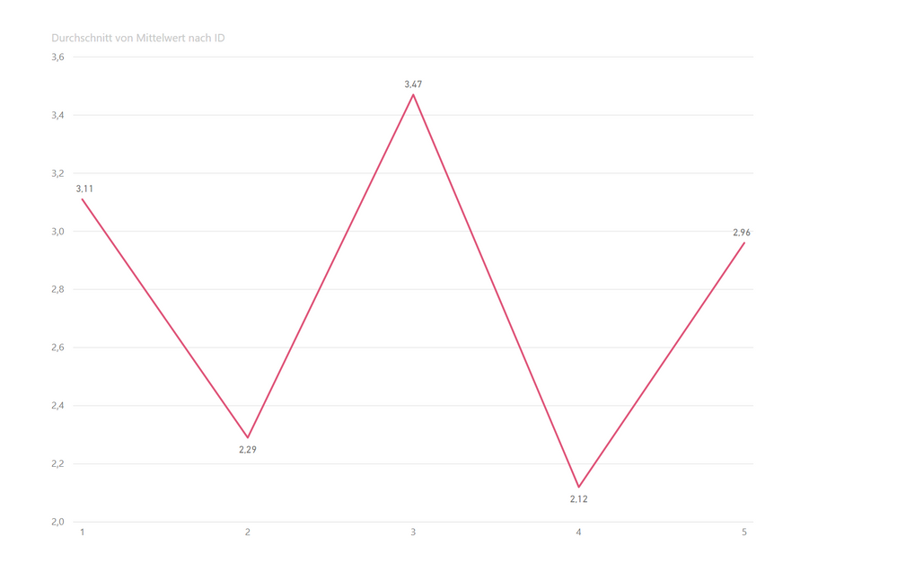
so i created a second data table in excel with the means of the question data to put them on a line chart.
question: is there the possibility to create a second data table in power bi with the means of my questions and connect it to the original one? so i can also use slicers based on factors of the first data set.
of course any other solution is appreciated.
looking forward for some help 🙂


Solved! Go to Solution.
- Mark as New
- Bookmark
- Subscribe
- Mute
- Subscribe to RSS Feed
- Permalink
- Report Inappropriate Content
@Stefan036 , you should unpivot your data in Query Editor first. Instead of having five different questions in five different columns, you should have 2 columns...Question and Answer. Then you can create a horizontal bar chart with the spacing you desire. The "Question" column becomes the dimension and the answer column is the number that gets aggregated (in your case, as the average)
I recommend horizontal bar chart to a vertical column chart because the questions will be easier to read if the text is horizontal.
- Mark as New
- Bookmark
- Subscribe
- Mute
- Subscribe to RSS Feed
- Permalink
- Report Inappropriate Content
Hello,
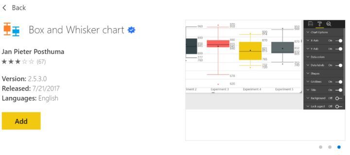
I'm not clear on what you are searching for; however, I've plotted a distribution and showed it mean before. My recommedation would be to go the marketplace and use the custom app for a bar and whisker plot. There are several of them. They do the statistics automatically so there is no need for an additional table.
Regards,
HD
- Mark as New
- Bookmark
- Subscribe
- Mute
- Subscribe to RSS Feed
- Permalink
- Report Inappropriate Content
@Stefan036 , you should unpivot your data in Query Editor first. Instead of having five different questions in five different columns, you should have 2 columns...Question and Answer. Then you can create a horizontal bar chart with the spacing you desire. The "Question" column becomes the dimension and the answer column is the number that gets aggregated (in your case, as the average)
I recommend horizontal bar chart to a vertical column chart because the questions will be easier to read if the text is horizontal.
- Mark as New
- Bookmark
- Subscribe
- Mute
- Subscribe to RSS Feed
- Permalink
- Report Inappropriate Content
thank you so much!
this is the way its done.
Helpful resources

Power BI Monthly Update - November 2025
Check out the November 2025 Power BI update to learn about new features.

Fabric Data Days
Advance your Data & AI career with 50 days of live learning, contests, hands-on challenges, study groups & certifications and more!


