FabCon is coming to Atlanta
Join us at FabCon Atlanta from March 16 - 20, 2026, for the ultimate Fabric, Power BI, AI and SQL community-led event. Save $200 with code FABCOMM.
Register now!- Power BI forums
- Get Help with Power BI
- Desktop
- Service
- Report Server
- Power Query
- Mobile Apps
- Developer
- DAX Commands and Tips
- Custom Visuals Development Discussion
- Health and Life Sciences
- Power BI Spanish forums
- Translated Spanish Desktop
- Training and Consulting
- Instructor Led Training
- Dashboard in a Day for Women, by Women
- Galleries
- Data Stories Gallery
- Themes Gallery
- Contests Gallery
- QuickViz Gallery
- Quick Measures Gallery
- Visual Calculations Gallery
- Notebook Gallery
- Translytical Task Flow Gallery
- TMDL Gallery
- R Script Showcase
- Webinars and Video Gallery
- Ideas
- Custom Visuals Ideas (read-only)
- Issues
- Issues
- Events
- Upcoming Events
The Power BI Data Visualization World Championships is back! Get ahead of the game and start preparing now! Learn more
- Power BI forums
- Forums
- Get Help with Power BI
- Desktop
- Re: Compare and visualize several means
- Subscribe to RSS Feed
- Mark Topic as New
- Mark Topic as Read
- Float this Topic for Current User
- Bookmark
- Subscribe
- Printer Friendly Page
- Mark as New
- Bookmark
- Subscribe
- Mute
- Subscribe to RSS Feed
- Permalink
- Report Inappropriate Content
Compare and visualize several means
hi,
i've got survey data with different questions. Now i want to get several means of these questions on a chart.
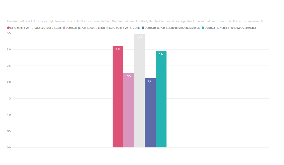
if i put the items on a bar chart, then there is no space between the bars. and i can't use another visualization, a line chart won't work.
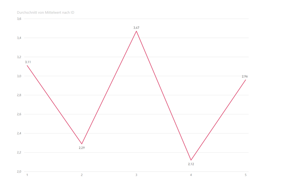
so i created a second data table in excel with the means of the question data to put them on a line chart.
question: is there the possibility to create a second data table in power bi with the means of my questions and connect it to the original one? so i can also use slicers based on factors of the first data set.
of course any other solution is appreciated.
looking forward for some help 🙂


Solved! Go to Solution.
- Mark as New
- Bookmark
- Subscribe
- Mute
- Subscribe to RSS Feed
- Permalink
- Report Inappropriate Content
@Stefan036 , you should unpivot your data in Query Editor first. Instead of having five different questions in five different columns, you should have 2 columns...Question and Answer. Then you can create a horizontal bar chart with the spacing you desire. The "Question" column becomes the dimension and the answer column is the number that gets aggregated (in your case, as the average)
I recommend horizontal bar chart to a vertical column chart because the questions will be easier to read if the text is horizontal.
- Mark as New
- Bookmark
- Subscribe
- Mute
- Subscribe to RSS Feed
- Permalink
- Report Inappropriate Content
Hello,
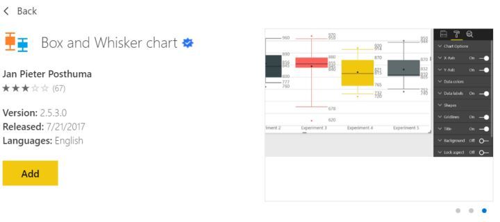
I'm not clear on what you are searching for; however, I've plotted a distribution and showed it mean before. My recommedation would be to go the marketplace and use the custom app for a bar and whisker plot. There are several of them. They do the statistics automatically so there is no need for an additional table.
Regards,
HD
- Mark as New
- Bookmark
- Subscribe
- Mute
- Subscribe to RSS Feed
- Permalink
- Report Inappropriate Content
@Stefan036 , you should unpivot your data in Query Editor first. Instead of having five different questions in five different columns, you should have 2 columns...Question and Answer. Then you can create a horizontal bar chart with the spacing you desire. The "Question" column becomes the dimension and the answer column is the number that gets aggregated (in your case, as the average)
I recommend horizontal bar chart to a vertical column chart because the questions will be easier to read if the text is horizontal.
- Mark as New
- Bookmark
- Subscribe
- Mute
- Subscribe to RSS Feed
- Permalink
- Report Inappropriate Content
thank you so much!
this is the way its done.
Helpful resources

Power BI Dataviz World Championships
The Power BI Data Visualization World Championships is back! Get ahead of the game and start preparing now!

| User | Count |
|---|---|
| 38 | |
| 36 | |
| 33 | |
| 30 | |
| 28 |
| User | Count |
|---|---|
| 126 | |
| 88 | |
| 78 | |
| 66 | |
| 65 |


