- Power BI forums
- Get Help with Power BI
- Desktop
- Service
- Report Server
- Power Query
- Mobile Apps
- Developer
- DAX Commands and Tips
- Custom Visuals Development Discussion
- Health and Life Sciences
- Power BI Spanish forums
- Translated Spanish Desktop
- Training and Consulting
- Instructor Led Training
- Dashboard in a Day for Women, by Women
- Galleries
- Data Stories Gallery
- Themes Gallery
- Contests Gallery
- QuickViz Gallery
- Quick Measures Gallery
- Visual Calculations Gallery
- Notebook Gallery
- Translytical Task Flow Gallery
- TMDL Gallery
- R Script Showcase
- Webinars and Video Gallery
- Ideas
- Custom Visuals Ideas (read-only)
- Issues
- Issues
- Events
- Upcoming Events
Learn from the best! Meet the four finalists headed to the FINALS of the Power BI Dataviz World Championships! Register now
- Power BI forums
- Forums
- Get Help with Power BI
- Desktop
- Re: Combined Graphs
- Subscribe to RSS Feed
- Mark Topic as New
- Mark Topic as Read
- Float this Topic for Current User
- Bookmark
- Subscribe
- Printer Friendly Page
- Mark as New
- Bookmark
- Subscribe
- Mute
- Subscribe to RSS Feed
- Permalink
- Report Inappropriate Content
Combined Graphs
Hello! I wanted to know if it is possible to combine a stacked bar graph and a clustered bar graph? For example, have the clustered bars showing values for 2016 and 2017 and having the stacked part showing values for "yes" and "no" for that year...
- Mark as New
- Bookmark
- Subscribe
- Mute
- Subscribe to RSS Feed
- Permalink
- Report Inappropriate Content
Hi @MExtross,
Could you please share your sample table for further analysis? Based on my understanding, you don't need to combine two visuals, just use stacked bar graph, put year field as X-Axis, the field including "Yes" or "No" as Legend, then you can get expected result.
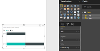
I create the following sample table.
Create a stacked bar graph as follows, showing values for 2016 and 2017 and having the stacked part showing values for "yes" and "no" for that year.
Best Regards,
Angelia
- Mark as New
- Bookmark
- Subscribe
- Mute
- Subscribe to RSS Feed
- Permalink
- Report Inappropriate Content
Hi @v-huizhn-msft,
My apologies! I realize I was very vague in my example.
The problem is that I would like the data sorted on a monthly basis as well. So the x-axis would be the month, the bars in the clustered part woulf be 2016 and 2017, and the stacked part would show the values of yes or no...
I have this on excel but am unable to copy the formatting in power bi.
Thanks,
Maegan
- Mark as New
- Bookmark
- Subscribe
- Mute
- Subscribe to RSS Feed
- Permalink
- Report Inappropriate Content
Hi @MExtross,
Based on my understanding, we can't achieve the requirement in Power BI desktop. Could you please post a screenshot of you got in excel?
Best Regards,
Angelia
- Mark as New
- Bookmark
- Subscribe
- Mute
- Subscribe to RSS Feed
- Permalink
- Report Inappropriate Content
- Mark as New
- Bookmark
- Subscribe
- Mute
- Subscribe to RSS Feed
- Permalink
- Report Inappropriate Content
Helpful resources
| User | Count |
|---|---|
| 60 | |
| 46 | |
| 32 | |
| 16 | |
| 16 |
| User | Count |
|---|---|
| 82 | |
| 68 | |
| 43 | |
| 26 | |
| 25 |


