- Power BI forums
- Get Help with Power BI
- Desktop
- Service
- Report Server
- Power Query
- Mobile Apps
- Developer
- DAX Commands and Tips
- Custom Visuals Development Discussion
- Health and Life Sciences
- Power BI Spanish forums
- Translated Spanish Desktop
- Training and Consulting
- Instructor Led Training
- Dashboard in a Day for Women, by Women
- Galleries
- Data Stories Gallery
- Themes Gallery
- Contests Gallery
- QuickViz Gallery
- Quick Measures Gallery
- Visual Calculations Gallery
- Notebook Gallery
- Translytical Task Flow Gallery
- TMDL Gallery
- R Script Showcase
- Webinars and Video Gallery
- Ideas
- Custom Visuals Ideas (read-only)
- Issues
- Issues
- Events
- Upcoming Events
Learn from the best! Meet the four finalists headed to the FINALS of the Power BI Dataviz World Championships! Register now
- Power BI forums
- Forums
- Get Help with Power BI
- Desktop
- Re: Combined Graphs
- Subscribe to RSS Feed
- Mark Topic as New
- Mark Topic as Read
- Float this Topic for Current User
- Bookmark
- Subscribe
- Printer Friendly Page
- Mark as New
- Bookmark
- Subscribe
- Mute
- Subscribe to RSS Feed
- Permalink
- Report Inappropriate Content
Combined Graphs
Hello! I wanted to know if it is possible to combine a stacked bar graph and a clustered bar graph? For example, have the clustered bars showing values for 2016 and 2017 and having the stacked part showing values for "yes" and "no" for that year...
- Mark as New
- Bookmark
- Subscribe
- Mute
- Subscribe to RSS Feed
- Permalink
- Report Inappropriate Content
Hi @MExtross,
Could you please share your sample table for further analysis? Based on my understanding, you don't need to combine two visuals, just use stacked bar graph, put year field as X-Axis, the field including "Yes" or "No" as Legend, then you can get expected result.
I create the following sample table.
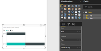
Create a stacked bar graph as follows, showing values for 2016 and 2017 and having the stacked part showing values for "yes" and "no" for that year.
Best Regards,
Angelia
- Mark as New
- Bookmark
- Subscribe
- Mute
- Subscribe to RSS Feed
- Permalink
- Report Inappropriate Content
Hi @v-huizhn-msft,
My apologies! I realize I was very vague in my example.
The problem is that I would like the data sorted on a monthly basis as well. So the x-axis would be the month, the bars in the clustered part woulf be 2016 and 2017, and the stacked part would show the values of yes or no...
I have this on excel but am unable to copy the formatting in power bi.
Thanks,
Maegan
- Mark as New
- Bookmark
- Subscribe
- Mute
- Subscribe to RSS Feed
- Permalink
- Report Inappropriate Content
Hi @MExtross,
Based on my understanding, we can't achieve the requirement in Power BI desktop. Could you please post a screenshot of you got in excel?
Best Regards,
Angelia
- Mark as New
- Bookmark
- Subscribe
- Mute
- Subscribe to RSS Feed
- Permalink
- Report Inappropriate Content
- Mark as New
- Bookmark
- Subscribe
- Mute
- Subscribe to RSS Feed
- Permalink
- Report Inappropriate Content
Helpful resources

Power BI DataViz World Championships - June 2026
A new Power BI DataViz World Championship is coming this June! Don't miss out on submitting your entry.

Join our Fabric User Panel
Share feedback directly with Fabric product managers, participate in targeted research studies and influence the Fabric roadmap.

| User | Count |
|---|---|
| 52 | |
| 34 | |
| 33 | |
| 17 | |
| 17 |
| User | Count |
|---|---|
| 61 | |
| 60 | |
| 39 | |
| 26 | |
| 24 |


