Fabric Data Days starts November 4th!
Advance your Data & AI career with 50 days of live learning, dataviz contests, hands-on challenges, study groups & certifications and more!
Get registered- Power BI forums
- Get Help with Power BI
- Desktop
- Service
- Report Server
- Power Query
- Mobile Apps
- Developer
- DAX Commands and Tips
- Custom Visuals Development Discussion
- Health and Life Sciences
- Power BI Spanish forums
- Translated Spanish Desktop
- Training and Consulting
- Instructor Led Training
- Dashboard in a Day for Women, by Women
- Galleries
- Data Stories Gallery
- Themes Gallery
- Contests Gallery
- Quick Measures Gallery
- Visual Calculations Gallery
- Notebook Gallery
- Translytical Task Flow Gallery
- TMDL Gallery
- R Script Showcase
- Webinars and Video Gallery
- Ideas
- Custom Visuals Ideas (read-only)
- Issues
- Issues
- Events
- Upcoming Events
Get Fabric Certified for FREE during Fabric Data Days. Don't miss your chance! Learn more
- Power BI forums
- Forums
- Get Help with Power BI
- Desktop
- Re: Color Saturation not showing in bing map visua...
- Subscribe to RSS Feed
- Mark Topic as New
- Mark Topic as Read
- Float this Topic for Current User
- Bookmark
- Subscribe
- Printer Friendly Page
- Mark as New
- Bookmark
- Subscribe
- Mute
- Subscribe to RSS Feed
- Permalink
- Report Inappropriate Content
Color Saturation not showing in bing map visual on latest power BI APP
Hi Power BI Gurus,
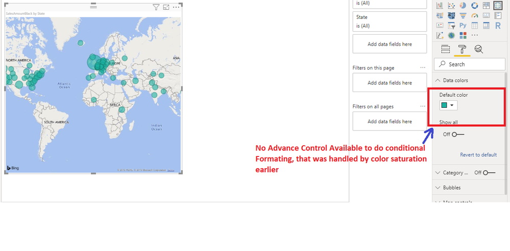
I was looking for color saturation on map and came up with this link and found comparing my latest desktop that same visual as of today not provinding color saturation.
Any ideas if there are some settings i'm missing will be appreciated?
Thanks,
Harry
Solved! Go to Solution.
- Mark as New
- Bookmark
- Subscribe
- Mute
- Subscribe to RSS Feed
- Permalink
- Report Inappropriate Content
Hi @HarsimranPWRBI ,
It looks like that you haven't updated your PowerBI Desktop for long time, this feature has changed since the Power BI Desktop November 2018.
That has finally changed this month, as we’ve upgraded all the generally available visuals that previously used color saturation to have the same conditional formatting experience as table and matrix currently has. This means you’ll have access to all three types of formatting currently available: Color by color scales, Color by rules, and Color by field. As mentioned, this change impacts all visuals which previously had color saturation which includes:
All variants of column and bar charts
Funnel chart
Bubble & filled maps
Treemap
Scatter chart
For more information, please refer to this blog: https://powerbi.microsoft.com/en-us/blog/power-bi-desktop-november-2018-feature-summary/#conditional...
Best Regards,
Teige
- Mark as New
- Bookmark
- Subscribe
- Mute
- Subscribe to RSS Feed
- Permalink
- Report Inappropriate Content
Hi @TeigeGao ,
You are correct they've removed color saturation, but for Map there's no advance control under Data Colors to do conditional formatting too.
Regards,
Harry
- Mark as New
- Bookmark
- Subscribe
- Mute
- Subscribe to RSS Feed
- Permalink
- Report Inappropriate Content
Hi:
I am trying to use the color saturation on a "Map" visual. I have a "Slicer" with different 'Pipeline' to see related pipeline info on the map. I am trying to make some "bubble" on the map have a certain color (red) depending on another field 'Significance' [it has value 1,2,3,4,5] describing criticalilty of an event in that location. When I go to "Format" pane to do color saturation- the 'Data Color' just shows the colors for different bubles representing different 'Pipeline's. I can't find
1. how to choose 'Significance' to do conditional formating [e.g color saturation]
2. Also in Map, when I use 'Significance' field for Size- it shows average/min/max/count [not just the value by itself]
Any help would be greatly appreciated! Thanks. 🙂
Helpful resources

Fabric Data Days
Advance your Data & AI career with 50 days of live learning, contests, hands-on challenges, study groups & certifications and more!

Power BI Monthly Update - October 2025
Check out the October 2025 Power BI update to learn about new features.


