Fabric Data Days starts November 4th!
Advance your Data & AI career with 50 days of live learning, dataviz contests, hands-on challenges, study groups & certifications and more!
Get registered- Power BI forums
- Get Help with Power BI
- Desktop
- Service
- Report Server
- Power Query
- Mobile Apps
- Developer
- DAX Commands and Tips
- Custom Visuals Development Discussion
- Health and Life Sciences
- Power BI Spanish forums
- Translated Spanish Desktop
- Training and Consulting
- Instructor Led Training
- Dashboard in a Day for Women, by Women
- Galleries
- Data Stories Gallery
- Themes Gallery
- Contests Gallery
- Quick Measures Gallery
- Visual Calculations Gallery
- Notebook Gallery
- Translytical Task Flow Gallery
- TMDL Gallery
- R Script Showcase
- Webinars and Video Gallery
- Ideas
- Custom Visuals Ideas (read-only)
- Issues
- Issues
- Events
- Upcoming Events
Get Fabric Certified for FREE during Fabric Data Days. Don't miss your chance! Learn more
- Power BI forums
- Forums
- Get Help with Power BI
- Desktop
- Clustered column chart - unfiltered additional col...
- Subscribe to RSS Feed
- Mark Topic as New
- Mark Topic as Read
- Float this Topic for Current User
- Bookmark
- Subscribe
- Printer Friendly Page
- Mark as New
- Bookmark
- Subscribe
- Mute
- Subscribe to RSS Feed
- Permalink
- Report Inappropriate Content
Clustered column chart - unfiltered additional column
Hi guys,
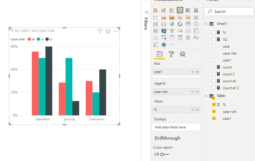
Being a relatively new to Power BI, need a piece of advise. I have this chart that shows Service Level percentage for CS and TS teams, sorted out by customer classification (Priority, Standard and unclassified / unknown customers). However, I would really like to get also unsorted service level into the same chart so it shows the general Service Level without team. As a result I would have a 3rd bar in each section that represent both team service level combined. I would assume I should create a new attribute (some sort of "ALL"), but I am a bit lost on "how".
Appreciate all userful ideas.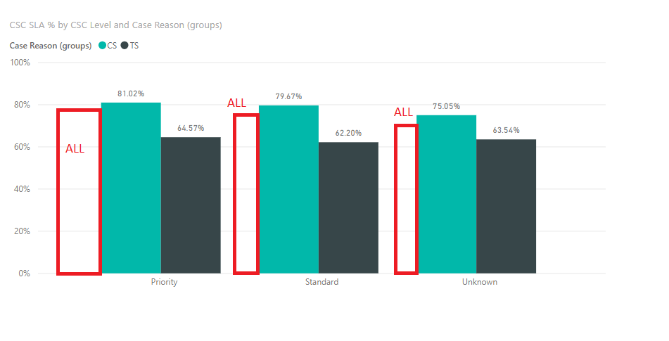
Solved! Go to Solution.
- Mark as New
- Bookmark
- Subscribe
- Mute
- Subscribe to RSS Feed
- Permalink
- Report Inappropriate Content
Hi @Anonymous
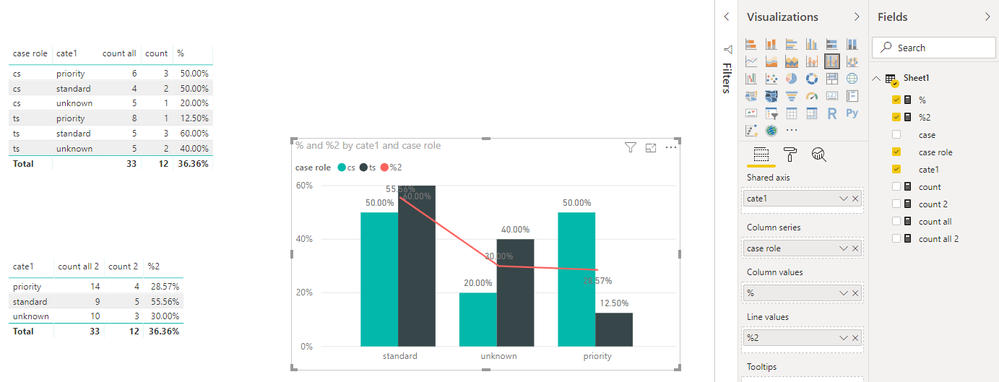
If you could create measure as below
count = CALCULATE(COUNT(Sheet1[case]),Sheet1[case] in {"compliant"})

count all = COUNTA(Sheet1[case])

% = [count]/[count all]

count 2 = CALCULATE([count],ALLEXCEPT(Sheet1,Sheet1[cate1]))

count all 2 = CALCULATE([count all],ALLEXCEPT(Sheet1,Sheet1[cate1]))

%2 = [count 2]/[count all 2]
As tested, it is impossible to create a columns chart as you provided with the current data.
could you accept a column and line chart?
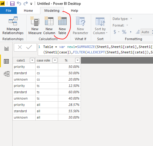
Or create a new table,
Table =
VAR new1 =
    SUMMARIZE (
        Sheet1,
        Sheet1[cate1],
        Sheet1[case role],
        "%", CALCULATE ( COUNT ( Sheet1[case] ), Sheet1[case] IN { "compliant" } )
            / COUNTA ( Sheet1[case] )
    )
VAR new2 =
    SUMMARIZE (
        Sheet1,
        Sheet1[cate1],
        "case role", "all",
        "%", CALCULATE (
            COUNT ( Sheet1[case] ),
            FILTER ( ALLEXCEPT ( Sheet1, Sheet1[cate1] ), Sheet1[case] IN { "compliant" } )
        )
            / CALCULATE ( COUNT ( Sheet1[case] ), ALLEXCEPT ( Sheet1, Sheet1[cate1] ) )
    )
RETURN
    UNION ( new1, new2 )
Best Regards
Maggie
Community Support Team _ Maggie Li
If this post helps, then please consider Accept it as the solution to help the other members find it more quickly.
- Mark as New
- Bookmark
- Subscribe
- Mute
- Subscribe to RSS Feed
- Permalink
- Report Inappropriate Content
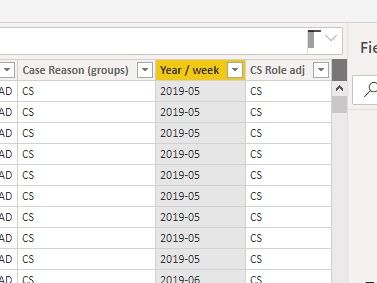
@v-juanli-msft if I may ask additional question. In the source table I also have respective week / year indicator. Can I populate this summary table with that additional measure (so there is also weekly drilldown available)?
- Mark as New
- Bookmark
- Subscribe
- Mute
- Subscribe to RSS Feed
- Permalink
- Report Inappropriate Content
Hi @Anonymous
If you could create measure as below
count = CALCULATE(COUNT(Sheet1[case]),Sheet1[case] in {"compliant"})

count all = COUNTA(Sheet1[case])

% = [count]/[count all]

count 2 = CALCULATE([count],ALLEXCEPT(Sheet1,Sheet1[cate1]))

count all 2 = CALCULATE([count all],ALLEXCEPT(Sheet1,Sheet1[cate1]))

%2 = [count 2]/[count all 2]
As tested, it is impossible to create a columns chart as you provided with the current data.
could you accept a column and line chart?
Or create a new table,
Table =
VAR new1 =
    SUMMARIZE (
        Sheet1,
        Sheet1[cate1],
        Sheet1[case role],
        "%", CALCULATE ( COUNT ( Sheet1[case] ), Sheet1[case] IN { "compliant" } )
            / COUNTA ( Sheet1[case] )
    )
VAR new2 =
    SUMMARIZE (
        Sheet1,
        Sheet1[cate1],
        "case role", "all",
        "%", CALCULATE (
            COUNT ( Sheet1[case] ),
            FILTER ( ALLEXCEPT ( Sheet1, Sheet1[cate1] ), Sheet1[case] IN { "compliant" } )
        )
            / CALCULATE ( COUNT ( Sheet1[case] ), ALLEXCEPT ( Sheet1, Sheet1[cate1] ) )
    )
RETURN
    UNION ( new1, new2 )
Best Regards
Maggie
Community Support Team _ Maggie Li
If this post helps, then please consider Accept it as the solution to help the other members find it more quickly.
- Mark as New
- Bookmark
- Subscribe
- Mute
- Subscribe to RSS Feed
- Permalink
- Report Inappropriate Content
@v-juanli-msft OMG, this works like magic. I was suspecting that additional table would be needed.
Nevetheless, both options work like magic. Thanks so much!
- Mark as New
- Bookmark
- Subscribe
- Mute
- Subscribe to RSS Feed
- Permalink
- Report Inappropriate Content
@Anonymous not sure how your existing measures are, add new measure and use ALL
Both % =
CALCULATE (<your existing measure>, ALL( YourTable[ServiceLevel] ) )
Subscribe to the @PowerBIHowTo YT channel for an upcoming video on List and Record functions in Power Query!!
Learn Power BI and Fabric - subscribe to our YT channel - Click here: @PowerBIHowTo
If my solution proved useful, I'd be delighted to receive Kudos. When you put effort into asking a question, it's equally thoughtful to acknowledge and give Kudos to the individual who helped you solve the problem. It's a small gesture that shows appreciation and encouragement! ❤
Did I answer your question? Mark my post as a solution. Proud to be a Super User! Appreciate your Kudos 🙂
Feel free to email me with any of your BI needs.
- Mark as New
- Bookmark
- Subscribe
- Mute
- Subscribe to RSS Feed
- Permalink
- Report Inappropriate Content
@parry2k thanks for coming back this quick.
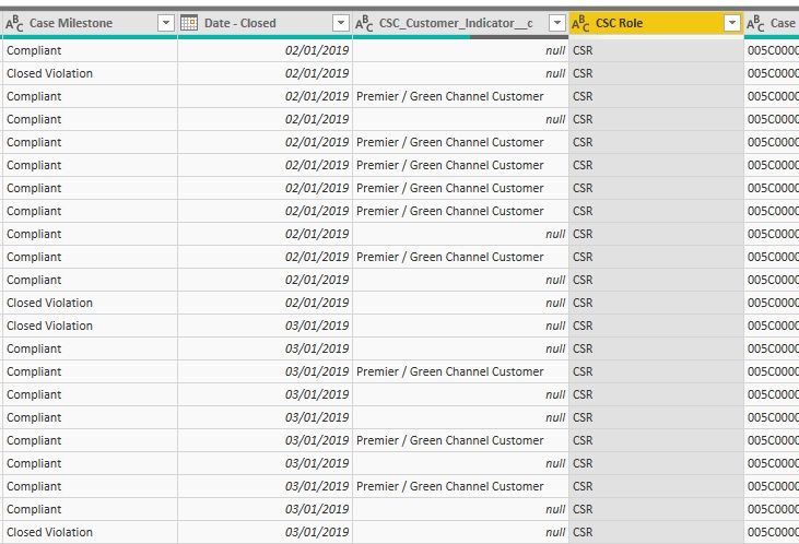
The initial table looks like this. To calculate service level I just sum up compliant milestones and then divide them by total count of IDs (total number of incoming cases, that is). Additionally before chart design I sum up CSC roles to CS and TS by grouping bins.
- Mark as New
- Bookmark
- Subscribe
- Mute
- Subscribe to RSS Feed
- Permalink
- Report Inappropriate Content
@Anonymous can you share your existing measures?
Subscribe to the @PowerBIHowTo YT channel for an upcoming video on List and Record functions in Power Query!!
Learn Power BI and Fabric - subscribe to our YT channel - Click here: @PowerBIHowTo
If my solution proved useful, I'd be delighted to receive Kudos. When you put effort into asking a question, it's equally thoughtful to acknowledge and give Kudos to the individual who helped you solve the problem. It's a small gesture that shows appreciation and encouragement! ❤
Did I answer your question? Mark my post as a solution. Proud to be a Super User! Appreciate your Kudos 🙂
Feel free to email me with any of your BI needs.
- Mark as New
- Bookmark
- Subscribe
- Mute
- Subscribe to RSS Feed
- Permalink
- Report Inappropriate Content
@parry2k First of all I do calculation on how many cases were closed according the milestone (have "Compliant" in the status).
Helpful resources

Fabric Data Days
Advance your Data & AI career with 50 days of live learning, contests, hands-on challenges, study groups & certifications and more!

Power BI Monthly Update - October 2025
Check out the October 2025 Power BI update to learn about new features.

| User | Count |
|---|---|
| 84 | |
| 49 | |
| 37 | |
| 31 | |
| 30 |
