Get Fabric certified for FREE!
Don't miss your chance to take the Fabric Data Engineer (DP-700) exam on us!
Learn more- Power BI forums
- Get Help with Power BI
- Desktop
- Service
- Report Server
- Power Query
- Mobile Apps
- Developer
- DAX Commands and Tips
- Custom Visuals Development Discussion
- Health and Life Sciences
- Power BI Spanish forums
- Translated Spanish Desktop
- Training and Consulting
- Instructor Led Training
- Dashboard in a Day for Women, by Women
- Galleries
- Data Stories Gallery
- Themes Gallery
- Contests Gallery
- QuickViz Gallery
- Quick Measures Gallery
- Visual Calculations Gallery
- Notebook Gallery
- Translytical Task Flow Gallery
- TMDL Gallery
- R Script Showcase
- Webinars and Video Gallery
- Ideas
- Custom Visuals Ideas (read-only)
- Issues
- Issues
- Events
- Upcoming Events
We've captured the moments from FabCon & SQLCon that everyone is talking about, and we are bringing them to the community, live and on-demand. Starts on April 14th. Register now
- Power BI forums
- Forums
- Get Help with Power BI
- Desktop
- Clustered Column Chart Statically Set Colors
- Subscribe to RSS Feed
- Mark Topic as New
- Mark Topic as Read
- Float this Topic for Current User
- Bookmark
- Subscribe
- Printer Friendly Page
- Mark as New
- Bookmark
- Subscribe
- Mute
- Subscribe to RSS Feed
- Permalink
- Report Inappropriate Content
Clustered Column Chart Statically Set Colors
Good morning, All.
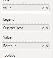
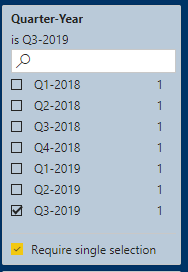
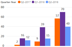
I am using a clustered column chart where values are driven by a Quarter-Year slicer. My visual setup is as followed:
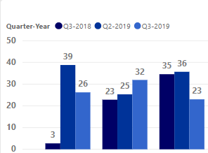
When a user selects a different quarter-year, I would like my colors to stay static. For example, using these three primary colors:
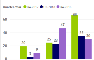
The current behavior is when I change a quarter-year, the colors are currently changing since each quarter-year has a color associated to it as such:
How do I force legend colors to be consistent for the visual?
Solved! Go to Solution.
- Mark as New
- Bookmark
- Subscribe
- Mute
- Subscribe to RSS Feed
- Permalink
- Report Inappropriate Content
@hnguyen76 - To clarify, is this correct?: Consistency in this case means that there will always be 3 columns: first column will be dark blue, second medium, and third light.
The problem with this is that you want the color for a particular quarter to change depending on its position in the chart.
One way to accomplish this is by using static categories in the Legend.
1. Create a Date Table that contains relative quarters (like the Date table in the attached pbix).
2. Create a Parameter table with the list of quarters and their relative quarters from above date table.
Parameters =
var a = SELECTCOLUMNS('Date',"Quarter Year", 'Date'[Quarter Year], "Relative Quarter",'Date'[Relative Quarter])
var b = DATATABLE(
    "Selected Quarter Description", STRING,
    "Selected Quarter Order", INTEGER,
    {{"Previous Year", 1},{"Previous Quarter", 2},{"Selected Quarter", 3}}
)
return CROSSJOIN(a,b)
3. On the Model Pane, set the Sort By value for the various Quarter values.
4. Create a relationship between your fact table and the new Date table.
5. Create a Measure which gets the value for the relevant quarters.
Value By Relevant Quarters =
var _ThisQuarter = SELECTEDVALUE(Parameters[Relative Quarter])
var _LastQuarter = _ThisQuarter - 1
var _LastYearQuarter = _ThisQuarter - 4
return
SWITCH(
    MAX('Parameters'[Selected Quarter Order]),
    1, CALCULATE(SUM(DummyData[Value]), 'Date'[Relative Quarter] = _LastYearQuarter),
    2, CALCULATE(SUM(DummyData[Value]), 'Date'[Relative Quarter] = _LastQuarter),
    3, CALCULATE(SUM(DummyData[Value]), 'Date'[Relative Quarter] = _ThisQuarter)
)
6. Create a slicer from the Parameters[Quarter Year].
7. Add a Column Chart, with Parameters[Select Quarter Description] in the Legend, and [Value by Relative Quarters] for the values.
Please see attached PBIX which demonstrates the logic.
I also appreciate Kudos.
- Mark as New
- Bookmark
- Subscribe
- Mute
- Subscribe to RSS Feed
- Permalink
- Report Inappropriate Content
Hi @Anonymous
That is actually correct. I just want the three columns to show with three colors. I've downloaded the PBIx and it looks like what I definitely need! Thanks for that!
Instead of displaying "Previous Year", "Previous Quarter", "Selected Quarter", could it be modified to show instead the values? For example, Previous Year would be "Q4-2020", Previous Quarter would be "Q3-2021", and "Selected Quarter" would be "Q4-2021"?
- Mark as New
- Bookmark
- Subscribe
- Mute
- Subscribe to RSS Feed
- Permalink
- Report Inappropriate Content
@hnguyen76 - I don't think there's a way to make that work, because each category (quarter) will be associated with a color. So, when the user interacts, those colors are still associated. That is why I created the 3 static values for the categories.
Helpful resources

New to Fabric Survey
If you have recently started exploring Fabric, we'd love to hear how it's going. Your feedback can help with product improvements.

Power BI DataViz World Championships - June 2026
A new Power BI DataViz World Championship is coming this June! Don't miss out on submitting your entry.

Join our Fabric User Panel
Share feedback directly with Fabric product managers, participate in targeted research studies and influence the Fabric roadmap.

| User | Count |
|---|---|
| 52 | |
| 38 | |
| 37 | |
| 19 | |
| 18 |
| User | Count |
|---|---|
| 67 | |
| 67 | |
| 34 | |
| 32 | |
| 29 |
