Get certified for free when you join Fabric Data Days 2026 and dive into Fabric, Power BI, SQL, AI, and other essential data skills.
Join nowJuly 7 - July 17 | Round 2 of the Power BI Dataviz World Championships. Don't miss your chance! Learn more
Hi,
I need help in making a chart.
Below I described the problem in the excel sheet.
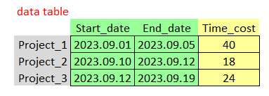
I have a data table with three columns (Start_date, End_date and Time_cost)
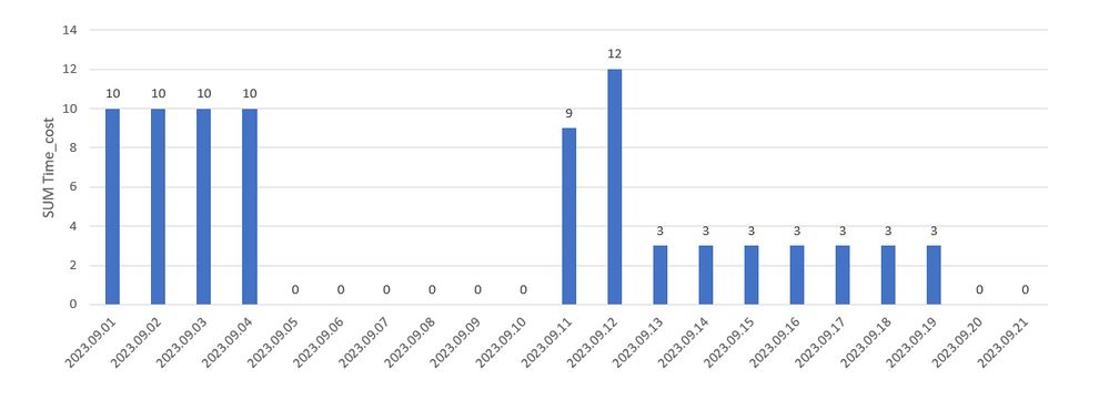
I want to plot this data in the chart as follows.
The Time_cost is to be divided by the number of days in which the Project occurs and placed in individual days in which it occurs. Just like in the Excel chart below
For better understanding, I put everything in an excel file
Link to file http://gofile.me/74fh2/cc0521h8J
I am asking for help in solving this problem
Solved! Go to Solution.
@amiskow , refer these approches
Measure way
Power BI Dax Measure- Allocate data between Range: https://youtu.be/O653vwLTUzM
Tables way
https://amitchandak.mediumcom/dax-get-all-dates-between-the-start-and-end-date-8f3dac4ff90b
https://amitchandak.medium.com/power-query-get-all-dates-between-the-start-and-end-date-9ad6a84cf5f2
Hi,
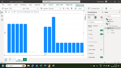
Please find attached the PBI file.
Hope this helps.
Thank you very much for help. That's exactly what it was about 😊
You are welcome.
@amiskow , refer these approches
Measure way
Power BI Dax Measure- Allocate data between Range: https://youtu.be/O653vwLTUzM
Tables way
https://amitchandak.mediumcom/dax-get-all-dates-between-the-start-and-end-date-8f3dac4ff90b
https://amitchandak.medium.com/power-query-get-all-dates-between-the-start-and-end-date-9ad6a84cf5f2
Join us in Barcelona for FabCon and SQLCon, the Fabric, Power BI, SQL, and AI community event. Save €200 with code FABCMTY200.
Join Data Days 2026: 60 days of free live/on-demand sessions, challenges, study groups, and certification opportunities.
| User | Count |
|---|---|
| 27 | |
| 23 | |
| 18 | |
| 18 | |
| 15 |
| User | Count |
|---|---|
| 53 | |
| 44 | |
| 42 | |
| 39 | |
| 34 |