Get certified for free when you join Fabric Data Days 2026 and dive into Fabric, Power BI, SQL, AI, and other essential data skills.
Join nowJuly 28 - August 9 | Final Round of the Power BI Dataviz World Championships. This is your chance. Learn more
Hi,
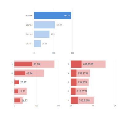
I have 3 bar charts in my dashboard and they are cross filtering each other. However for one of the charts, while filtering, it shows bar inside bar rather that highlighting a part of it. How can I fix this?
In snip below, left right chart is the behavior I dont want and right chart is how I want to see it.
Thanks for your help in advance!
Veena.
Solved! Go to Solution.
Hi,
My data has some negative values which is causing this behavior. @JorgePinho - thanks for your help though!
Regards,
Veena.
Hi,
My data has some negative values which is causing this behavior. @JorgePinho - thanks for your help though!
Regards,
Veena.
Thank you so much for following up! 🙂
Hi,
It's the Stacked Bar chart, same for all 3.
Just simulated a simillar scenario in my Power BI and both charts look the way you want. I have no idea of what might be happening...
Which visual are you using? The standard clustered bar chart?
If you love stickers, then you will definitely want to check out our community sticker challenge, Barcelona edition!
Check out the July 2026 Power BI update to learn about new features.
| User | Count |
|---|---|
| 26 | |
| 22 | |
| 22 | |
| 20 | |
| 17 |
| User | Count |
|---|---|
| 35 | |
| 29 | |
| 21 | |
| 19 | |
| 17 |