Get certified for free when you join Fabric Data Days 2026 and dive into Fabric, Power BI, SQL, AI, and other essential data skills.
Join nowJuly 7 - July 17 | Round 2 of the Power BI Dataviz World Championships. Don't miss your chance! Learn more
Hi Experts,
Is there any way to change bar color in clustered column chart in Power BI?
i.e. If second value is < first value in clustered column chart then change second bar color to red, otherwise green.
Regards,
Glenn
Solved! Go to Solution.
Hi @superglenntot,
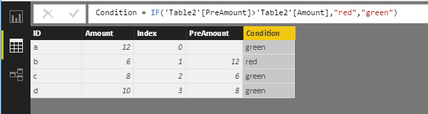
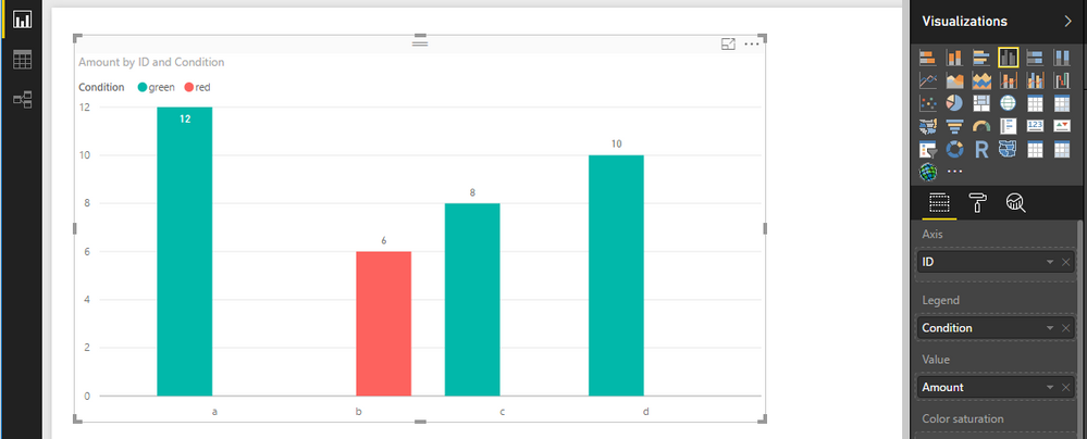
Power BI doesn't provide a feature for us to specify chart column color based on a condition. For your requirement, you can work around the issue utilize the Legend property.
Assume the condition is each amount is less than the previous amount, highlight the current bar with red, otherwise it's green. You can use DAX to transform data firstly. See attached .pbix file.
Best Regards,
Qiuyun Yu
Hi @superglenntot,
Power BI doesn't provide a feature for us to specify chart column color based on a condition. For your requirement, you can work around the issue utilize the Legend property.
Assume the condition is each amount is less than the previous amount, highlight the current bar with red, otherwise it's green. You can use DAX to transform data firstly. See attached .pbix file.
Best Regards,
Qiuyun Yu
How can i achieve this in measure
Thank you vry much, Qiuyun Yu!
Join us in Barcelona for FabCon and SQLCon, the Fabric, Power BI, SQL, and AI community event. Save €200 with code FABCMTY200.
Join Data Days 2026: 60 days of free live/on-demand sessions, challenges, study groups, and certification opportunities.
| User | Count |
|---|---|
| 29 | |
| 23 | |
| 18 | |
| 18 | |
| 15 |
| User | Count |
|---|---|
| 51 | |
| 44 | |
| 43 | |
| 39 | |
| 32 |