This is best Fabric, Power BI, SQL and AI community event. How do we know? The last event sold out! Save €200 with code FABCMTY200.
Register nowA new Data Days event is coming soon! This time we’re going bigger than ever. Fabric, Power BI, SQL, AI and more. Don't miss out.
Hi,
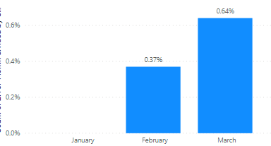
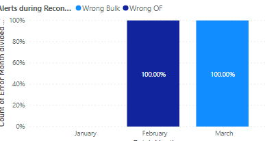
I have built a graph that is summarizing error data per month. I want to add a legend to show breakdown by type of error, but when I add this to the legend it changes my values.
Here is my graph before adding a legend
Here is my graph after: It changes the values to be 100%
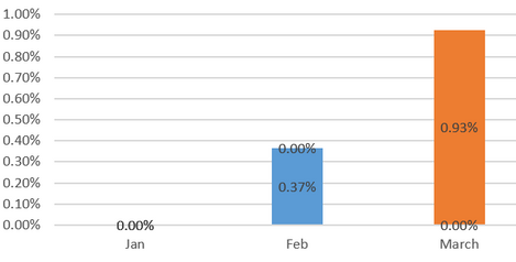
I had a previous graph in excel that looked like this, which is what I'm trying to replicate (data isn't updated which is why the numbers differ)
Any help would be appreciated!
Solved! Go to Solution.
In my ex[perience this happens when you either have the data type wrong or you haven't set up a relationship correctly (if you're drawing data from more than one table). I'd check you've got your data types correct first.
Check your relation of legend with fact.
In my ex[perience this happens when you either have the data type wrong or you haven't set up a relationship correctly (if you're drawing data from more than one table). I'd check you've got your data types correct first.
Check out the May 2026 Power BI update to learn about new features.
Sign up to receive a private message when registration opens and key events begin.
If you have recently started exploring Fabric, we'd love to hear how it's going. Your feedback can help with product improvements.
| User | Count |
|---|---|
| 29 | |
| 25 | |
| 25 | |
| 21 | |
| 14 |
| User | Count |
|---|---|
| 59 | |
| 50 | |
| 25 | |
| 20 | |
| 20 |