Join us at FabCon Vienna from September 15-18, 2025
The ultimate Fabric, Power BI, SQL, and AI community-led learning event. Save €200 with code FABCOMM.
Get registered- Power BI forums
- Get Help with Power BI
- Desktop
- Service
- Report Server
- Power Query
- Mobile Apps
- Developer
- DAX Commands and Tips
- Custom Visuals Development Discussion
- Health and Life Sciences
- Power BI Spanish forums
- Translated Spanish Desktop
- Training and Consulting
- Instructor Led Training
- Dashboard in a Day for Women, by Women
- Galleries
- Data Stories Gallery
- Themes Gallery
- Contests Gallery
- Quick Measures Gallery
- Notebook Gallery
- Translytical Task Flow Gallery
- TMDL Gallery
- R Script Showcase
- Webinars and Video Gallery
- Ideas
- Custom Visuals Ideas (read-only)
- Issues
- Issues
- Events
- Upcoming Events
Enhance your career with this limited time 50% discount on Fabric and Power BI exams. Ends August 31st. Request your voucher.
- Power BI forums
- Forums
- Get Help with Power BI
- DAX Commands and Tips
- single measure select multiple value shows in one ...
- Subscribe to RSS Feed
- Mark Topic as New
- Mark Topic as Read
- Float this Topic for Current User
- Bookmark
- Subscribe
- Printer Friendly Page
- Mark as New
- Bookmark
- Subscribe
- Mute
- Subscribe to RSS Feed
- Permalink
- Report Inappropriate Content
single measure select multiple value shows in one graph
how to show three different values in one graph
Redution buckts
Ex Rate
New Materials
scrap
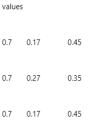
values
0.7 0.17 0.45
0.7 0.27 0.35
0.7 0.17 0.45
Valueof Month Values
Dec 2020 120 -> starting inventory
Jan 121
feb 111
March 121 --> end inventory
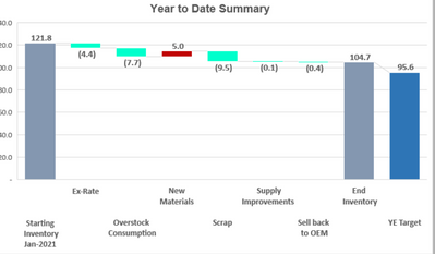
Graph should like below
any idea . thanks in advance
- Mark as New
- Bookmark
- Subscribe
- Mute
- Subscribe to RSS Feed
- Permalink
- Report Inappropriate Content
Hi @Anonymous ,
According to your description, here’s a blog may help to solve your problem.
How to Build A Waterfall Chart to Indicate the Val... - Microsoft Power BI Community
If it still not work, can you provide more details about your data below? What does each data represent?
Best Regards,
Community Support Team _ kalyj
Helpful resources
| User | Count |
|---|---|
| 27 | |
| 12 | |
| 8 | |
| 8 | |
| 5 |
| User | Count |
|---|---|
| 31 | |
| 15 | |
| 12 | |
| 7 | |
| 6 |


