FabCon is coming to Atlanta
Join us at FabCon Atlanta from March 16 - 20, 2026, for the ultimate Fabric, Power BI, AI and SQL community-led event. Save $200 with code FABCOMM.
Register now!- Power BI forums
- Get Help with Power BI
- Desktop
- Service
- Report Server
- Power Query
- Mobile Apps
- Developer
- DAX Commands and Tips
- Custom Visuals Development Discussion
- Health and Life Sciences
- Power BI Spanish forums
- Translated Spanish Desktop
- Training and Consulting
- Instructor Led Training
- Dashboard in a Day for Women, by Women
- Galleries
- Data Stories Gallery
- Themes Gallery
- Contests Gallery
- QuickViz Gallery
- Quick Measures Gallery
- Visual Calculations Gallery
- Notebook Gallery
- Translytical Task Flow Gallery
- TMDL Gallery
- R Script Showcase
- Webinars and Video Gallery
- Ideas
- Custom Visuals Ideas (read-only)
- Issues
- Issues
- Events
- Upcoming Events
The Power BI Data Visualization World Championships is back! Get ahead of the game and start preparing now! Learn more
- Power BI forums
- Forums
- Get Help with Power BI
- DAX Commands and Tips
- single measure select multiple value shows in one ...
- Subscribe to RSS Feed
- Mark Topic as New
- Mark Topic as Read
- Float this Topic for Current User
- Bookmark
- Subscribe
- Printer Friendly Page
- Mark as New
- Bookmark
- Subscribe
- Mute
- Subscribe to RSS Feed
- Permalink
- Report Inappropriate Content
single measure select multiple value shows in one graph
how to show three different values in one graph
Redution buckts
Ex Rate
New Materials
scrap
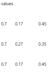
values
0.7 0.17 0.45
0.7 0.27 0.35
0.7 0.17 0.45
Valueof Month Values
Dec 2020 120 -> starting inventory
Jan 121
feb 111
March 121 --> end inventory
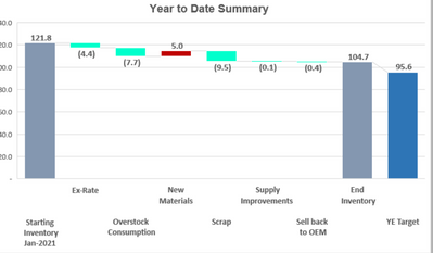
Graph should like below
any idea . thanks in advance
- Mark as New
- Bookmark
- Subscribe
- Mute
- Subscribe to RSS Feed
- Permalink
- Report Inappropriate Content
To show Ex Rate, New Materials and Scrap in one Power BI chart you can use one of three main approaches.
-
Using Field Parameters
Create a new field parameter in Modeling tab
Add the three measures Ex Rate, New Materials, Scrap
Power BI will create a small table with measure names and a parameter measure
Put Month on X axis, the parameter measure on Values, and the parameter label on Legend
Add a slicer for that parameter table so you can multi select measures and see them all in one chart -
Using a disconnected table and SWITCH
Create a small table with one column Metric and rows Ex Rate, New Materials, Scrap
Then create one measure Metric Value that checks which metric is selected and returns the corresponding measure value
For example, SELECTEDVALUE from the Metric column and SWITCH to pick the right measure
Add Month on X axis, Metric on Legend, and Metric Value as Values
This way each metric becomes a separate line or bar in the same visual -
If your data is columns instead of measures
In Power Query, select Ex Rate, New Materials and Scrap columns and choose Unpivot Columns
You’ll get columns Metric and Value
Load that table and build a chart with Month on X axis, Value on Y axis, and Metric on Legend
Now all three will show together
If your goal is to show start and end inventory with drivers, use a Waterfall chart instead.
Build a small table with Start Inventory, Ex Rate, New Materials, Scrap, End Inventory and mark Start and End as Totals.
Put Step on Category and Amount on Y axis in a Waterfall visual.
You’ll get a clear start to end flow with each factor contributing to the change.
Choose Field Parameters if you have separate measures
Choose Unpivot if your columns are wide
Choose Waterfall if you want to show contribution to inventory change
____________
⭐️ Fabric Group Channel
⭐️ Microsoft Fabric Community
Please join the Power BI UX/UI User Group if you need help with dashboard design and usability
Join to Data Governance User Group
Join to DENEB and Power BI Enthusiasts User Group
Join to Data Fabric Best Practices User Group
Subscribe to my medium blog
- Mark as New
- Bookmark
- Subscribe
- Mute
- Subscribe to RSS Feed
- Permalink
- Report Inappropriate Content
Hi @Anonymous ,
According to your description, here’s a blog may help to solve your problem.
How to Build A Waterfall Chart to Indicate the Val... - Microsoft Power BI Community
If it still not work, can you provide more details about your data below? What does each data represent?
Best Regards,
Community Support Team _ kalyj
Helpful resources

Power BI Dataviz World Championships
The Power BI Data Visualization World Championships is back! Get ahead of the game and start preparing now!

Power BI Monthly Update - November 2025
Check out the November 2025 Power BI update to learn about new features.

| User | Count |
|---|---|
| 19 | |
| 11 | |
| 9 | |
| 4 | |
| 4 |
| User | Count |
|---|---|
| 35 | |
| 32 | |
| 20 | |
| 12 | |
| 10 |


