FabCon is coming to Atlanta
Join us at FabCon Atlanta from March 16 - 20, 2026, for the ultimate Fabric, Power BI, AI and SQL community-led event. Save $200 with code FABCOMM.
Register now!- Power BI forums
- Get Help with Power BI
- Desktop
- Service
- Report Server
- Power Query
- Mobile Apps
- Developer
- DAX Commands and Tips
- Custom Visuals Development Discussion
- Health and Life Sciences
- Power BI Spanish forums
- Translated Spanish Desktop
- Training and Consulting
- Instructor Led Training
- Dashboard in a Day for Women, by Women
- Galleries
- Data Stories Gallery
- Themes Gallery
- Contests Gallery
- QuickViz Gallery
- Quick Measures Gallery
- Visual Calculations Gallery
- Notebook Gallery
- Translytical Task Flow Gallery
- TMDL Gallery
- R Script Showcase
- Webinars and Video Gallery
- Ideas
- Custom Visuals Ideas (read-only)
- Issues
- Issues
- Events
- Upcoming Events
Get Fabric Certified for FREE during Fabric Data Days. Don't miss your chance! Request now
- Power BI forums
- Forums
- Get Help with Power BI
- DAX Commands and Tips
- Showing the Max of a value across an entire datase...
- Subscribe to RSS Feed
- Mark Topic as New
- Mark Topic as Read
- Float this Topic for Current User
- Bookmark
- Subscribe
- Printer Friendly Page
- Mark as New
- Bookmark
- Subscribe
- Mute
- Subscribe to RSS Feed
- Permalink
- Report Inappropriate Content
Showing the Max of a value across an entire dataset
Hi there,
I have a dataset that I bring into PowerBI which lists
SITE
CRAFT
DATE
COUNT
the data goes out to 2025. Each week there is a list of 15 crafts for Sydney and for Vancouver and the count per craft... per the image below.
SITE | CRAFT | DATE | COUNT |
Sydney | Animation | 21/03/2022 | 29 |
Vancouver | Animation | 21/03/2022 | 15 |
Sydney | Animation | 28/03/2022 | 37 |
Vancouver | Animation | 28/03/2022 | 9 |
Sydney | FX | 20/06/2022 | 28 |
Vancouver | FX | 20/06/2022 | 12 |
Sydney | FX | 11/07/2022 | 19 |
Vancouver | FX | 11/07/2022 | 22 |
What I am trying to do is show the max per craft and the week that occurs.
So there would be two lines for each craft showing the name of the craft, the location, the week and that weeks count as it is the max across the entire data set.
For example the output would look like;
| SITE | CRAFT | DATE | COUNT |
| Sydney | Animation | 28/03/2022 | 37 |
| Vancouver | Animation | 21/03/2022 | 15 |
| Sydney | FX | 20/06/2022 | 28 |
| Vancouver | FX | 11/07/2022 | 22 |
So on and so forth.
I tried to build a measure that was Calculate(SUM(CrewPlanCondensed[Count])) but then not sure how to use that measure in a table to display the other data (basically I made a mess of it).
Would love some guidance on how to achieve this.
- Mark as New
- Bookmark
- Subscribe
- Mute
- Subscribe to RSS Feed
- Permalink
- Report Inappropriate Content
Hi @Anonymous ,
I watched your conversation with @VahidDM .
You are trying to get the maximum number of dates for each craft. The result contains the site, count and the name of the craft for this maximum date.
Measure =
CALCULATE(
    MAX( 'Table'[DATE] ),
    'Table'[COUNT]
        = MAX( 'Table'[COUNT] )
)
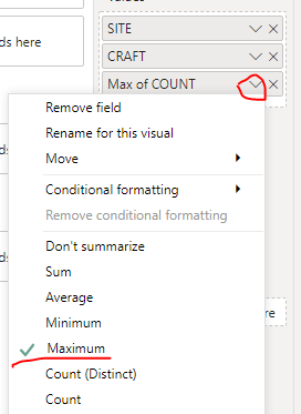
You need to create a measure like the one above and put three fact fields in the table visual, [SITE] , [CRAFT] , [COUNT], like the following
Then, the most import thing, set the [COUNT] field as Maximum
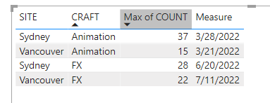
Last , put the measure in the table visual. Result:
Pbix in the end you can refer.
Best Regards
Community Support Team _ chenwu zhu
If this post helps, then please consider Accept it as the solution to help the other members find it more quickly.
- Mark as New
- Bookmark
- Subscribe
- Mute
- Subscribe to RSS Feed
- Permalink
- Report Inappropriate Content
Hi there,
Thank you this works as expected, except for the following;
It shows the last date in the range when we are at the maximim.
i.e. for Animation in Sydney we hit 75 in 24/01/22, then we drop off again and then at 72 on the 02/05/22 til the 30/05/22. The output for animation in Sydney is showing 30/05/22 as the max crew week were I would need it to be the 24/01/22 as that is when we first hit the maximum.
Is this easy to sort out?
- Mark as New
- Bookmark
- Subscribe
- Mute
- Subscribe to RSS Feed
- Permalink
- Report Inappropriate Content
Duh.. I changed the Max to Min?!
- Mark as New
- Bookmark
- Subscribe
- Mute
- Subscribe to RSS Feed
- Permalink
- Report Inappropriate Content
Hi @Anonymous
Can you post sample data as text and expected output?
Not enough information to go on;
please see this post regarding How to Get Your Question Answered Quickly:
https://community.powerbi.com/t5/Community-Blog/How-to-Get-Your-Question-Answered-Quickly/ba-p/38490
The most important parts are:
1. Sample data as text, use the table tool in the editing bar
2. Expected output from sample data
3. Explanation in words of how to get from 1. to 2.
4. Relation between your tables
Appreciate your Kudos!!
LinkedIn:www.linkedin.com/in/vahid-dm/
- Mark as New
- Bookmark
- Subscribe
- Mute
- Subscribe to RSS Feed
- Permalink
- Report Inappropriate Content
Edited, thanks
I don't know why the table columns are compressed. It keeps saying it is correcting HTML errors and then saving.
"Your post has been changed because invalid HTML was found in the message body. The invalid HTML has been removed. Please review the message and submit the message when you are satisfied."
I fudged the data and put spaces in the table, it should be clear as to what I am trying to achieve.
- Mark as New
- Bookmark
- Subscribe
- Mute
- Subscribe to RSS Feed
- Permalink
- Report Inappropriate Content
Hi @Anonymous
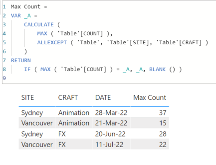
Try this measure for MAX Count:
Max Count =
VAR _A =
    CALCULATE (
        MAX ( 'Table'[COUNT] ),
        ALLEXCEPT ( 'Table', 'Table'[SITE], 'Table'[CRAFT] )
    )
RETURN
    IF ( MAX ( 'Table'[COUNT] ) = _A, _A, BLANK () )
Add SITE,CRAFT,and DATE column to the table visaul and then add this measure.
The Output:
If this post helps, please consider accepting it as the solution to help the other members find it more quickly.
Appreciate your Kudos!!
LinkedIn: www.linkedin.com/in/vahid-dm/
- Mark as New
- Bookmark
- Subscribe
- Mute
- Subscribe to RSS Feed
- Permalink
- Report Inappropriate Content
Hey there,
I did that as outlined above, I have site, Craft, Date and the measure in the 'Values' for the table visualisation.
What did you do for the Values in the date field. I can't seem to get the visualisation setup just to show 2 lines per craft output properly.
Either I am repeating the date by setting earliest or repeated dates by putting don't summarise.
Cheers
- Mark as New
- Bookmark
- Subscribe
- Mute
- Subscribe to RSS Feed
- Permalink
- Report Inappropriate Content
Hi @Anonymous
Download this file: https://gofile.io/d/MWXc55
If this post helps, please consider accepting it as the solution to help the other members find it more quickly.
Appreciate your Kudos!!
LinkedIn: www.linkedin.com/in/vahid-dm/
- Mark as New
- Bookmark
- Subscribe
- Mute
- Subscribe to RSS Feed
- Permalink
- Report Inappropriate Content
Thanks for that, exactly as it should be but for me it doesn't do that. Maybe it is the way the date field is created. The underlying source is a huge messy spreadsheet that gets unpivoted to form the date column.
The value is Date and shows as Date in the table but I am just not sure why in my visualisation it is not limiting to only show the max for the crafts. It shows the correct total, it is just repeated for every date instance that is listed for the crafts.
I'll keep messing with it and see how far it goes before I break it fundatmentally.
- Mark as New
- Bookmark
- Subscribe
- Mute
- Subscribe to RSS Feed
- Permalink
- Report Inappropriate Content
@Anonymous
Can you share your PBIX file with me?
Appreciate your Kudos!!
LinkedIn: www.linkedin.com/in/vahid-dm/
- Mark as New
- Bookmark
- Subscribe
- Mute
- Subscribe to RSS Feed
- Permalink
- Report Inappropriate Content
Sorry I cannot, the table has current production information in it that has about 5 NDA slapped over the top of it.
If I modify it then I might be eroding the reason why it isn't working also.
One of those instances where I think I am stuck to be honest.
I'll keep looking at my data and see if something jumps out.
- Mark as New
- Bookmark
- Subscribe
- Mute
- Subscribe to RSS Feed
- Permalink
- Report Inappropriate Content
so I know this isn't correct but this worked so much as to show the maximum per craft.
Max Craft = CALCULATE (
    MAX ( CrewPlanCondensed[Count] ),
    ALLEXCEPT ( CrewPlanCondensed, CrewPlanCondensed[Craft],CrewPlanCondensed[Location]))
BUT
It doesn't limit it to the date. So for Animation - Sydney it shows 62 which is the max, but there is a line in the output for every Monday in the data for Sydney Animation,
Vancouver it shows the 81, but again for Animation there is a long list of 81 as it is showing a line for every Monday in the spreadsheet.
- Mark as New
- Bookmark
- Subscribe
- Mute
- Subscribe to RSS Feed
- Permalink
- Report Inappropriate Content
Date in the main table is a result of this in the query
    #"Changed Type1" = Table.TransformColumnTypes(#"Unpivoted Columns",{{"Attribute", type date}, {"Value", Int64.Type}}),
    #"Renamed Columns" = Table.RenameColumns(#"Changed Type1",{{"Attribute", "Date"}, {"Value", "Count"}}),
Could that be a factor in my headache here
- Mark as New
- Bookmark
- Subscribe
- Mute
- Subscribe to RSS Feed
- Permalink
- Report Inappropriate Content
Hi @Anonymous
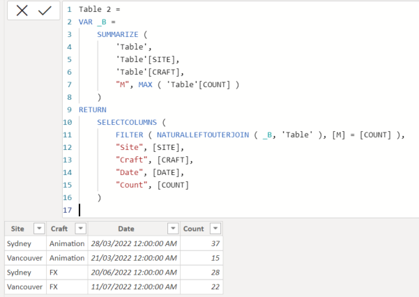
Try this code to add a new table then use the new table:
Table 2 =
VAR _B =
    SUMMARIZE (
        'Table',
        'Table'[SITE],
        'Table'[CRAFT],
        "M", MAX ( 'Table'[COUNT] )
    )
RETURN
    SELECTCOLUMNS (
        FILTER ( NATURALLEFTOUTERJOIN ( _B, 'Table' ), [M] = [COUNT] ),
        "Site", [SITE],
        "Craft", [CRAFT],
        "Date", [DATE],
        "Count", [COUNT]
    )
output:
If this post helps, please consider accepting it as the solution to help the other members find it more quickly.
Appreciate your Kudos!!
LinkedIn: www.linkedin.com/in/vahid-dm/
- Mark as New
- Bookmark
- Subscribe
- Mute
- Subscribe to RSS Feed
- Permalink
- Report Inappropriate Content
"The expression refers to multiple columns. Multiple columns cannot be converted to a scalar value."
Table 2 =
VAR _B =
    SUMMARIZE (
        'CrewPlanCondensed',
        'CrewPlanCondensed'[Location],
        'CrewPlanCondensed'[Craft],
        "M", MAX ( 'CrewPlanCondensed'[Count] )
    )
RETURN
    SELECTCOLUMNS (
        FILTER ( NATURALLEFTOUTERJOIN ( _B, CrewPlanCondensed), [M] = [COUNT] ),
        "Site", [Location],
        "Craft", [CRAFT],
        "Date", [Date],
        "Count", [Count]
    )
That is what I have, I feel I have mucked up something there.
- Mark as New
- Bookmark
- Subscribe
- Mute
- Subscribe to RSS Feed
- Permalink
- Report Inappropriate Content
@Anonymous
Use that code to add a new table:
If this post helps, please consider accepting it as the solution to help the other members find it more quickly.
Appreciate your Kudos!!
LinkedIn: www.linkedin.com/in/vahid-dm/
- Mark as New
- Bookmark
- Subscribe
- Mute
- Subscribe to RSS Feed
- Permalink
- Report Inappropriate Content
I have added a new table per the script above which comes back with just over 5000 lines.
I built a table visualisation and followed the steps above by creating the measure and binding it to the new table then used the Count value from the measure in the visualisation and it still comes back with rows and rows of extra information.
Is that what I should have done?
- Mark as New
- Bookmark
- Subscribe
- Mute
- Subscribe to RSS Feed
- Permalink
- Report Inappropriate Content
oh I can see what it is doing. It is not showing the first week we hit the max. It is showing a line for each week we are at the maximum number.
For example in Sydney we hit the max for CharFX of 36 on the 25/04/22. There is a line for each week now we are at 36 and then it stops. So there are weekly lines til 19/09/22 then nothing more as the crew number drops.
Ideally this would just show the first week we hit the max number, not all the weeks we are at that number.
Thanks.
Helpful resources

Power BI Monthly Update - November 2025
Check out the November 2025 Power BI update to learn about new features.

Fabric Data Days
Advance your Data & AI career with 50 days of live learning, contests, hands-on challenges, study groups & certifications and more!

| User | Count |
|---|---|
| 9 | |
| 9 | |
| 8 | |
| 6 | |
| 6 |
| User | Count |
|---|---|
| 20 | |
| 18 | |
| 16 | |
| 14 | |
| 14 |


