Join the #PBI10 DataViz contest
Power BI is turning 10, and we’re marking the occasion with a special community challenge. Use your creativity to tell a story, uncover trends, or highlight something unexpected.
Get started- Power BI forums
- Get Help with Power BI
- Desktop
- Service
- Report Server
- Power Query
- Mobile Apps
- Developer
- DAX Commands and Tips
- Custom Visuals Development Discussion
- Health and Life Sciences
- Power BI Spanish forums
- Translated Spanish Desktop
- Training and Consulting
- Instructor Led Training
- Dashboard in a Day for Women, by Women
- Galleries
- Webinars and Video Gallery
- Data Stories Gallery
- Themes Gallery
- Contests Gallery
- Quick Measures Gallery
- Notebook Gallery
- Translytical Task Flow Gallery
- R Script Showcase
- Ideas
- Custom Visuals Ideas (read-only)
- Issues
- Issues
- Events
- Upcoming Events
Join us for an expert-led overview of the tools and concepts you'll need to become a Certified Power BI Data Analyst and pass exam PL-300. Register now.
- Power BI forums
- Forums
- Get Help with Power BI
- DAX Commands and Tips
- Re: Resorting age group buckets
- Subscribe to RSS Feed
- Mark Topic as New
- Mark Topic as Read
- Float this Topic for Current User
- Bookmark
- Subscribe
- Printer Friendly Page
- Mark as New
- Bookmark
- Subscribe
- Mute
- Subscribe to RSS Feed
- Permalink
- Report Inappropriate Content
Resorting age group buckets
Hello all,
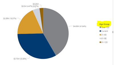
I have a pie chart showing invoice amounts by by age group Current, 31-60, 61-90, 91-20 and over 120. Unfortunately, on my visualization, those buckets are out of order. Is there a way I can fix this to show in order?
Thank you!
Solved! Go to Solution.
- Mark as New
- Bookmark
- Subscribe
- Mute
- Subscribe to RSS Feed
- Permalink
- Report Inappropriate Content
The easiest way would be to add a "1", "2", etc, to the labels.
But a neater way would would be to add a sort column. Here, you would add a new column next to each of the labels, such as Current being 1, and 31-60 being 2, etc. You can do that using SWITCH.
So the calculated column would be:
Sort column = SWITCH 'table name' [Age group], "Current","1",31-60","2", etc.
Then click on "Age group" field, and then click on sort by column, and then click on your new sort column. That should do it.
- Mark as New
- Bookmark
- Subscribe
- Mute
- Subscribe to RSS Feed
- Permalink
- Report Inappropriate Content
This seemed to do the trick. Thank you!
- Mark as New
- Bookmark
- Subscribe
- Mute
- Subscribe to RSS Feed
- Permalink
- Report Inappropriate Content
The easiest way would be to add a "1", "2", etc, to the labels.
But a neater way would would be to add a sort column. Here, you would add a new column next to each of the labels, such as Current being 1, and 31-60 being 2, etc. You can do that using SWITCH.
So the calculated column would be:
Sort column = SWITCH 'table name' [Age group], "Current","1",31-60","2", etc.
Then click on "Age group" field, and then click on sort by column, and then click on your new sort column. That should do it.
Helpful resources

Join our Fabric User Panel
This is your chance to engage directly with the engineering team behind Fabric and Power BI. Share your experiences and shape the future.

Power BI Monthly Update - June 2025
Check out the June 2025 Power BI update to learn about new features.

| User | Count |
|---|---|
| 10 | |
| 9 | |
| 9 | |
| 8 | |
| 8 |
| User | Count |
|---|---|
| 14 | |
| 12 | |
| 11 | |
| 11 | |
| 8 |


