Join us at FabCon Vienna from September 15-18, 2025
The ultimate Fabric, Power BI, SQL, and AI community-led learning event. Save €200 with code FABCOMM.
Get registered- Power BI forums
- Get Help with Power BI
- Desktop
- Service
- Report Server
- Power Query
- Mobile Apps
- Developer
- DAX Commands and Tips
- Custom Visuals Development Discussion
- Health and Life Sciences
- Power BI Spanish forums
- Translated Spanish Desktop
- Training and Consulting
- Instructor Led Training
- Dashboard in a Day for Women, by Women
- Galleries
- Data Stories Gallery
- Themes Gallery
- Contests Gallery
- Quick Measures Gallery
- Notebook Gallery
- Translytical Task Flow Gallery
- TMDL Gallery
- R Script Showcase
- Webinars and Video Gallery
- Ideas
- Custom Visuals Ideas (read-only)
- Issues
- Issues
- Events
- Upcoming Events
Compete to become Power BI Data Viz World Champion! First round ends August 18th. Get started.
- Power BI forums
- Forums
- Get Help with Power BI
- DAX Commands and Tips
- Re: Resorting age group buckets
- Subscribe to RSS Feed
- Mark Topic as New
- Mark Topic as Read
- Float this Topic for Current User
- Bookmark
- Subscribe
- Printer Friendly Page
- Mark as New
- Bookmark
- Subscribe
- Mute
- Subscribe to RSS Feed
- Permalink
- Report Inappropriate Content
Resorting age group buckets
Hello all,
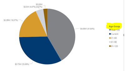
I have a pie chart showing invoice amounts by by age group Current, 31-60, 61-90, 91-20 and over 120. Unfortunately, on my visualization, those buckets are out of order. Is there a way I can fix this to show in order?
Thank you!
Solved! Go to Solution.
- Mark as New
- Bookmark
- Subscribe
- Mute
- Subscribe to RSS Feed
- Permalink
- Report Inappropriate Content
The easiest way would be to add a "1", "2", etc, to the labels.
But a neater way would would be to add a sort column. Here, you would add a new column next to each of the labels, such as Current being 1, and 31-60 being 2, etc. You can do that using SWITCH.
So the calculated column would be:
Sort column = SWITCH 'table name' [Age group], "Current","1",31-60","2", etc.
Then click on "Age group" field, and then click on sort by column, and then click on your new sort column. That should do it.
- Mark as New
- Bookmark
- Subscribe
- Mute
- Subscribe to RSS Feed
- Permalink
- Report Inappropriate Content
This seemed to do the trick. Thank you!
- Mark as New
- Bookmark
- Subscribe
- Mute
- Subscribe to RSS Feed
- Permalink
- Report Inappropriate Content
The easiest way would be to add a "1", "2", etc, to the labels.
But a neater way would would be to add a sort column. Here, you would add a new column next to each of the labels, such as Current being 1, and 31-60 being 2, etc. You can do that using SWITCH.
So the calculated column would be:
Sort column = SWITCH 'table name' [Age group], "Current","1",31-60","2", etc.
Then click on "Age group" field, and then click on sort by column, and then click on your new sort column. That should do it.


