This is best Fabric, Power BI, SQL and AI community event. How do we know? The last event sold out! Save €200 with code FABCMTY200.
Register nowJuly 28 - August 9 | Final Round of the Power BI Dataviz World Championships. This is your chance. Learn more
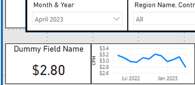
In the below scenario Month & Year is from a Date table joined on Date to my Fact table.
I need the measure from fact table to show only the selected month value on the left card (April 2023, working properly), but I also need the graphic to show all dates/months prior to and including April 2023.
Currently visual interactions are turned off with the graph, so I can't use any logic to isolate that April 2023 is currently selected to end the display date range. It needs to end with the selected date value for whatever month is selected.
If I turn on visual interactions it will break the range displayed and only show a single month.
Any clue how to get around this??
You need to use another, disconnected dates table for the x axis of your chart, and a measure for the value (returning BLANK() after the selected date)
Join us in Barcelona for FabCon and SQLCon, the Fabric, Power BI, SQL, and AI community event. Save €200 with code FABCMTY200.
If you love stickers, then you will definitely want to check out our community sticker challenge, Barcelona edition!
Check out the July 2026 Power BI update to learn about new features.