Join us at the 2025 Microsoft Fabric Community Conference
March 31 - April 2, 2025, in Las Vegas, Nevada. Use code MSCUST for a $150 discount! Early bird discount ends December 31.
Register Now- Power BI forums
- Get Help with Power BI
- Desktop
- Service
- Report Server
- Power Query
- Mobile Apps
- Developer
- DAX Commands and Tips
- Custom Visuals Development Discussion
- Health and Life Sciences
- Power BI Spanish forums
- Translated Spanish Desktop
- Training and Consulting
- Instructor Led Training
- Dashboard in a Day for Women, by Women
- Galleries
- Community Connections & How-To Videos
- COVID-19 Data Stories Gallery
- Themes Gallery
- Data Stories Gallery
- R Script Showcase
- Webinars and Video Gallery
- Quick Measures Gallery
- 2021 MSBizAppsSummit Gallery
- 2020 MSBizAppsSummit Gallery
- 2019 MSBizAppsSummit Gallery
- Events
- Ideas
- Custom Visuals Ideas
- Issues
- Issues
- Events
- Upcoming Events
Be one of the first to start using Fabric Databases. View on-demand sessions with database experts and the Microsoft product team to learn just how easy it is to get started. Watch now
- Power BI forums
- Forums
- Get Help with Power BI
- Custom Visuals Development Discussion
- Re: Custom visual made with Charticulator not resp...
- Subscribe to RSS Feed
- Mark Topic as New
- Mark Topic as Read
- Float this Topic for Current User
- Bookmark
- Subscribe
- Printer Friendly Page
- Mark as New
- Bookmark
- Subscribe
- Mute
- Subscribe to RSS Feed
- Permalink
- Report Inappropriate Content
Custom visual made with Charticulator not respecting scale
Hi,
I tried to create a custom visual via Charticulator.
It's a clustered and stacked column chart.
Do someone know why my visual is not respecting the scale please? Here only deep blue rectangles are resized:
You can find here my power BI example and my custom visual.
Thank you in advance
Regards,
Camille
Solved! Go to Solution.
- Mark as New
- Bookmark
- Subscribe
- Mute
- Subscribe to RSS Feed
- Permalink
- Report Inappropriate Content
Hi @Camicamomille,
At a glance, this sometimes happens when an object isn't snapped to a visual guide, however in order to investigate the issue, we'll need the raw file from Charticulator rather than the compiled Power BI custom visual. I did check the link in your OP but could only find the workbook and .pbiviz file.
If you're able to provide the .chart file, I can take a look. If you're not sure how to do this, please review the Download as Chart section of their doc.
Thanks,
Daniel
Did I answer your question? Mark my post as a solution!
Proud to be a Super User!
My course: Introduction to Developing Power BI Visuals
On how to ask a technical question, if you really want an answer (courtesy of SQLBI)
- Mark as New
- Bookmark
- Subscribe
- Mute
- Subscribe to RSS Feed
- Permalink
- Report Inappropriate Content
@dm-p Hi - I have the problem not wanting to make nested chart scalable, but when I exported the chart to power bi - the axes and scales option isn't available. Do you have any solutions to this ? The reason being is that I want the chart in fixed proportion and make the viz to be scrollable to the side when I minimiz it.
Thank you in advance.
- Mark as New
- Bookmark
- Subscribe
- Mute
- Subscribe to RSS Feed
- Permalink
- Report Inappropriate Content
Hi @Hystericred,
Currently Charticulator doesn't offer scrolling on any generated visuals and will fit them to the viewport. If this is something you want, I'd suggest creating an issue for it in their repository to see if they'll consider adding it as a feature.
Regards,
Daniel
Did I answer your question? Mark my post as a solution!
Proud to be a Super User!
My course: Introduction to Developing Power BI Visuals
On how to ask a technical question, if you really want an answer (courtesy of SQLBI)
- Mark as New
- Bookmark
- Subscribe
- Mute
- Subscribe to RSS Feed
- Permalink
- Report Inappropriate Content
Hi @dm-p,
I made an attempt but I need the data sets (forecast and actual) on the same Y-axis., please see link here: https://drive.google.com/open?id=1_-AtkI0RwzPCVYb7lf1w5oNCDlJaL6FQ.
I suspect that I need to make a nested chart but do not manage to get the desired result, and have found no tutorials online for making a nested chart. Do you have any smart thoughts? 🙂 Or any recommendations on tutorials to solve this issue? (I can´t access the nested chart in your example, it´s blank, so can´t learn anything from there unfortunately)
Thanks,
Helena
- Mark as New
- Bookmark
- Subscribe
- Mute
- Subscribe to RSS Feed
- Permalink
- Report Inappropriate Content
Hi @Anonymous,
There's indeed not many tutorials on Charticulator about, but as luck would have it, I published a blog post last week covering nested charts, which you might hopefully find useful. The scenario is for small multiples but still covers the concepts of nested charts in-general.
Nested charts have a bug when you first open them, they appear blank and you need to do something to the canvas to make the layout appear. I've got a small section in the above post that covers this, as it took me a while to figure out; I typically drag a guide or something similarly non-destructive and the nested chart will appear. If you do this with my example it will definitely work so you can have a look into it further 🙂
Regards,
Daniel
Did I answer your question? Mark my post as a solution!
Proud to be a Super User!
My course: Introduction to Developing Power BI Visuals
On how to ask a technical question, if you really want an answer (courtesy of SQLBI)
- Mark as New
- Bookmark
- Subscribe
- Mute
- Subscribe to RSS Feed
- Permalink
- Report Inappropriate Content
- Mark as New
- Bookmark
- Subscribe
- Mute
- Subscribe to RSS Feed
- Permalink
- Report Inappropriate Content
Hi @Camicamomille,
I need the same type of chart, did you manage to solve the issue? Is it possible that you can share the chart with me somehow so I can make use of it?
Thanks,
Helena
- Mark as New
- Bookmark
- Subscribe
- Mute
- Subscribe to RSS Feed
- Permalink
- Report Inappropriate Content
Hi Helena,
Sorry I did not manage to solve this issue...
Regards,
Camille
- Mark as New
- Bookmark
- Subscribe
- Mute
- Subscribe to RSS Feed
- Permalink
- Report Inappropriate Content
- Mark as New
- Bookmark
- Subscribe
- Mute
- Subscribe to RSS Feed
- Permalink
- Report Inappropriate Content
Helena,
The link to the visual is on my first post
Regards,
Camille
- Mark as New
- Bookmark
- Subscribe
- Mute
- Subscribe to RSS Feed
- Permalink
- Report Inappropriate Content
Hi @Camicamomille,
At a glance, this sometimes happens when an object isn't snapped to a visual guide, however in order to investigate the issue, we'll need the raw file from Charticulator rather than the compiled Power BI custom visual. I did check the link in your OP but could only find the workbook and .pbiviz file.
If you're able to provide the .chart file, I can take a look. If you're not sure how to do this, please review the Download as Chart section of their doc.
Thanks,
Daniel
Did I answer your question? Mark my post as a solution!
Proud to be a Super User!
My course: Introduction to Developing Power BI Visuals
On how to ask a technical question, if you really want an answer (courtesy of SQLBI)
- Mark as New
- Bookmark
- Subscribe
- Mute
- Subscribe to RSS Feed
- Permalink
- Report Inappropriate Content
Hi @Camicamomille & @Anonymous
I had a go at this, using an example on another thread. The generated viz does seem to scale as I'd expect when I resize in Power BI Desktop...
...so I'm hoping that @Camicamomille's version may be a placement issue w/guides as originally assumed. Still happy to take a look at this if you want to attach the .chart file as previously mentioned.
I've attached a copy of my workbook, generated custom visual, and the .chart file for you to load into Charticulator as a starting point, if you wish to have a go at working it to your particular situation. You'll find these just underneath this post's content below.
All the best,
Daniel
EDIT: Looks like .chart files are not allowed and broke my post. I've attached all 3 files in a .zip instead.
Did I answer your question? Mark my post as a solution!
Proud to be a Super User!
My course: Introduction to Developing Power BI Visuals
On how to ask a technical question, if you really want an answer (courtesy of SQLBI)
- Mark as New
- Bookmark
- Subscribe
- Mute
- Subscribe to RSS Feed
- Permalink
- Report Inappropriate Content
Hi again @dm-p
I followed your tutorial for nested chart and understand the nested part, however I do not get how I can create the kind of stacked column charts that are in your zip.file, which is what I´m after. I tried to solve it by just replacing the data that you have used with my, but unfortunately it never updates, it just says "Working" when I do that. So, my question is if you may have published a tutorial also for the chart in the zip.file so I can follwo the steps and create it myself from scratch? I did not manage to figure out the steps to do on my own unfortunately...
Thankful for any help!
/Helena
- Mark as New
- Bookmark
- Subscribe
- Mute
- Subscribe to RSS Feed
- Permalink
- Report Inappropriate Content
Hi @Anonymous
Unfortunately, no, I haven't written-up a tutorial on this one as they are quite time-intensive. As the chart has explicit grouping based on my sample data, it's likely that if your data contains different fields then the gropuing expressions aren't working and the tool just shows 'working'.
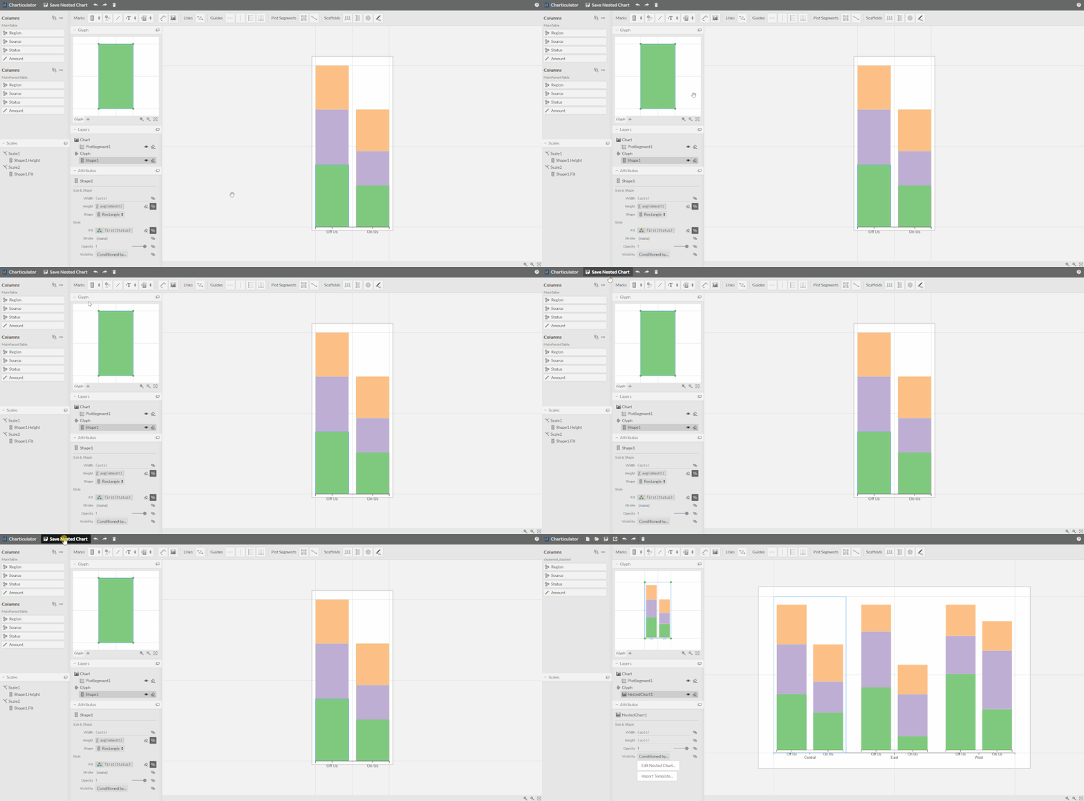
In terms of how I reproduced it with the same data I used (which you might be able to adapt for your data), here's the high-level process. I'm not going to spend time on formatting, just getting things where they need to be:
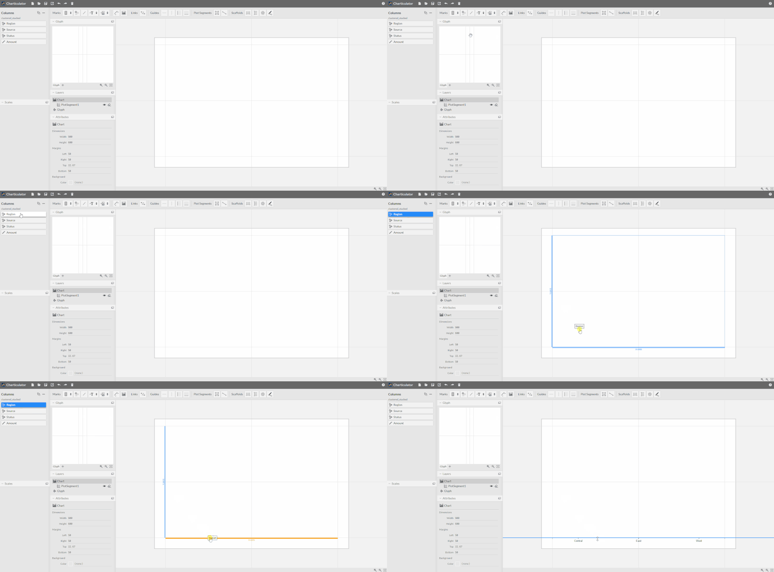
- Drag region to the visual's x-axis
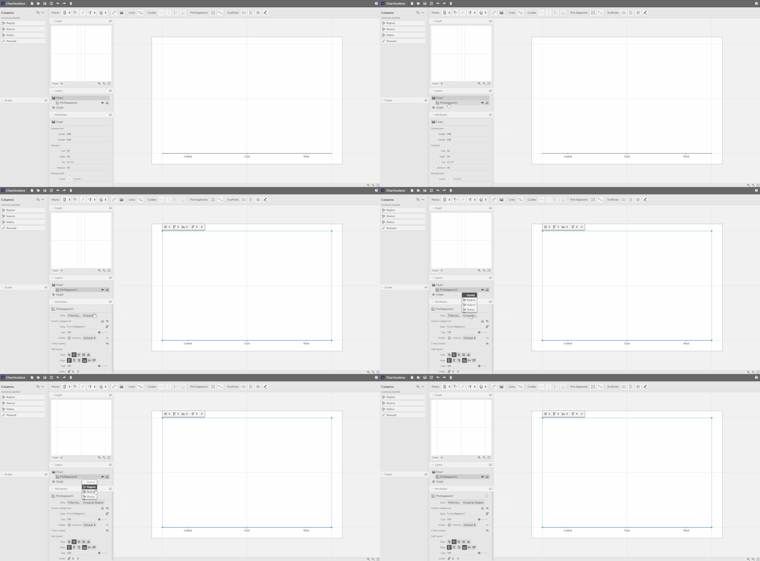
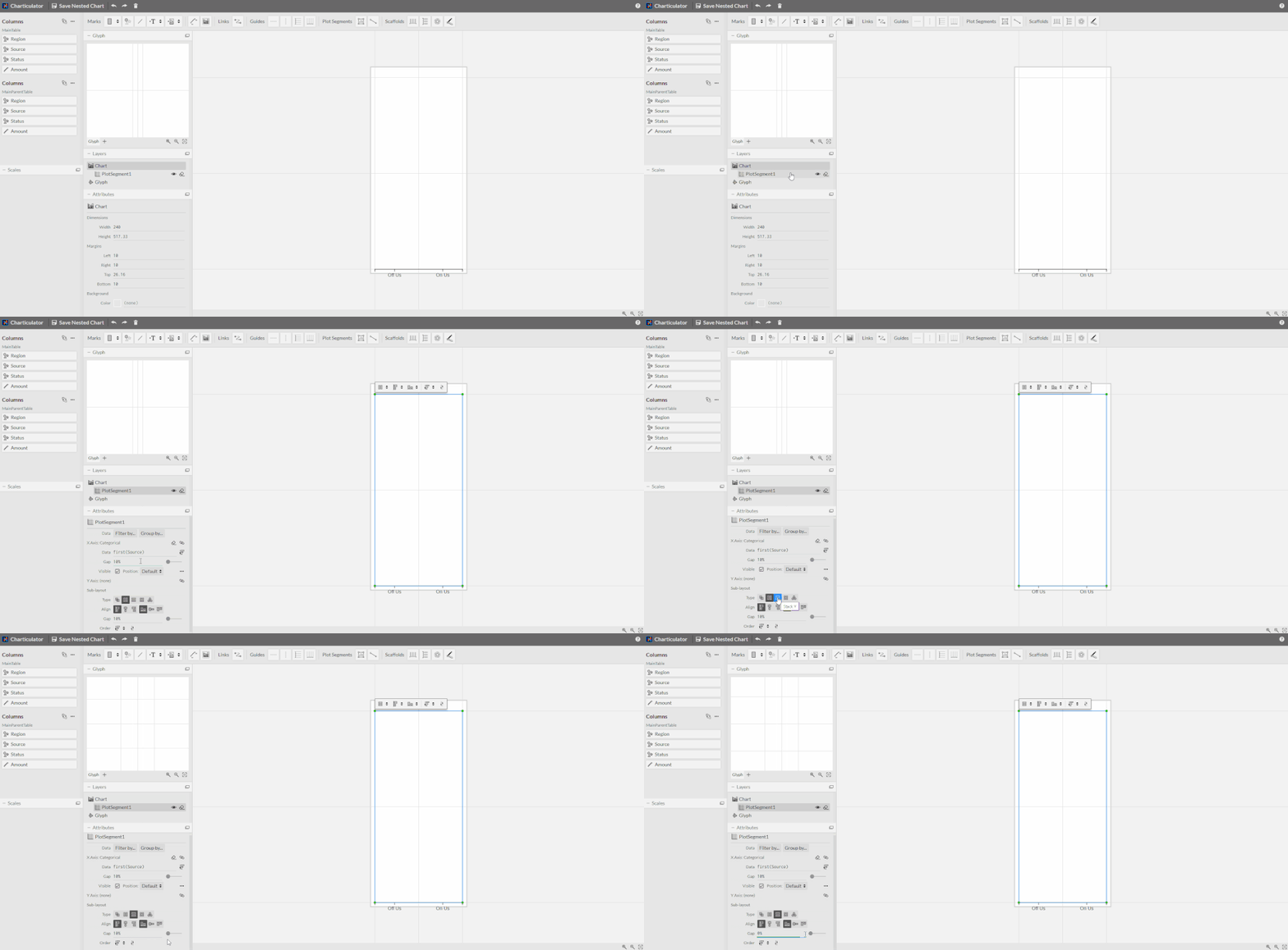
- Set the plot segment to group by region, so you get 3 glyphs on the canvas
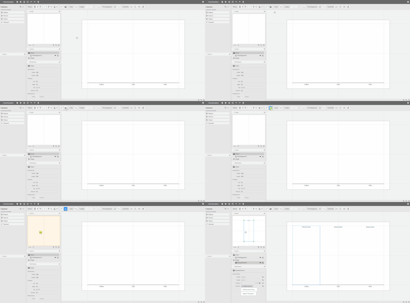
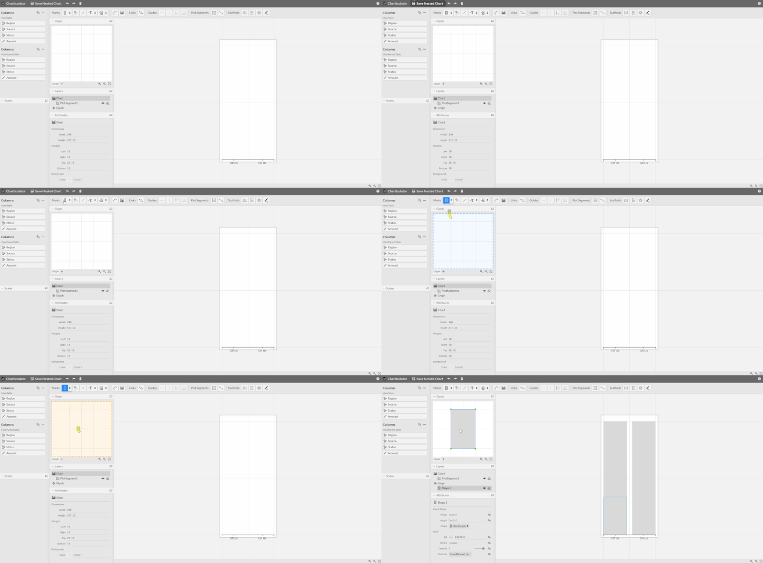
- Add a nested chart to the glyph
- Edit the nested chart
- In the nested chart:
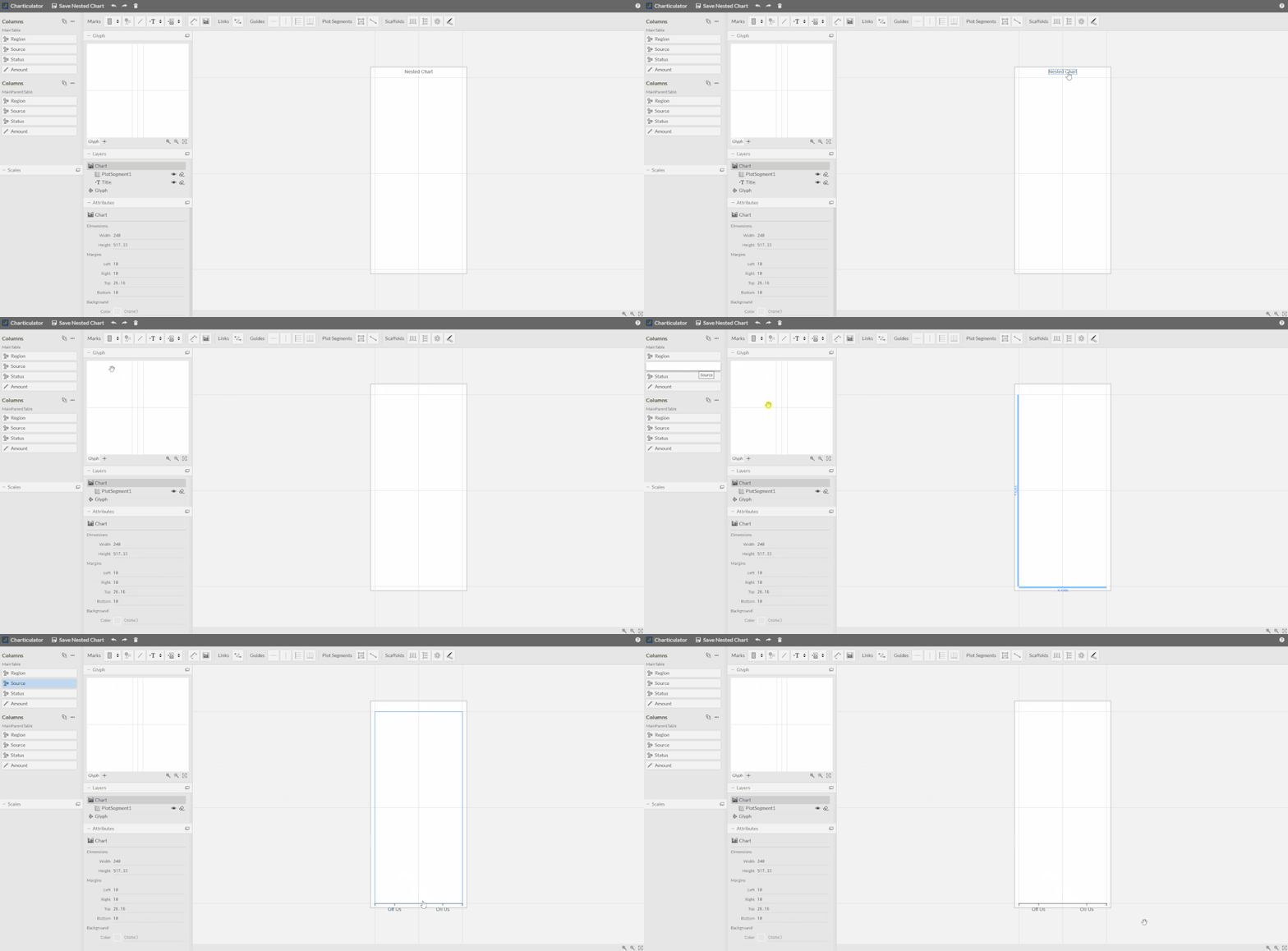
- Drag source to the visual's x-axis - this will group the glyphs within the nested chart
- Change the plot segment's layout to stack Y and reduce its gap to 0%
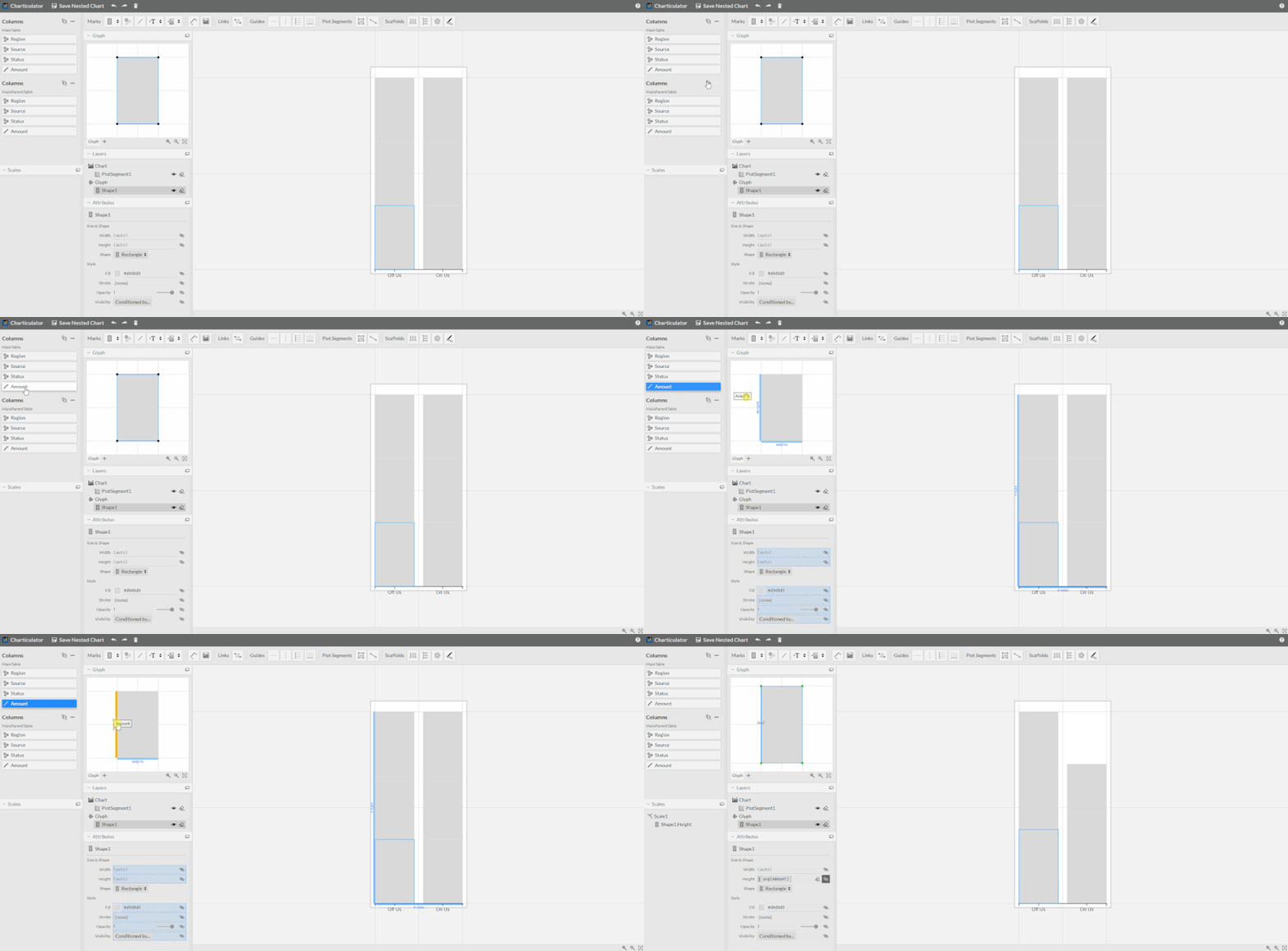
- Add a rectangle mark to the glyph
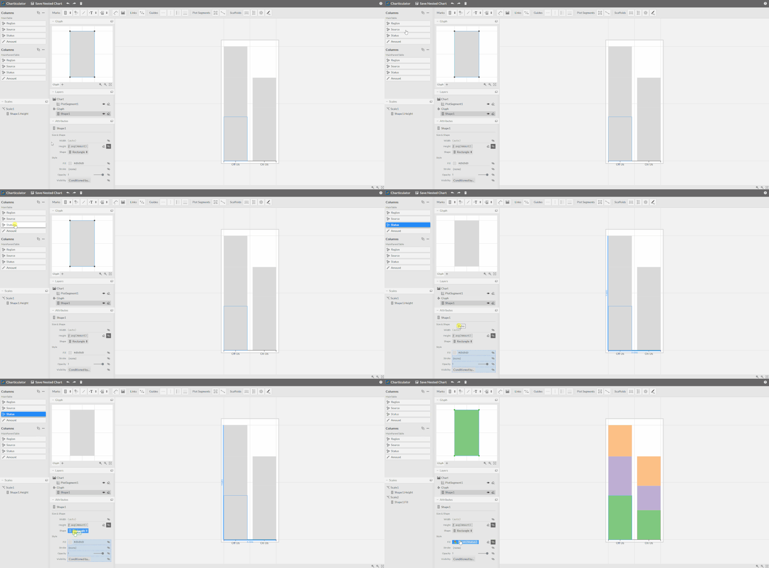
- Drag amount to the glyph height
- Drag status to the shape fill colour
- Drag source to the visual's x-axis - this will group the glyphs within the nested chart
- Save the nested chart and check the main chart - it should be as intended (in terms of layout)
After this point, you can clean-up the layout as needed. Hopefully this helps clarify how I put the original together.
Regards,
Daniel
Did I answer your question? Mark my post as a solution!
Proud to be a Super User!
My course: Introduction to Developing Power BI Visuals
On how to ask a technical question, if you really want an answer (courtesy of SQLBI)
- Mark as New
- Bookmark
- Subscribe
- Mute
- Subscribe to RSS Feed
- Permalink
- Report Inappropriate Content
Hi @dm-p
Many thanks for taking time to look into this and your support! Your chart works fine in Power BI for me.
A couple of questions:
-Is it possible to have the chart update in Power BI if the source data is updated with more categories? (e.g. we if we have 5 statuses in the Status-column instead of the current 3.) Or would that have to be adjusted for in Charticulator?
-I would also need to have different fill in the column pairs, is that posssible?
- Mark as New
- Bookmark
- Subscribe
- Mute
- Subscribe to RSS Feed
- Permalink
- Report Inappropriate Content
Hi @Anonymous, and glad you found it useful!
While additional statuses would theoretically work, I would always recommend revisiting the visual in charticulator for any changes to the underlying data. The visuals produced are essentially bespoke to each situation and are not a good 'one size fits all' solution. This is one of the reasons building marketplace custom visuals is so challenging, as it's difficult to consider the many permutations and combinations that makers might have 😉
I think your second requirement would be possible, but you'd have to get pretty specific with the nested chart. I currently don't have capacity to attempt this but I might approach this by setting up a glyph for one series and condition its visibility based on its value. I could then set specific status colours for that one, and I'd repeat with the second glyph for the other series.
Regards,
Daniel
Did I answer your question? Mark my post as a solution!
Proud to be a Super User!
My course: Introduction to Developing Power BI Visuals
On how to ask a technical question, if you really want an answer (courtesy of SQLBI)
- Mark as New
- Bookmark
- Subscribe
- Mute
- Subscribe to RSS Feed
- Permalink
- Report Inappropriate Content
- Mark as New
- Bookmark
- Subscribe
- Mute
- Subscribe to RSS Feed
- Permalink
- Report Inappropriate Content
Hi Camille,
It is unclear what is wrong in this case.
I see that it is respecting the scale but proportions is changed irrationally for some frame sizes.
Looks like it is rather their feature than a bug or may be there is some option to regulate this behavior.
Evgenii Elkin,
Software Engineer
Microsoft Power BI Custom Visuals
pbicvsupport@microsoft.com
Helpful resources

Join us at the Microsoft Fabric Community Conference
March 31 - April 2, 2025, in Las Vegas, Nevada. Use code MSCUST for a $150 discount!

Microsoft Fabric Community Conference 2025
Arun Ulag shares exciting details about the Microsoft Fabric Conference 2025, which will be held in Las Vegas, NV.

| User | Count |
|---|---|
| 4 | |
| 3 | |
| 1 | |
| 1 | |
| 1 |

