FabCon is coming to Atlanta
Join us at FabCon Atlanta from March 16 - 20, 2026, for the ultimate Fabric, Power BI, AI and SQL community-led event. Save $200 with code FABCOMM.
Register now!- Power BI forums
- Get Help with Power BI
- Desktop
- Service
- Report Server
- Power Query
- Mobile Apps
- Developer
- DAX Commands and Tips
- Custom Visuals Development Discussion
- Health and Life Sciences
- Power BI Spanish forums
- Translated Spanish Desktop
- Training and Consulting
- Instructor Led Training
- Dashboard in a Day for Women, by Women
- Galleries
- Data Stories Gallery
- Themes Gallery
- Contests Gallery
- QuickViz Gallery
- Quick Measures Gallery
- Visual Calculations Gallery
- Notebook Gallery
- Translytical Task Flow Gallery
- TMDL Gallery
- R Script Showcase
- Webinars and Video Gallery
- Ideas
- Custom Visuals Ideas (read-only)
- Issues
- Issues
- Events
- Upcoming Events
The Power BI Data Visualization World Championships is back! Get ahead of the game and start preparing now! Learn more
- Power BI forums
- Forums
- Get Help with Power BI
- Custom Visuals Development Discussion
- Re: Conditional formatting color on x-axis label
- Subscribe to RSS Feed
- Mark Topic as New
- Mark Topic as Read
- Float this Topic for Current User
- Bookmark
- Subscribe
- Printer Friendly Page
- Mark as New
- Bookmark
- Subscribe
- Mute
- Subscribe to RSS Feed
- Permalink
- Report Inappropriate Content
Conditional formatting color on x-axis label
Hi All,
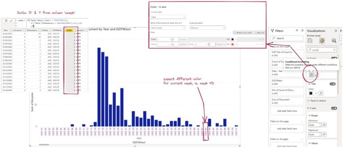
I'm working on bar chart with x-axis contain year & week arrangement. I want to apply some conditional formatting on x-axis label to give indication of particular week, ie. week 43 with different color against the rest. i have arrange additional column 'cweek' contain '0' and '1' to differentiate current week vs the rest.
However, when i apply conditional formatting, with any method, turns out all the color still same and no difference on current week. (gradient, rules, field value with column 'cweekcol'). Any idea how to work on conditional formatting or 1-0 condition cannot work here?
i prefer to apply coloring in the x axis label, not the data label, bar to ensure the color is there even when the data is zero (bar not shown).

conditional_formatting_color_xaxislabel
thanks in advance.
Solved! Go to Solution.
- Mark as New
- Bookmark
- Subscribe
- Mute
- Subscribe to RSS Feed
- Permalink
- Report Inappropriate Content
@Anonymous Hi!
There is no way you can do it, because in the axis of the chart, as in the title, you are not in the filter context, so it applies the same value to all the labels, he cannot understand the underlying value what you see.
BBF
- Mark as New
- Bookmark
- Subscribe
- Mute
- Subscribe to RSS Feed
- Permalink
- Report Inappropriate Content
Hi, @Anonymous!
I have exctally the same need that you, but the conditional formatting is not working as well. All the axis-label changed but don't how the filter was builded.
Do you find any solution to this?
Thank you very much!
- Mark as New
- Bookmark
- Subscribe
- Mute
- Subscribe to RSS Feed
- Permalink
- Report Inappropriate Content
Same problem any resolution 😞
Why there is a conditional formatting pane if this doesn't works with the filter context?
Mah!
- Mark as New
- Bookmark
- Subscribe
- Mute
- Subscribe to RSS Feed
- Permalink
- Report Inappropriate Content
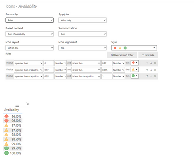
Please change the condition like below see if it works for you. Instead of percent use number
- Mark as New
- Bookmark
- Subscribe
- Mute
- Subscribe to RSS Feed
- Permalink
- Report Inappropriate Content
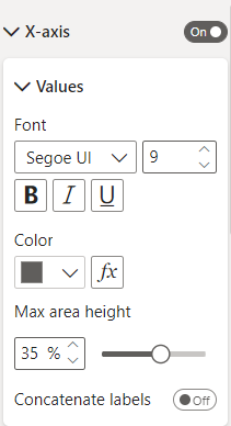
Is not the same FX option.
There isn't the icon field.
Thank you in any case.
- Mark as New
- Bookmark
- Subscribe
- Mute
- Subscribe to RSS Feed
- Permalink
- Report Inappropriate Content
@Anonymous Hi!
There is no way you can do it, because in the axis of the chart, as in the title, you are not in the filter context, so it applies the same value to all the labels, he cannot understand the underlying value what you see.
BBF
- Mark as New
- Bookmark
- Subscribe
- Mute
- Subscribe to RSS Feed
- Permalink
- Report Inappropriate Content
thanks for this explanation, ive been pulling my hair our trying to work out why my axis wasnt shows the correct colour, and from your explanation i realies that i was using another table to provide the X-axis therefore my condiditonal formatiing has no idea of the value of my calculation...
Helpful resources

Power BI Dataviz World Championships
The Power BI Data Visualization World Championships is back! Get ahead of the game and start preparing now!


