FabCon is coming to Atlanta
Join us at FabCon Atlanta from March 16 - 20, 2026, for the ultimate Fabric, Power BI, AI and SQL community-led event. Save $200 with code FABCOMM.
Register now!- Power BI forums
- Get Help with Power BI
- Desktop
- Service
- Report Server
- Power Query
- Mobile Apps
- Developer
- DAX Commands and Tips
- Custom Visuals Development Discussion
- Health and Life Sciences
- Power BI Spanish forums
- Translated Spanish Desktop
- Training and Consulting
- Instructor Led Training
- Dashboard in a Day for Women, by Women
- Galleries
- Data Stories Gallery
- Themes Gallery
- Contests Gallery
- QuickViz Gallery
- Quick Measures Gallery
- Visual Calculations Gallery
- Notebook Gallery
- Translytical Task Flow Gallery
- TMDL Gallery
- R Script Showcase
- Webinars and Video Gallery
- Ideas
- Custom Visuals Ideas (read-only)
- Issues
- Issues
- Events
- Upcoming Events
Learn from the best! Meet the four finalists headed to the FINALS of the Power BI Dataviz World Championships! Register now
- Power BI forums
- Forums
- Get Help with Power BI
- Custom Visuals Development Discussion
- Re: Conditional formatting based on changing value...
- Subscribe to RSS Feed
- Mark Topic as New
- Mark Topic as Read
- Float this Topic for Current User
- Bookmark
- Subscribe
- Printer Friendly Page
- Mark as New
- Bookmark
- Subscribe
- Mute
- Subscribe to RSS Feed
- Permalink
- Report Inappropriate Content
Conditional formatting based on changing values
Hello,
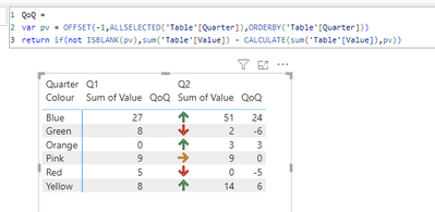
I've been asked to show a graphic in a report that has up and down arrows to show the change from quarter to quarter. I'm fairly new to PBI and have looked at lots of the replies online etc. but I can't get the to work as I think they should.
If I was working in Excel, I would use an IF Function, if this is > than that, Red.
The data I am working with is a specific count of something, there is no working out a percentage of a target number, it is either more than, or less than, the number in the previous month, an example below.
| Colour | Q1 | Q2 |
| Pink | 9 | 9 |
| Yellow | 8 | 14 |
| Blue | 27 | 51 |
| Green | 8 | 2 |
| Red | 5 | 0 |
| Orange | 0 | 3 |
Please can anyone help?
Many thanks,
Lozza
- Mark as New
- Bookmark
- Subscribe
- Mute
- Subscribe to RSS Feed
- Permalink
- Report Inappropriate Content
what would the expected outcome look like based on your sample data?
- Mark as New
- Bookmark
- Subscribe
- Mute
- Subscribe to RSS Feed
- Permalink
- Report Inappropriate Content
| Colour | Q1 | Q2 | |
| Pink | 9 | 9 | = |
| Yellow | 8 | 14 | up arrow |
| Blue | 27 | 51 | up arrow |
| Green | 8 | 2 | down arrow |
| Red | 5 | 0 | down arrow |
| Orange | 0 | 3 | up arrow |
Either up and down arrows and an equals sign, or a colour coded symbol (red for down, yellow for equals, green for up)?
Thank you for looking at this for me.
- Mark as New
- Bookmark
- Subscribe
- Mute
- Subscribe to RSS Feed
- Permalink
- Report Inappropriate Content
Helpful resources

Join our Fabric User Panel
Share feedback directly with Fabric product managers, participate in targeted research studies and influence the Fabric roadmap.

Power BI Monthly Update - February 2026
Check out the February 2026 Power BI update to learn about new features.


