FabCon is coming to Atlanta
Join us at FabCon Atlanta from March 16 - 20, 2026, for the ultimate Fabric, Power BI, AI and SQL community-led event. Save $200 with code FABCOMM.
Register now!- Power BI forums
- Get Help with Power BI
- Desktop
- Service
- Report Server
- Power Query
- Mobile Apps
- Developer
- DAX Commands and Tips
- Custom Visuals Development Discussion
- Health and Life Sciences
- Power BI Spanish forums
- Translated Spanish Desktop
- Training and Consulting
- Instructor Led Training
- Dashboard in a Day for Women, by Women
- Galleries
- Data Stories Gallery
- Themes Gallery
- Contests Gallery
- Quick Measures Gallery
- Notebook Gallery
- Translytical Task Flow Gallery
- TMDL Gallery
- R Script Showcase
- Webinars and Video Gallery
- Ideas
- Custom Visuals Ideas (read-only)
- Issues
- Issues
- Events
- Upcoming Events
To celebrate FabCon Vienna, we are offering 50% off select exams. Ends October 3rd. Request your discount now.
- Power BI forums
- PBI Archive (Private)
- Custom Visuals Community Blog
- The Ultimate Waterfall Chart
- Subscribe to RSS Feed
- Mark as New
- Mark as Read
- Bookmark
- Subscribe
- Printer Friendly Page
- Report Inappropriate Content
- Subscribe to RSS Feed
- Mark as New
- Mark as Read
- Bookmark
- Subscribe
- Printer Friendly Page
- Report Inappropriate Content
Hello Everybody!
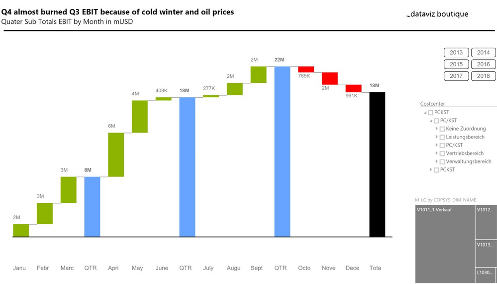
Let me introduce you today the Ultimate Waterfall Chart, a Custom Visual by Dataviz.boutique, soon available in the gallery. Let’s have a more detailed look on my first example I have prepared. Its not a final dashboard, it just has the charts or features on it I want to explain.
We are looking here at a vertical or so called calculation Waterfall Chart. The status bars represent base and result measures (e.g. sales and EBIT) whereas the contribution bars in between represent the increase or decrease of the measures. It is used for every category, except time series which I would like to explain in the second part of this post later. This vertical Waterfall is also grouped by years. So, it’s a so called small multiple chart.
One single chart is basically multiplied by another Dimension/Column. Since, for example, 1000 USD have is the same bar size/length in all charts. So, a visual comparison is possible -- we call that “same scaling”. The “Blue” bar is a manual added sub total sum. You can change also the color of these types of bars for special highlighting in case you would like to. You can basically change all colors of all bars in this visuals. The default colors follow also the IBCS Colors. Last but not least it is also possible to sort the charts inside the small multiples by the multiplied category.
Below you see an example of an horizontal Waterfall Chart which is used for Time Series only. We have here a single Chart (of course, small multiples are also possible) with three subtotals and the total value which each of them represents the year-to-date (YTD) value. This is the sum of 3 months for Quarter 1 in case and the sum of the first 9 month for Q3 YTD.
We are happy to get your feedback and suggestions for enhancements as well. These charts are following the rules of the International Business Communication Standards (IBCS®) http://www.ibcs-a.org/.
You must be a registered user to add a comment. If you've already registered, sign in. Otherwise, register and sign in.
- New Beta version of powerbi-visual-tools v3
- Announcing the deprecation of custom visual's API ...
- Power KPI 1.5.0 - cache issue
- Custom visuals developers - Promote your business ...
- Security Developer Guideline
- Visual API 1.7 is available
- Visual API 1.6 and Drill-down capability available
- Reminder: custom visuals moved to the Office store...
- New Power BI Custom Visual – PlayAxis
- The Ultimate Waterfall Chart
- poijposqj on: New Beta version of powerbi-visual-tools v3
- quycau on: Announcing the deprecation of custom visual's API ...
-
v-viig
 on:
Visual API 1.7 is available
- solarmovie on: Reminder: custom visuals moved to the Office store...
- Anonymous on: New Power BI Custom Visual – PlayAxis
- jorio on: The Ultimate Waterfall Chart
- Anonymous on: What I learnt building Power BI Custom Visuals
- Anonymous on: Welcome to the custom visuals community blog!


