New Offer! Become a Certified Fabric Data Engineer
Check your eligibility for this 50% exam voucher offer and join us for free live learning sessions to get prepared for Exam DP-700.
Get StartedJoin us at the 2025 Microsoft Fabric Community Conference. March 31 - April 2, Las Vegas, Nevada. Use code FABINSIDER for $400 discount. Register now
- Microsoft Fabric Community
- Fabric community blogs
- Power BI Community Blog
- Strategic decisions support through business drive...
- Subscribe to RSS Feed
- Mark as New
- Mark as Read
- Bookmark
- Subscribe
- Printer Friendly Page
- Report Inappropriate Content
- Subscribe to RSS Feed
- Mark as New
- Mark as Read
- Bookmark
- Subscribe
- Printer Friendly Page
- Report Inappropriate Content
Missed the introduction to this series? See Become your organization’s strategic advisor by using Machine Learning and Power BI
Having interviewed and worked with hundreds of business analysts and P&L owners, I am impressed by the capacity of human intuition. People who have been in role for more than a couple of years can often balance multiple complex considerations and quickly make a good decision. This frees up time for the employee. Unfortunately, this spare time is more often used to increase the frequency at which they look at the standard reports, rather than deep analysis to try and challenge their already impressive understanding of the business. A common problem with this is confirmation bias and existing misunderstandings of true drivers can persist or a change in underlying fundamental is overlooked. In the next couple of posts, I will share techniques that I have seen successfully employed to counter common heuristics and to increase the chance of continuous improvement.
Below is an example of a dataset similar to that of a retail chain which a regional store manager shared with me. The initial goal of that project was to change the main business report to update hourly instead of weekly. The store manager had made revenue growth and inventory management the top priorities a couple of years earlier; and believed it had been very successful. Hourly reports on what the stores were ordering was expected to lead to more accurate revenue predictions. The regional manager also wanted to be able to intervene in time if the implicit forecast was too low to meet all-up targets.
An initial look at the business revealed healthy revenue growth and low variations in weeks on hand. A basic analysis however also showed that discounts had increased in size, eroding profits. For descriptive analytics like this, I find it helpful to create a couple of views with one KPI at a time, e.g. marginal profit or revenue and display it for every relevant business hierarchy. For instance, product hierarchy, geography and time. While that is an effective way to show how the business is doing it does little to explain why. For that it tends to be more effective to show correlated KPIs for the same dimension, e.g. revenue vs. profit by store over time.
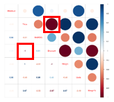
As a second step, I therefore frequently add a correlation plot. In addition to being simple to understand correlation plots are quick and easy to do. High correlation between two variables means that they move in the same direction, at the same rate. Because it is a relative measure there is rarely a need for normalization. Below is an R correlation plot in Power BI, showing a couple of months’ worth of data from the stores.
The blue to red column to the far right is the legend indicating whether two variables are strongly correlated (dark blue), have no correlation (white), or are inversely correlated (dark red). Large circles in a dark color are thus strongly correlated while small, lightly colored circles indicate weak correlation. The circles appear in the upper-right triangle in the matrix, and their corresponding correlation coefficient appear in the lower-left. For instance, price and discount have a perfect negative correlation.
The visual representation of this can be found on the row “Price” (second row) in the “Discount” column (fourth column). The numeric correlation coefficient is in the “Price” column (2nd) on the “Discount” row (4th).
When we analyze the data using this visual a couple of things pop-out. Revenue and price have low negative correlation, i.e. a decrease in price will typically coincide with an increase in revenue. Revenue and inventory are strongly correlated so days that the stores carry a lot of inventory tend to coincide with high revenue. The key insight for the regional manager however was the -0.51 correlation between price and inventory. Before seeing this correlation plot the regional manager was unaware that the stores had, in response to stronger focus on inventory management, begun managing inventory primarily by changing the price. This was an unintended consequence of the directive which had been issued to improve store managers focus on accurate forecasting. Instead, the store managers had found an inventive way to achieve the same goal using price, thus hurting contribution margins and decreasing customer satisfaction. When the store managers found themselves carrying too much inventory they would simply run a large discount. Conversely when they were running low they would increase prices. By only comparing revenue and inventory this behavior had gone unnoticed by the leadership team.
Using correlation plots for business analytics
You have probably heard that correlation does not equal causation. That is misleading since two things happening at the same time often have a cause and effect relationship but it is important to remember alternative explanations. Let us say that for your business daily revenue for product A and B shows high correlation, e.g. 0.75. So 75% of the changes in revenue for A is captured in the changes for B. That does not necessarily mean that people who buy A has more value from B. Alternative explanations could be:
- Buyers of B have more value from A,
- Products A and B have similar seasonality (maybe they are both more popular on warm days),
- Promotions for A has by chance coincided with promotions for B, etc.
In other words, high correlation might be a coincidence (unlikely with a large enough set of data), might be because one causes the other, or because there is something else which affects both, e.g. product C. Typically the direction of the interaction is known or someone familiar with the business has a strong hypothesis. If not, a common second step is to investigate a difference in timing. If for instance marketing investments happen on average 3 days before you observe an increase in revenue you can be sure that revenue does not drive marketing, but that it is the other way around.
So, while correlation does not in itself prove causation, running a correlation analysis helps you validate your understanding of a business and tells you where to focus next. I typically let the correlations that might be interesting determine which different KPIs I show together for only a few business dimensions to let the data tell the story. In this case inventory by store and product was paired with average price to help the regional manager drive a change in behavior.
How to recreate the report
R visuals will automatically work in Power BI when the report is published to the service but to get them to work in Power BI Desktop you need to have R installed on your computer. R, a third-party program, can be downloaded from CRAN. Once installed, in Power BI Desktop go to File -> Options and settings -> Options -> R Scripting and validate that the R home directory path is the same as what you used to install the base. Please use this link for detailed instructions. You may also want an R dedicated script editor, e.g. RStudio (the Windows installation file is the first link under “Installers for Supported Platforms”.
Once you have R installed you can use R visuals just as you would use any other native visual in Power BI with the addition of an R script that you paste in the editor. An example file is attached to this post.
To create the correlation plot R visual:
- Open a pbix file with the relevant data, e.g. my attached example file and click on the + sign in the bottom row to create a new page.
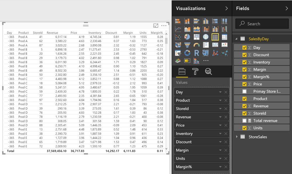
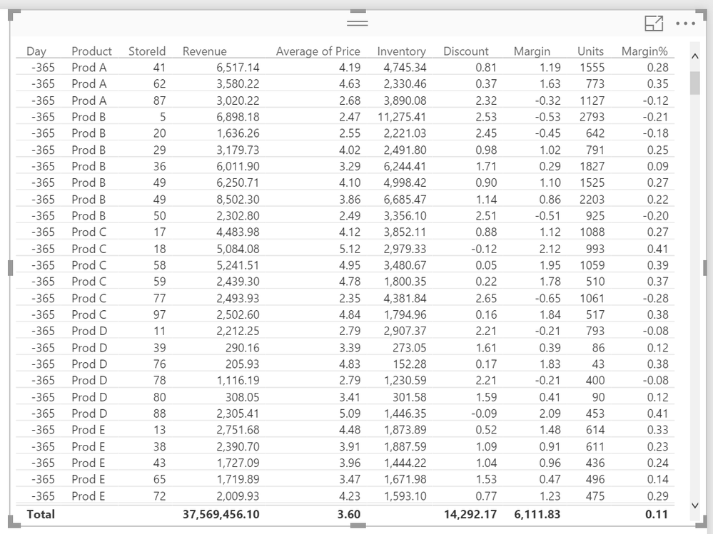
- Because an R visual will not display anything until you have added a script, I start by adding a simple standard visual like a table that I add the columns that I want to analyze to. This is achieved by clicking on the desired visual under “Visualizations” and then selecting the columns of interest from the far-right menu.
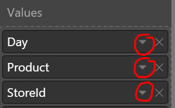
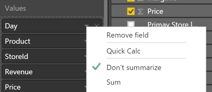
- Correlations are calculated row by row so getting the granularity right is important. In this case I want to understand if a change in inventory for a particular day, product and store is correlated with the average price. To make this level of detail explicit I first added the three columns [Day], [Product] and [StoreId] to the table and for each verified that the aggregation option “Don’t summarize” was used.
- Similarly, I selected “Sum” for all the other columns except Price where I used “Average”.
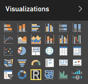
- Once I’m happy with the data input (this will be the raw data that R receives) I convert the visual to an R visual by selecting the visual in the canvas and then clicking on the R visualization icon
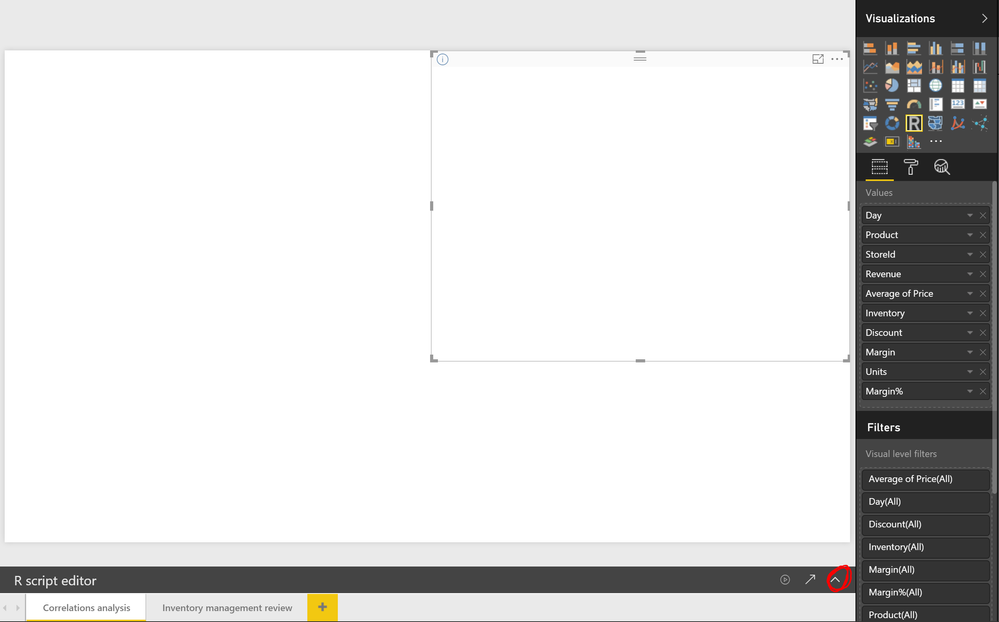
- Add the script using the R script* editor (visible when you select the R visual directly in the canvas). Note, you may have to expand it by clicking on the far-right arrow in the R script editor menu below the canvas.
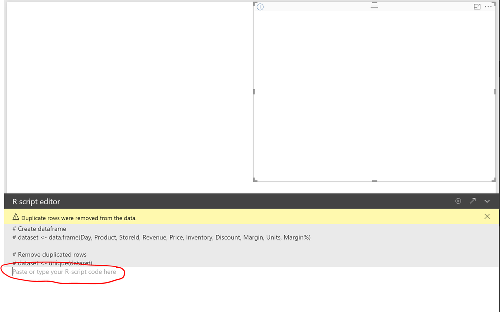
- Once expanded you should see the below, with space for the R script.
Copy/paste the script below into the script editor (any line that starts with # or ## is a comment only and is not executed):## Use the corrplot library for the cor() function which calculates correlations and has the corrplot() function to visualize the output library(corrplot) ## Get rid of the first three columns in dataset since they, in this example, contain categorical values dataset <- dataset[,-1:-3] ## Calculate correlations between the remaining columns m <- cor(dataset) ## Plot the result with a light gray background color corrplot.mixed(m, bg="light gray")
- Use the first arrow in the R script editor to manually execute the script (any change/interaction with the report will also cause the script to be rerun.
To recreate this visual for your own data the steps will be almost identical. It is important however to remember to get the granularity right. If you don’t need to do any aggregation you would skip in this case the first three columns [Day], [Product] and [StoreId], set all of the other fields to “Don’t summarize” and delete the line of code that excludes the first three columns from the calculation, namely “dataset <- dataset[,-1:-3]” and its preceding comment, i.e. so that the script looks like:
## Use the corrplot library for the cor() function which calculates correlations and has the corrplot() function to visualize the output
library(corrplot)
## Calculate correlations between the remaining columns
m <- cor(dataset)
## Plot the result with a light gray background color
corrplot.mixed(m, bg="light gray")
Links and downloads
Understanding the correlation coefficient: https://en.wikipedia.org/wiki/Pearson_product-moment_correlation_coefficient
Example of correlation plot in the R showcase: http://community.powerbi.com/t5/R-Script-Showcase/Correlation-Plot/m-p/58462
Additional R installation instructions for Power BI: http://powerbi.tips/2016/09/using-r-visuals-in-power-bi/
* Third-party programs. This software enables you to obtain software applications from other sources. Those applications are offered and distributed by third parties under their own license terms. Microsoft is not developing, distributing or licensing those applications to you, but instead, as a convenience, enables you to use this software to obtain those applications directly from the application providers.
By using the software, you acknowledge and agree that you are obtaining the applications directly from the third-party providers and under separate license terms, and that it is your responsibility to locate, understand and comply with those license terms. Microsoft grants you no license rights for third-party software or applications that is obtained using this software.
You must be a registered user to add a comment. If you've already registered, sign in. Otherwise, register and sign in.
- Understanding TMDL in Power BI: A Game-Changer for...
- 🏆 Power BI DataViz World Championships | Week 1 F...
- 🏆 Power BI DataViz World Championships | Week 1 W...
- 🏆 Power BI DataViz Campeonato mundial! Semana 1!
- Fabric Capacity Scaling and Power BI - What happen...
- 🏆 Power BI DataViz World Championships | ¡La sema...
- 🏆 Power BI DataViz World Championships | Week 2 C...
- How to Use Multi-Cursor in Power BI TMDL View
- 🏆 Power BI DataViz World Championships | Meet the...
- Securing Data using Sensitivity Labels in Power BI
-
 Pragati11
on:
🏆 Power BI DataViz World Championships | Week 1 W...
-
 slindsay
on:
🏆 Power BI DataViz World Championships | Week 2 C...
-
 slindsay
on:
🏆 Power BI Data Visualization World Championships...
-
 slindsay
on:
🏆 Power BI DataViz World Championships | Week 1 C...
- Jalə on: Developing an Azerbaijan Shape Map
- ccarawan_1 on: Frequently Asked Questions | Power BI DataViz Worl...
- LYPowerBI on: Using Variables While Creating Custom Columns in P...
- cravity-hub on: Embedding Power BI Report in Web Pages
-
Poweraegg
 on:
Connecting Fact Tables in Microsoft Fabric: A Brid...
-
 PradipVS
on:
Power BI - Powered by Copilot
-
How to
647 -
Tips & Tricks
616 -
Events
121 -
Support insights
121 -
Opinion
80 -
DAX
66 -
Power BI
65 -
Power Query
62 -
Power BI Dev Camp
45 -
Power BI Desktop
40 -
Roundup
37 -
Power BI Embedded
20 -
Time Intelligence
19 -
Tips&Tricks
18 -
Featured User Group Leader
15 -
PowerBI REST API
12 -
Dataflow
9 -
Power BI Service
8 -
Power Query Tips & Tricks
8 -
finance
8 -
Data Protection
7 -
Direct Query
7 -
Power BI REST API
6 -
Auto ML
6 -
financial reporting
6 -
Data Analysis
6 -
Power Automate
6 -
Data Visualization
6 -
Python
6 -
powerbi
5 -
service
5 -
Power BI PowerShell
5 -
Machine Learning
5 -
Income Statement
5 -
Dax studio
5 -
Paginated Reports
4 -
External tool
4 -
Power BI Goals
4 -
PowerShell
4 -
Desktop
4 -
Bookmarks
4 -
Line chart
4 -
Group By
4 -
community
4 -
RLS
4 -
M language
4 -
R script
3 -
Aggregation
3 -
calendar
3 -
Gateways
3 -
R
3 -
M Query
3 -
Webinar
3 -
CALCULATE
3 -
R visual
3 -
Reports
3 -
PowerApps
3 -
Data Science
3 -
Azure
3 -
Data model
3 -
Conditional Formatting
3 -
Visualisation
3 -
Administration
3 -
M code
3 -
Visuals
3 -
SQL Server 2017 Express Edition
3 -
Row and column conversion
2 -
Python script
2 -
Nulls
2 -
DVW Analytics
2 -
parameter
2 -
Industrial App Store
2 -
Week
2 -
Date duration
2 -
Formatting
2 -
Weekday Calendar
2 -
Support insights.
2 -
construct list
2 -
slicers
2 -
SAP
2 -
Power Platform
2 -
Workday
2 -
external tools
2 -
index
2 -
RANKX
2 -
PBI Desktop
2 -
Date Dimension
2 -
Integer
2 -
Visualization
2 -
Power BI Challenge
2 -
Query Parameter
2 -
Date
2 -
SharePoint
2 -
Power BI Installation and Updates
2 -
How Things Work
2 -
Tabular Editor
2 -
rank
2 -
ladataweb
2 -
Troubleshooting
2 -
Date DIFF
2 -
Transform data
2 -
Tips and Tricks
2 -
Incremental Refresh
2 -
Number Ranges
2 -
Query Plans
2 -
Power BI & Power Apps
2 -
Random numbers
2 -
Day of the Week
2 -
Custom Visual
2 -
VLOOKUP
2 -
pivot
2 -
calculated column
2 -
M
2 -
hierarchies
2 -
Power BI Anniversary
2 -
Language M
2 -
inexact
2 -
Date Comparison
2 -
Power BI Premium Per user
2 -
Forecasting
2 -
REST API
2 -
Editor
2 -
Split
2 -
Life Sciences
2 -
measure
2 -
Microsoft-flow
2 -
Paginated Report Builder
2 -
Working with Non Standatd Periods
2 -
powerbi.tips
2 -
Custom function
2 -
Reverse
2 -
PUG
2 -
Custom Measures
2 -
Filtering
2 -
Table
1 -
Natural Query Language
1 -
Infographic
1 -
automation
1 -
Prediction
1 -
newworkspacepowerbi
1 -
Performance KPIs
1 -
HR Analytics
1 -
keepfilters
1 -
Connect Data
1 -
Financial Year
1 -
Schneider
1 -
dynamically delete records
1 -
Copy Measures
1 -
Friday
1 -
Q&A
1 -
Event
1 -
Custom Visuals
1 -
Free vs Pro
1 -
Format
1 -
Active Employee
1 -
Custom Date Range on Date Slicer
1 -
refresh error
1 -
PAS
1 -
certain duration
1 -
DA-100
1 -
bulk renaming of columns
1 -
Single Date Picker
1 -
Monday
1 -
PCS
1 -
Saturday
1 -
update
1 -
Slicer
1 -
Visual
1 -
forecast
1 -
Regression
1 -
CICD
1 -
Current Employees
1 -
date hierarchy
1 -
relationship
1 -
SIEMENS
1 -
Multiple Currency
1 -
Power BI Premium
1 -
On-premises data gateway
1 -
Binary
1 -
Power BI Connector for SAP
1 -
Sunday
1 -
Training
1 -
Announcement
1 -
Features
1 -
domain
1 -
pbiviz
1 -
sport statistics
1 -
Intelligent Plant
1 -
Circular dependency
1 -
GE
1 -
Exchange rate
1 -
Dendrogram
1 -
range of values
1 -
activity log
1 -
Decimal
1 -
Charticulator Challenge
1 -
Field parameters
1 -
deployment
1 -
ssrs traffic light indicators
1 -
SQL
1 -
trick
1 -
Scripts
1 -
Color Map
1 -
Industrial
1 -
Weekday
1 -
Working Date
1 -
Space Issue
1 -
Emerson
1 -
Date Table
1 -
Cluster Analysis
1 -
Stacked Area Chart
1 -
union tables
1 -
Number
1 -
Start of Week
1 -
Tips& Tricks
1 -
Workspace
1 -
Theme Colours
1 -
Text
1 -
Flow
1 -
Publish to Web
1 -
Extract
1 -
Topper Color On Map
1 -
Historians
1 -
context transition
1 -
Custom textbox
1 -
OPC
1 -
Zabbix
1 -
Label: DAX
1 -
Business Analysis
1 -
Supporting Insight
1 -
rank value
1 -
Synapse
1 -
End of Week
1 -
Tips&Trick
1 -
Showcase
1 -
custom connector
1 -
Waterfall Chart
1 -
Power BI On-Premise Data Gateway
1 -
patch
1 -
Top Category Color
1 -
A&E data
1 -
Previous Order
1 -
Substring
1 -
Wonderware
1 -
Power M
1 -
Format DAX
1 -
Custom functions
1 -
accumulative
1 -
DAX&Power Query
1 -
Premium Per User
1 -
GENERATESERIES
1 -
Report Server
1 -
Audit Logs
1 -
analytics pane
1 -
step by step
1 -
Top Brand Color on Map
1 -
Tutorial
1 -
Previous Date
1 -
XMLA End point
1 -
color reference
1 -
Date Time
1 -
Marker
1 -
Lineage
1 -
CSV file
1 -
conditional accumulative
1 -
Matrix Subtotal
1 -
Check
1 -
null value
1 -
Excel
1 -
Cumulative Totals
1 -
Report Theme
1 -
Bookmarking
1 -
oracle
1 -
mahak
1 -
pandas
1 -
Networkdays
1 -
Button
1 -
Dataset list
1 -
Keyboard Shortcuts
1 -
Fill Function
1 -
LOOKUPVALUE()
1 -
Tips &Tricks
1 -
Plotly package
1 -
Healthcare
1 -
Sameperiodlastyear
1 -
Office Theme
1 -
matrix
1 -
bar chart
1 -
Measures
1 -
powerbi argentina
1 -
Canvas Apps
1 -
total
1 -
Filter context
1 -
Difference between two dates
1 -
get data
1 -
OSI
1 -
Query format convert
1 -
ETL
1 -
Json files
1 -
Merge Rows
1 -
CONCATENATEX()
1 -
take over Datasets;
1 -
Networkdays.Intl
1 -
refresh M language Python script Support Insights
1 -
Governance
1 -
Fun
1 -
Power BI gateway
1 -
gateway
1 -
Elementary
1 -
Custom filters
1 -
Vertipaq Analyzer
1 -
powerbi cordoba
1 -
Model Driven Apps
1 -
REMOVEFILTERS
1 -
XMLA endpoint
1 -
translations
1 -
OSI pi
1 -
Parquet
1 -
Change rows to columns
1 -
remove spaces
1 -
Get row and column totals
1 -
Retail
1 -
Power BI Report Server
1 -
School
1 -
Cost-Benefit Analysis
1 -
DIisconnected Tables
1 -
Sandbox
1 -
Honeywell
1 -
Combine queries
1 -
X axis at different granularity
1 -
ADLS
1 -
Primary Key
1 -
Microsoft 365 usage analytics data
1 -
Randomly filter
1 -
Week of the Day
1 -
Azure AAD
1 -
query
1 -
Dynamic Visuals
1 -
KPI
1 -
Intro
1 -
Icons
1 -
ISV
1 -
Ties
1 -
unpivot
1 -
Practice Model
1 -
Continuous streak
1 -
ProcessVue
1 -
Create function
1 -
Table.Schema
1 -
Acknowledging
1 -
Postman
1 -
Text.ContainsAny
1 -
Power BI Show
1 -
Get latest sign-in data for each user
1 -
API
1 -
Kingsley
1 -
Merge
1 -
variable
1 -
Issues
1 -
function
1 -
stacked column chart
1 -
ho
1 -
ABB
1 -
KNN algorithm
1 -
List.Zip
1 -
optimization
1 -
Artificial Intelligence
1 -
Map Visual
1 -
Text.ContainsAll
1 -
Tuesday
1 -
help
1 -
group
1 -
Scorecard
1 -
Json
1 -
Tops
1 -
financial reporting hierarchies RLS
1 -
Featured Data Stories
1 -
MQTT
1 -
Custom Periods
1 -
Partial group
1 -
Reduce Size
1 -
FBL3N
1 -
Wednesday
1 -
Power Pivot
1 -
Quick Tips
1 -
data
1 -
PBIRS
1 -
Usage Metrics in Power BI
1 -
Multivalued column
1 -
Pipeline
1 -
Path
1 -
Yokogawa
1 -
Dynamic calculation
1 -
Data Wrangling
1 -
native folded query
1 -
transform table
1 -
UX
1 -
Cell content
1 -
General Ledger
1 -
Thursday
1

