FabCon is coming to Atlanta
Join us at FabCon Atlanta from March 16 - 20, 2026, for the ultimate Fabric, Power BI, AI and SQL community-led event. Save $200 with code FABCOMM.
Register now!Special holiday offer! You and a friend can attend FabCon with a BOGO code. Supplies are limited. Register now.
- Microsoft Fabric Community
- Fabric community blogs
- Power BI Community Blog
- Revenue and forecasting
- Subscribe to RSS Feed
- Mark as New
- Mark as Read
- Bookmark
- Subscribe
- Printer Friendly Page
- Report Inappropriate Content
- Subscribe to RSS Feed
- Mark as New
- Mark as Read
- Bookmark
- Subscribe
- Printer Friendly Page
- Report Inappropriate Content
Missed the previous parts of this series? See Become your organization’s strategic advisor by using Machine Learning and Power BI
Forecasting is an important part of most management positions. Knowing how many products will sell where and when, informs resource decisions like staffing and inventory. It is also an intuitive way to compare performance between different business units, product categories etc. For P&L owners it is an essential tool to proactively manage their margin by adapting investment levels.
Building on the previous post the first forecasting technique that we will explore will be a time series projection. Like the decomposition that we looked at in the previous post it can be conceptually understood as extrapolating and summing the seasonality and trend vectors. Not unexpectedly, these types of forecasts perform well for businesses with persistent trends and seasonality. Unlike a regression model which can take planned changes into account these types of models only considers the past. In a later post we will look at alternative forecasting models if a large change is planned for the business.
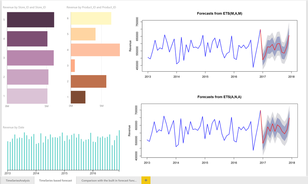
A popular technique for time series based forecasting is exponential smoothing, and the built-in forecasting function in Power BI uses an implementation of this algorithm. Here we will use it to predict revenue and quantity for our sample data. Below is an example that I created by duplicating the page from my last post and changing the scripts of the R visuals to forecast one year forward using first a multiplicative Holt-Winters model and secondly an exponential smoothing with additive seasonality.
These charts were all made with a categorical column and the sum of revenue. The time-series forecasts were made with an R-visuals using the below script.
In the two R visuals with the forecasts the blue line is the actual values to date, the red line is the mean of the predicted values and the shaded areas represents the 75 and 95% confidence intervals respectively. As you can see the shaded areas are in both cases large. This is indicative of limited forecast accuracy, i.e. there is not that much explanatory power in the historic revenue numbers alone. For this dataset, this is because of multiple historic deliberate experimentations. In a later post, we will explore alternative forecasting models that improve the prediction accuracy by taking such factors into account.
Using the report
For this report to work in Power BI Desktop you need the package forecast installed. If you have not previously used this package on your computer, install it by going to your R console in R Studio or other R GUI and type install.packages("forecast") and hit the Enter key.
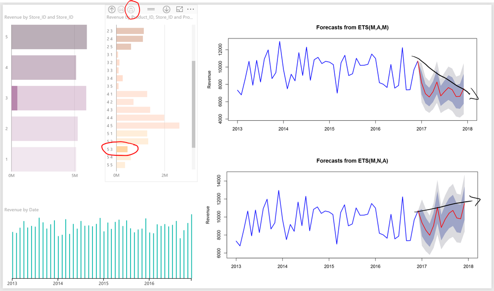
By clicking on and drilling into the different stores and products we can switch between forecasting a single store, product or using the drill-down arrow for a combination of both, e.g. Product 5 and store 3: a combination where the two methodologies suggest disparate trends and high uncertainty.
Just as with the decomposition in the previous post a time series based forecast is non-additive, e.g. the sum of forecasts for the individual products is unlikely to exactly match the forecast for the business all-up, due to the Law of large numbers cancelling out some noise when the products are first summed. For that reason, a dynamic setup like Power BI is a great advantage, offering the ability to quickly click through the different business areas, product classes, geographies and automatically getting a forecast for each, as well as the more accurate aggregates for any underlying combination. This works because the basic Power BI functionality filters the underlying data model, only sending the R script the data that has been selected. The R script then recalculates the new subset, updating the forecast. This will also happen when you filter on time, by limiting how much history the script can analyze. That can be desirable, e.g. to filter out a year with large anomalies but it can just as well decrease accuracy by limiting the available data too much.
An accurate forecast for each part of the business can inform resource allocation decisions, how much inventory to carry as well as serve as a leading indicator of a growing business opportunity or risk.
Recreating the report
R visuals will automatically work in Power BI when the report is published to the service, where the most common packages have already been installed, but to get them to work in Power BI Desktop you need a local R installation (please see my previous post for installation instructions).
To build this report I duplicated the page “TimeSeriesAnalysis” by right-clicking on the page tab and selecting “Duplicate Page”. I then rearranged the visuals and changed the R script* to:
## Load the library "forecast" to gain access to the exponential smoothing function ets()

## If you have not installed this package you will get an error message saying that the library was not found. In that case install it by typing: install.packages("forecast") directly in your R Console.

require(forecast)

## Convert the column "Revenue" in the Power BI input "dataset" into a time series object with the right periodicity (12 for months per year)

## as.numeric(substr(dataset[1,'Date'],0,4)) returns 2013, the first year in the dataset which helps the user understand the time scale

myts <- ts(dataset[,'Revenue'], start = as.numeric(substr(dataset[1,'Date'],0,4)), frequency= 12)

## Create the ets model with the right parameters, type ?ets in your R console after loading the forecast library for details

myets <- ets(myts, "ZZA")

## The second argument in the function forecast() defines how many values you want to forecast. Since this is monthly data 12 is a whole year ahead

## Level determines which confidence intervals to plot, c(75,95) sets them to 75% and 95%.

myprediction <- forecast(myets, 12, level = c(75,95))

## Find the last row with actual values (to know which color to use for the plot)

lastValue = tail(myprediction$x,1)

## Get the mean value for all future fitted dates

myprediction$mean=ts(c(lastValue,myprediction$mean),
               	frequency = frequency(myprediction$mean),
                     	end=end(myprediction$mean))

## Populate the upper values for all future fitted dates

myprediction$upper=ts(rbind(c(lastValue,lastValue),myprediction$upper),
                      	frequency = frequency(myprediction$upper),
                      	end=end(myprediction$upper))

## And the same for the the lower range values for all future fitted dates

myprediction$lower=ts(rbind(c(lastValue,lastValue),myprediction$lower),
                      	frequency = frequency(myprediction$lower),
                      	end=end(myprediction$lower))

## Plot the results with historical values in blue and future values in red with shaded confidence intervals

plot(myprediction, lwd=2, col="blue", fcol="red", flwd=2, shaded=TRUE, col.sub = "gray50", cex.sub=0.75, xlab = "", ylab = "Revenue")
The ets implementation is documented here. The "myets" model parameter can be changed, e.g. to “MAM” for a multiplicative Holt-Winters model, “MNA” for exponential smoothing with additive seasonality or “ZZZ” for a fully automated model (the ets function will test all three options for each “Z” that it encounters and use the best fitting option).
To change one of the R visuals to forecast quantity instead of Revenue:
- Select the R visual that should forecast quantity instead
- In the left-hand side menu in Power BI Desktop, find the column “Units_sold” in the table Sales and click the box to the left to add it to the visual
- Remove the column “Revenue” from the Values section for the visual
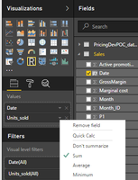
- In the same area, click on the down arrow for Units_sold and set it to “Sum” to aggregate it to a single value by day
- Modify the R script on the second row (not counting comments demarcated with an initial hashtag) to: myts <- ts(dataset[,’Units_sold’], start = as.numeric(substr(dataset[1,'Date'],0,4)), frequency= 12)
- Update the R script on the last row of the script to name the Y axis Quantity instead of Revenue: plot(myprediction, lwd=2, col="blue", fcol="red", flwd=2, shaded=TRUE, col.sub = "gray50", cex.sub=0.75, xlab = "", ylab = "Quantity")
In step 5 you can also use a relative reference to make the script column name agnostic, i.e. “myts <- ts(dataset[,2], start = as.numeric(substr(dataset[1,'Date'],0,4)), frequency= 12)” will always use the second column in the input. For a more robust example on how to handle different date options in Power BI I recommend taking a look at the Forecasting example in the R showcase on PowerBI.com.
Tips and tricks
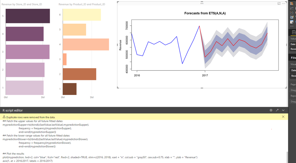
You may want to zoom in on the x-axis’ last years to make the forecast more prevalent. Rather than using the Power BI controls to change this (which may decrease forecast accuracy) you can achieve this by modifying the plot command on the last row to:
plot(myprediction, lwd=2, col="blue", fcol="red", flwd=2, shaded=TRUE, xlim=c(2015, 2018), col.sub = "gray50", cex.sub=0.75, xlab = "", ylab = "Revenue")
However, this may yield an x-axis with decimals. To solve that we add:
plot(myprediction, lwd=2, col="blue", fcol="red", flwd=2, shaded=TRUE, xlim=c(2015, 2018), xaxt = "n", col.sub = "gray50", cex.sub=0.75, xlab = "", ylab = "Revenue")

axis(1, at = 2015:2018, labels = 2015:2018)
The xaxt=”n” parameter initially suppresses the x-axis. The second line of script sets the x-axis using the function axis().
If you are hitting an R script error and are struggling to find the root cause the second arrow in the R script editor moves the currently selected data to your default script editor.
Links and downloads
Forecasting in the R showcase on Power BI
Local Polynomial Regression Fitting
* Copyright (c) Microsoft Corporation. All rights reserved.
Third-party programs. This software enables you to obtain software applications from other sources.
Those applications are offered and distributed by third parties under their own license terms.
Microsoft is not developing, distributing or licensing those applications to you, but instead,
as a convenience, enables you to use this software to obtain those applications directly from
the application providers.
By using the software, you acknowledge and agree that you are obtaining the applications directly
from the third-party providers and under separate license terms, and that it is your responsibility to locate,
understand and comply with those license terms.
Microsoft grants you no license rights for third-party software or applications that is obtained using this software.
You must be a registered user to add a comment. If you've already registered, sign in. Otherwise, register and sign in.
- ABS & REL parameters in DAX Window function
- Revolutionizing Power BI Development: Create Dashb...
- Power Query vs DAX: Where Should the Logic Live?
- Data Governance in Microsoft Fabric: Trust, Visibi...
- The "Hidden" Gems That Will Save You Hours
- Importance of Power BI Governance Framework
- When Semi-Additive Metrics Fall Short: Why You Nee...
- QuickViz Challenge | Spotlight 🔦
- 🏆 Announcing the finalists of the Fabric Data Day...
- 🏆 Announcing the winner of the Fabric Data Days N...
-
Olayemi_Awofe
 on:
Revolutionizing Power BI Development: Create Dashb...
-
Olayemi_Awofe
 on:
Power Query vs DAX: Where Should the Logic Live?
-
burakkaragoz
 on:
The "Hidden" Gems That Will Save You Hours
- Hemanth_Elluri2 on: Importance of Power BI Governance Framework
- tech_enthusiast on: QuickViz Challenge | Spotlight 🔦
-
Abhilash_P
 on:
🏆 Announcing the finalists of the Fabric Data Day...
- lahirucw on: 🏆 Announcing the winner of the Fabric Data Days N...
- RishabhVerma on: 🏆 Announcing the winners of the Fabric Data Days ...
-
EsraaKamal
 on:
What Happens Actually When You Change Cross Filter...
-
Prosundas
 on:
SQL's APPLY Clause in PowerBI DAX ?
-
How to
741 -
Tips & Tricks
724 -
Events
183 -
Support insights
121 -
Opinion
93 -
DAX
66 -
Power BI
65 -
Power Query
62 -
Power BI Dev Camp
45 -
Power BI Desktop
40 -
Roundup
39 -
Dataflow
31 -
Featured User Group Leader
27 -
Power BI Embedded
20 -
Time Intelligence
19 -
Data Protection
18 -
Tips&Tricks
18 -
PowerBI REST API
12 -
Power Query Tips & Tricks
8 -
finance
8 -
Power BI Service
8 -
Direct Query
7 -
Power BI REST API
6 -
Auto ML
6 -
financial reporting
6 -
Data Analysis
6 -
Power Automate
6 -
Data Visualization
6 -
Python
6 -
Tips and Tricks
6 -
Income Statement
5 -
Dax studio
5 -
powerbi
5 -
service
5 -
Power BI PowerShell
5 -
Machine Learning
5 -
RLS
4 -
M language
4 -
Life Sciences
4 -
Paginated Reports
4 -
External tool
4 -
Power BI Goals
4 -
Desktop
4 -
PowerShell
4 -
Bookmarks
4 -
Line chart
4 -
Group By
4 -
community
4 -
Data model
3 -
Conditional Formatting
3 -
Visualisation
3 -
Administration
3 -
M code
3 -
Visuals
3 -
SQL Server 2017 Express Edition
3 -
R script
3 -
Aggregation
3 -
Webinar
3 -
calendar
3 -
Gateways
3 -
R
3 -
M Query
3 -
CALCULATE
3 -
R visual
3 -
Reports
3 -
PowerApps
3 -
Data Science
3 -
Azure
3 -
Custom visual
2 -
VLOOKUP
2 -
pivot
2 -
calculated column
2 -
M
2 -
hierarchies
2 -
Power BI Anniversary
2 -
Language M
2 -
inexact
2 -
Date Comparison
2 -
Power BI Premium Per user
2 -
Forecasting
2 -
REST API
2 -
Editor
2 -
Split
2 -
measure
2 -
Microsoft-flow
2 -
Paginated Report Builder
2 -
Working with Non Standatd Periods
2 -
powerbi.tips
2 -
Custom function
2 -
Reverse
2 -
PUG
2 -
Custom Measures
2 -
Filtering
2 -
Row and column conversion
2 -
Python script
2 -
Nulls
2 -
DVW Analytics
2 -
parameter
2 -
Industrial App Store
2 -
Week
2 -
Date duration
2 -
Formatting
2 -
Weekday Calendar
2 -
Support insights.
2 -
construct list
2 -
slicers
2 -
SAP
2 -
Power Platform
2 -
Workday
2 -
external tools
2 -
index
2 -
RANKX
2 -
Date
2 -
PBI Desktop
2 -
Date Dimension
2 -
Integer
2 -
Visualization
2 -
Power BI Challenge
2 -
Query Parameter
2 -
SharePoint
2 -
Power BI Installation and Updates
2 -
How Things Work
2 -
Tabular Editor
2 -
rank
2 -
ladataweb
2 -
Troubleshooting
2 -
Date DIFF
2 -
Transform data
2 -
Healthcare
2 -
Incremental Refresh
2 -
Number Ranges
2 -
Query Plans
2 -
Power BI & Power Apps
2 -
Random numbers
2 -
Day of the Week
2 -
Retail
1 -
Power BI Report Server
1 -
School
1 -
Cost-Benefit Analysis
1 -
DIisconnected Tables
1 -
Sandbox
1 -
Honeywell
1 -
Combine queries
1 -
X axis at different granularity
1 -
ADLS
1 -
Primary Key
1 -
Microsoft 365 usage analytics data
1 -
Randomly filter
1 -
Week of the Day
1 -
Azure AAD
1 -
query
1 -
Dynamic Visuals
1 -
KPI
1 -
Intro
1 -
Icons
1 -
ISV
1 -
Ties
1 -
unpivot
1 -
Practice Model
1 -
Continuous streak
1 -
ProcessVue
1 -
Create function
1 -
Table.Schema
1 -
Acknowledging
1 -
Postman
1 -
Text.ContainsAny
1 -
Power BI Show
1 -
Get latest sign-in data for each user
1 -
Power Pivot
1 -
API
1 -
Kingsley
1 -
Merge
1 -
variable
1 -
Issues
1 -
function
1 -
stacked column chart
1 -
ho
1 -
ABB
1 -
KNN algorithm
1 -
List.Zip
1 -
optimization
1 -
Artificial Intelligence
1 -
Map Visual
1 -
Text.ContainsAll
1 -
Tuesday
1 -
help
1 -
group
1 -
Scorecard
1 -
Json
1 -
Tops
1 -
financial reporting hierarchies RLS
1 -
Featured Data Stories
1 -
MQTT
1 -
Custom Periods
1 -
Partial group
1 -
Reduce Size
1 -
FBL3N
1 -
Wednesday
1 -
Q&A
1 -
Quick Tips
1 -
data
1 -
PBIRS
1 -
Usage Metrics in Power BI
1 -
Multivalued column
1 -
Pipeline
1 -
Path
1 -
Yokogawa
1 -
Dynamic calculation
1 -
Data Wrangling
1 -
native folded query
1 -
transform table
1 -
UX
1 -
Cell content
1 -
General Ledger
1 -
Thursday
1 -
update
1 -
Table
1 -
Natural Query Language
1 -
Infographic
1 -
automation
1 -
Prediction
1 -
newworkspacepowerbi
1 -
Performance KPIs
1 -
HR Analytics
1 -
keepfilters
1 -
Connect Data
1 -
Financial Year
1 -
Schneider
1 -
dynamically delete records
1 -
Copy Measures
1 -
Friday
1 -
Training
1 -
Event
1 -
Custom Visuals
1 -
Free vs Pro
1 -
Format
1 -
Active Employee
1 -
Custom Date Range on Date Slicer
1 -
refresh error
1 -
PAS
1 -
certain duration
1 -
DA-100
1 -
bulk renaming of columns
1 -
Single Date Picker
1 -
Monday
1 -
PCS
1 -
Saturday
1 -
Slicer
1 -
Visual
1 -
forecast
1 -
Regression
1 -
CICD
1 -
Current Employees
1 -
date hierarchy
1 -
relationship
1 -
SIEMENS
1 -
Multiple Currency
1 -
Power BI Premium
1 -
On-premises data gateway
1 -
Binary
1 -
Power BI Connector for SAP
1 -
Sunday
1 -
Workspace
1 -
Announcement
1 -
Features
1 -
domain
1 -
pbiviz
1 -
sport statistics
1 -
Intelligent Plant
1 -
Circular dependency
1 -
GE
1 -
Exchange rate
1 -
Dendrogram
1 -
range of values
1 -
activity log
1 -
Decimal
1 -
Charticulator Challenge
1 -
Field parameters
1 -
deployment
1 -
ssrs traffic light indicators
1 -
SQL
1 -
trick
1 -
Scripts
1 -
Color Map
1 -
Industrial
1 -
Weekday
1 -
Working Date
1 -
Space Issue
1 -
Emerson
1 -
Date Table
1 -
Cluster Analysis
1 -
Stacked Area Chart
1 -
union tables
1 -
Number
1 -
Start of Week
1 -
Tips& Tricks
1 -
Theme Colours
1 -
Text
1 -
Flow
1 -
Publish to Web
1 -
Extract
1 -
Topper Color On Map
1 -
Historians
1 -
context transition
1 -
Custom textbox
1 -
OPC
1 -
Zabbix
1 -
Label: DAX
1 -
Business Analysis
1 -
Supporting Insight
1 -
rank value
1 -
Synapse
1 -
End of Week
1 -
Tips&Trick
1 -
Excel
1 -
Showcase
1 -
custom connector
1 -
Waterfall Chart
1 -
Power BI On-Premise Data Gateway
1 -
patch
1 -
Top Category Color
1 -
A&E data
1 -
Previous Order
1 -
Substring
1 -
Wonderware
1 -
Power M
1 -
Format DAX
1 -
Custom functions
1 -
accumulative
1 -
DAX&Power Query
1 -
Premium Per User
1 -
GENERATESERIES
1 -
Report Server
1 -
Audit Logs
1 -
analytics pane
1 -
step by step
1 -
Top Brand Color on Map
1 -
Tutorial
1 -
Previous Date
1 -
XMLA End point
1 -
color reference
1 -
Date Time
1 -
Marker
1 -
Lineage
1 -
CSV file
1 -
conditional accumulative
1 -
Matrix Subtotal
1 -
Check
1 -
null value
1 -
Show and Tell
1 -
Cumulative Totals
1 -
Report Theme
1 -
Bookmarking
1 -
oracle
1 -
mahak
1 -
pandas
1 -
Networkdays
1 -
Button
1 -
Dataset list
1 -
Keyboard Shortcuts
1 -
Fill Function
1 -
LOOKUPVALUE()
1 -
Tips &Tricks
1 -
Plotly package
1 -
Sameperiodlastyear
1 -
Office Theme
1 -
matrix
1 -
bar chart
1 -
Measures
1 -
powerbi argentina
1 -
Canvas Apps
1 -
total
1 -
Filter context
1 -
Difference between two dates
1 -
get data
1 -
OSI
1 -
Query format convert
1 -
ETL
1 -
Json files
1 -
Merge Rows
1 -
CONCATENATEX()
1 -
take over Datasets;
1 -
Networkdays.Intl
1 -
refresh M language Python script Support Insights
1 -
Tutorial Requests
1 -
Governance
1 -
Fun
1 -
Power BI gateway
1 -
gateway
1 -
Elementary
1 -
Custom filters
1 -
Vertipaq Analyzer
1 -
powerbi cordoba
1 -
Model Driven Apps
1 -
REMOVEFILTERS
1 -
XMLA endpoint
1 -
translations
1 -
OSI pi
1 -
Parquet
1 -
Change rows to columns
1 -
remove spaces
1 -
Get row and column totals
1
- 12-21-2025 - 12-24-2025
- 12-14-2025 - 12-20-2025
- 12-07-2025 - 12-13-2025
- 11-30-2025 - 12-06-2025
- 11-23-2025 - 11-29-2025
- 11-16-2025 - 11-22-2025
- 11-09-2025 - 11-15-2025
- 11-02-2025 - 11-08-2025
- 10-26-2025 - 11-01-2025
- 10-19-2025 - 10-25-2025
- 10-12-2025 - 10-18-2025
- 10-05-2025 - 10-11-2025
- 09-28-2025 - 10-04-2025
- 09-21-2025 - 09-27-2025
- View Complete Archives


