New Offer! Become a Certified Fabric Data Engineer
Check your eligibility for this 50% exam voucher offer and join us for free live learning sessions to get prepared for Exam DP-700.
Get StartedJoin us at the 2025 Microsoft Fabric Community Conference. March 31 - April 2, Las Vegas, Nevada. Use code FABINSIDER for $400 discount. Register now
- Microsoft Fabric Community
- Fabric community blogs
- Power BI Community Blog
- Power BI – The New Card Visual Part 1
- Subscribe to RSS Feed
- Mark as New
- Mark as Read
- Bookmark
- Subscribe
- Printer Friendly Page
- Report Inappropriate Content
- Subscribe to RSS Feed
- Mark as New
- Mark as Read
- Bookmark
- Subscribe
- Printer Friendly Page
- Report Inappropriate Content
June 2023 month's Power BI update has got so many additions to it from having new card visual to Power BI Developer Mode; On-Object interaction updates to Admin Monitoring and so on. It just feels like a feast this month as we have got some capabilities that we as Power BI Developers have been waiting for some time.
In this blog I will be focussing on the new card visual that was released in this Power BI update. Few things to know as a starter on this new visual is:
- It is released under Preview in Power BI
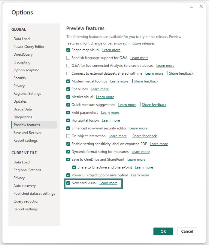
- It needs to be enabled in Power BI desktop settings as a Preview feature
I had a little play with this visual few days back and really think this is a great visual that we all have been waiting for some time. It is going to take away a lot of effort of clubbing multiple card visuals with text visuals together to show a KPI like visual on our Power BI reports. Let’s see what this visual has got for us.
Make sure you have the June 2023 version of Power BI Desktop
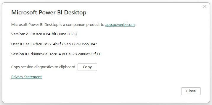
In order to use this new visual, you need to make sure your Power BI Desktop is upgraded to June 2023 version. If you are using a Microsoft Store version, then this should already been updated to June 2023 version (based on availability in your region). But if you using the standalone Power BI Desktop then you can download the latest update from here. Once you have updated Power BI Desktop, you can check what version it got updated to by navigating to File –> About and you see the version listed as shown below:
So now we have the latest Power BI Desktop version on our machine.
Enable the New Card Visual under Preview Features
You can enable the new card visual under File –> Options –> Preview features –> New card visual
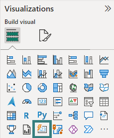
Once you enable this visual, you will see it under Visualisations section:
So, now we have finished all the prerequisite steps to get to the new card visual in the Power BI Desktop.
Create our First Visual using the New Card Visual
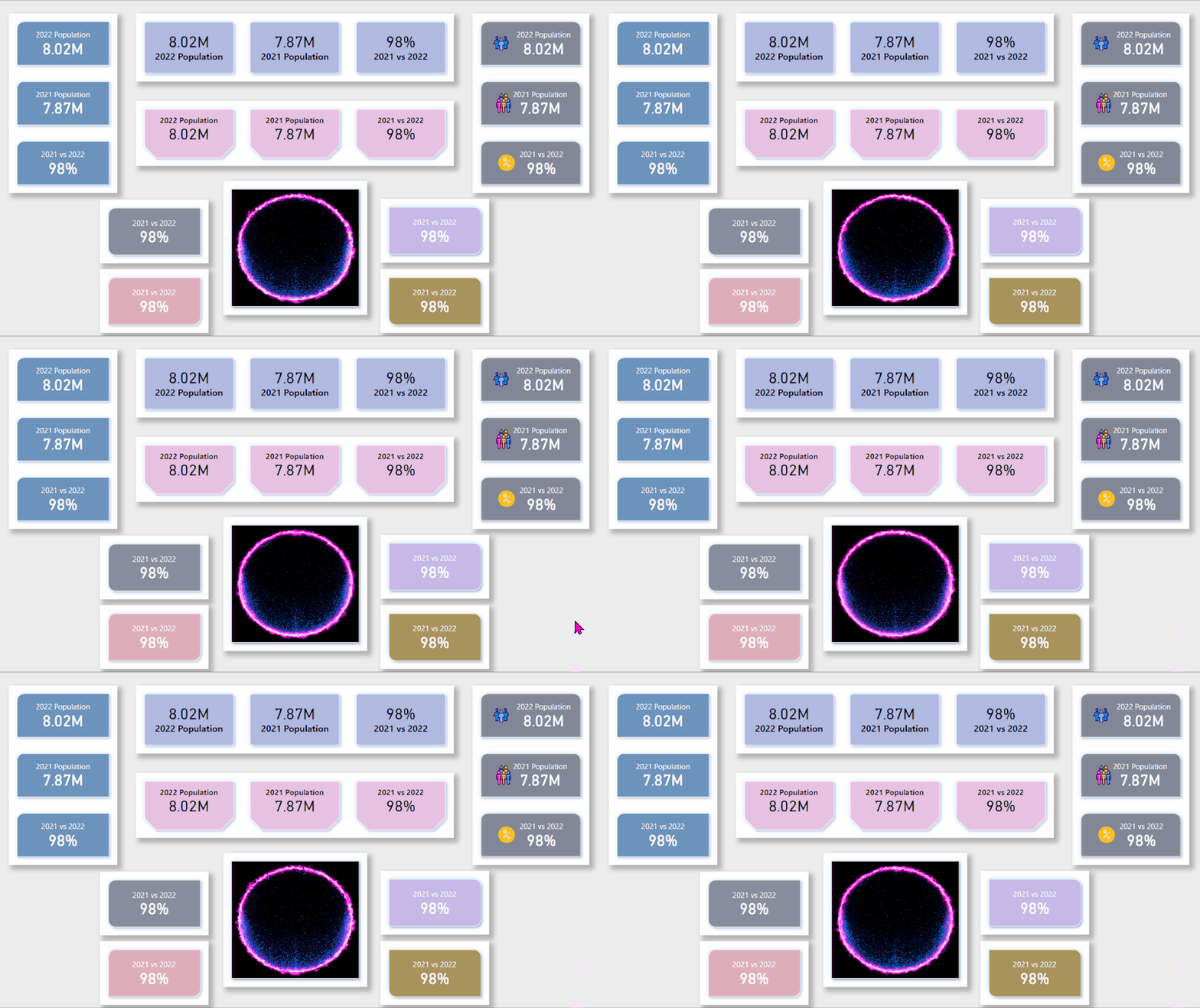
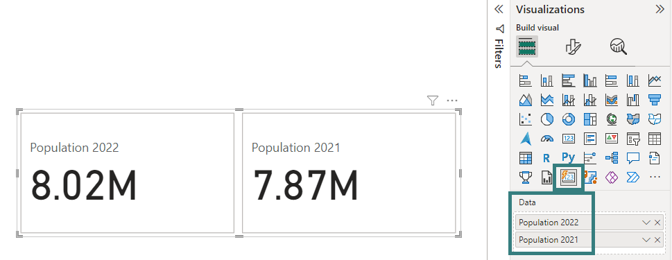
You can drag the new card visual on the report canvas and start adding your fields to it. It also supports multiple fields like a multi-card visual (existing visual in Power BI).
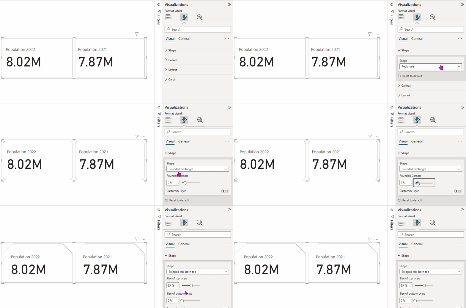
But the wow factor on this visual starts when we start exploring its formatting options. Let’s start with the Shape formatting.
You can select different shapes for the card visual:
- Rectangle
- Rounded Rectangle
- Snipped tab, both top
On these shapes you can definitely customize with more options like Rounded Corners, Size of top snips, Size of bottom snips, etc.
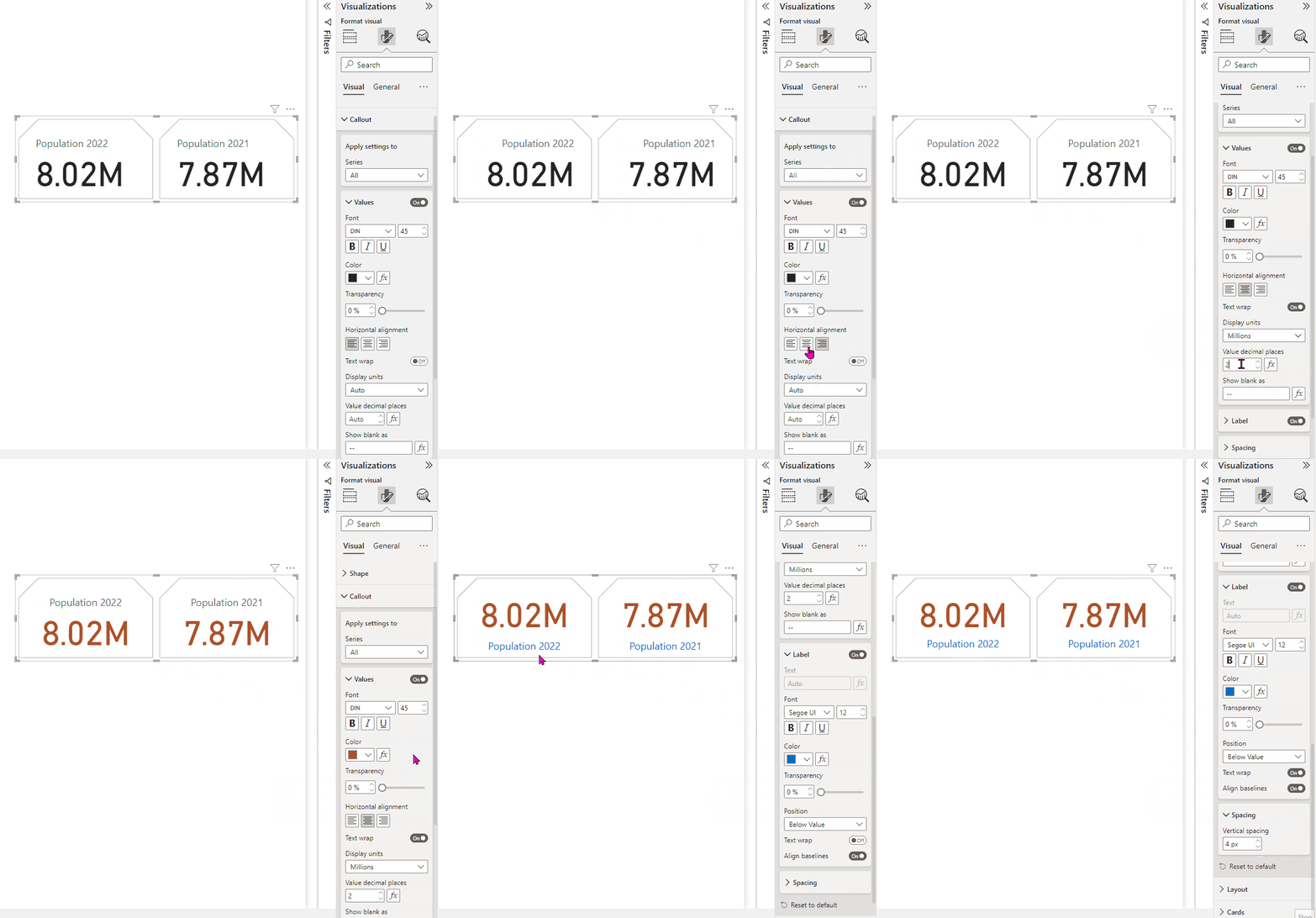
The next formatting setting is Callout. There are so many option for formatting the values in the card, changing the alignment of the card value and label, even adding dynamic colours to card labels, etc.
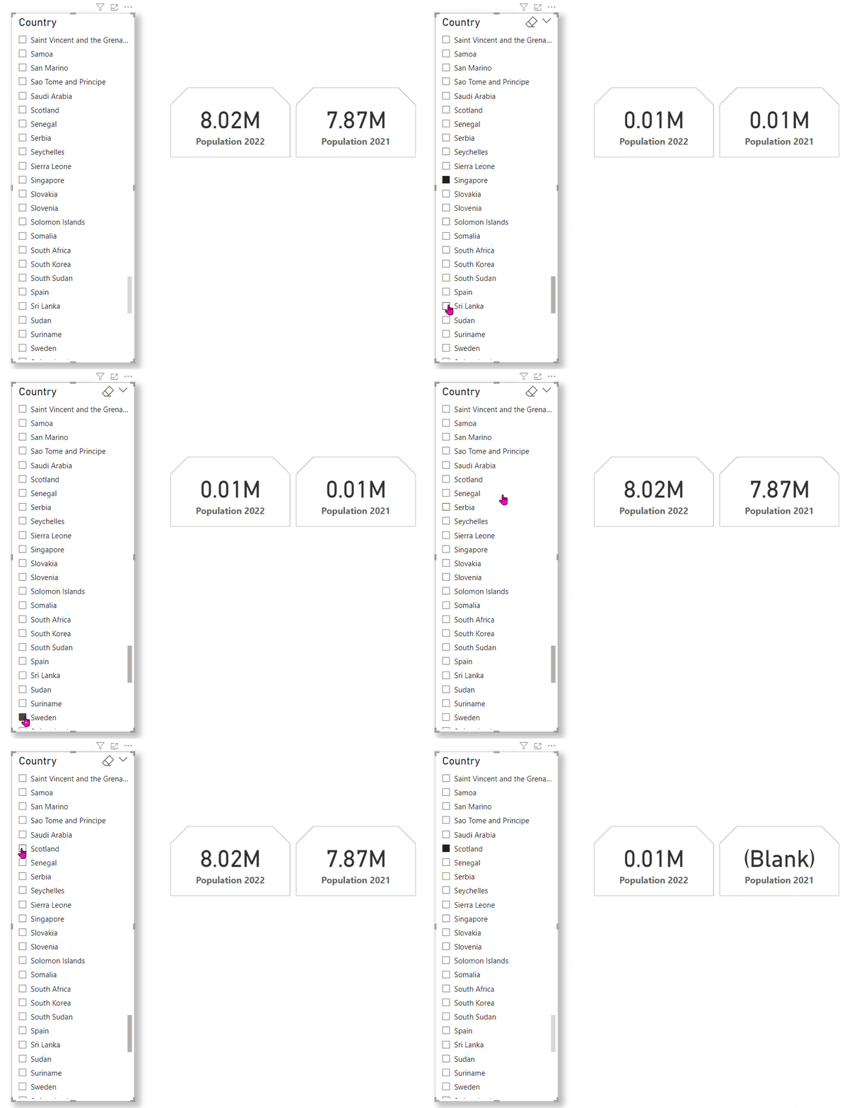
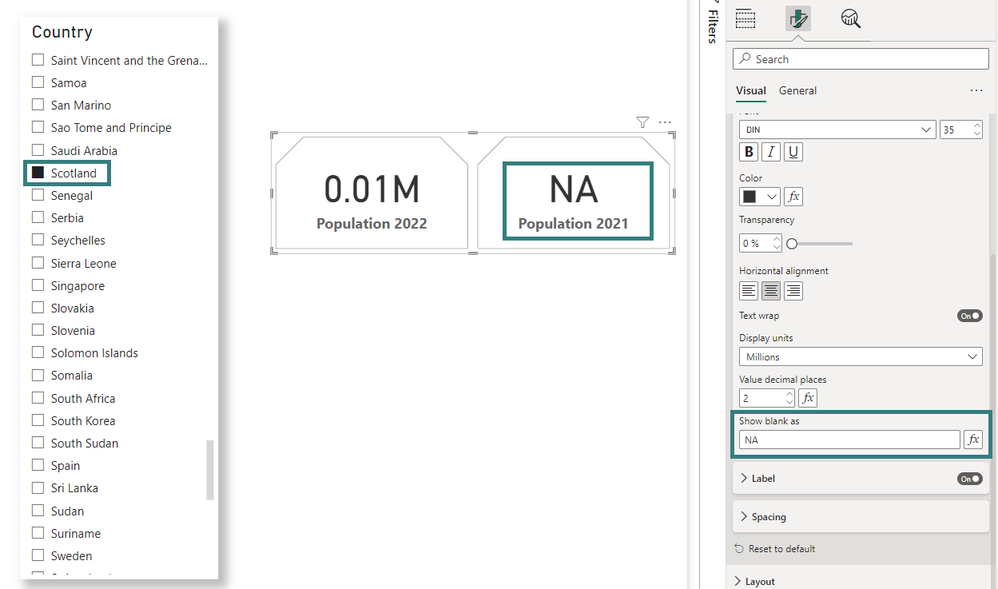
My favourite part on the Callout settings is Show blank as setting under Values section. Consider I have a COUNTRY slicer on this report page, where I am slicing the card information by country value. I send up seeing BLANK for one of the countries.
This Show as blank setting help us control this value on the card visual. Whatever value I define in this setting that is displayed in place of (BLANK) in the card visual, which is the general ask on the reports. Say, I add a value in this setting as NA then the card visual displays it whenever a value is not found for the selection. This value can be set as dynamic as well.
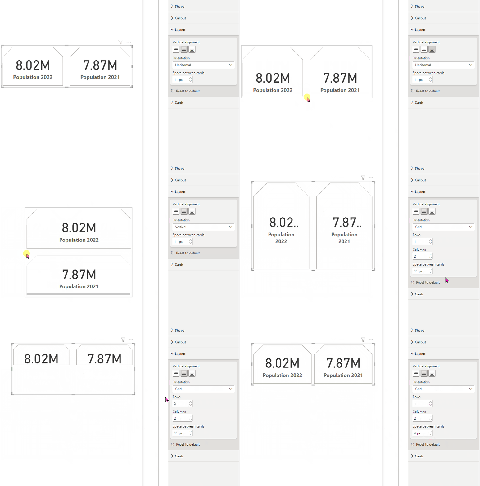
The next setting worth exploring is the card Layout. You can change alignment, orientation and spacing on card in this section.
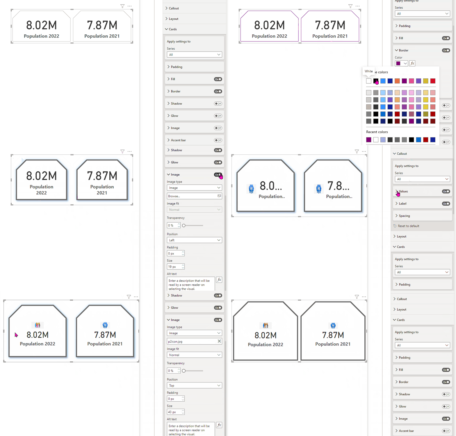
The last but not the least, final formatting setting is Cards. There are lot many options you can apply here on the card visual. The setting can be applied to the whole card visual or to individual values within the card visual.
So many formatting settings to choose from and to many options as well.
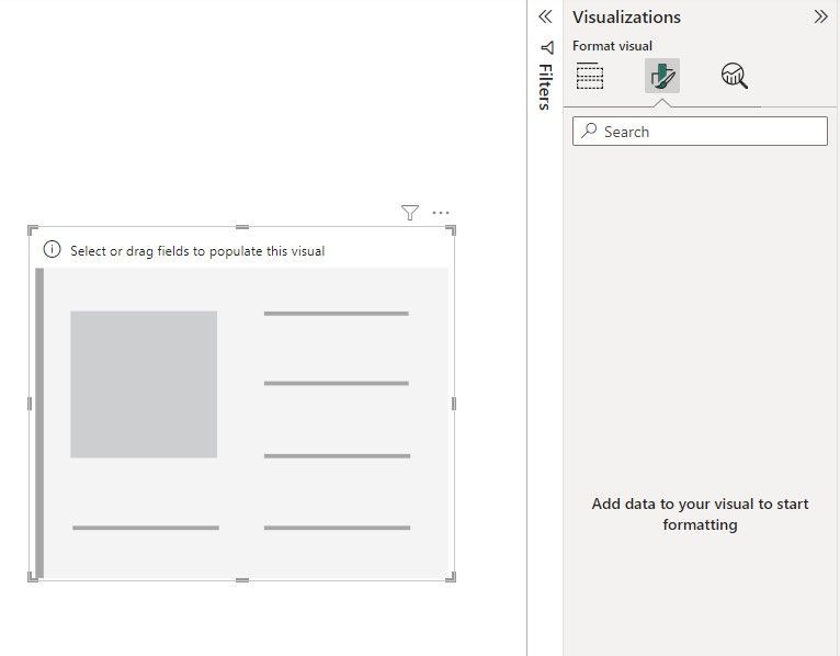
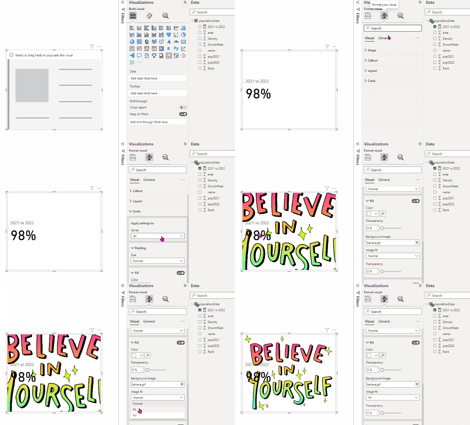
Also did I tell you, you can bring in gif images as a background in this new card visual? Let’s see this quickly. Once I create a new card visual, I don’t see any formatting settings as, I haven’t moved any data field to it.
In order to see the settings, I will have to move a data field to my card visual and then I can set a background gif image under Cards --> Fill settings:
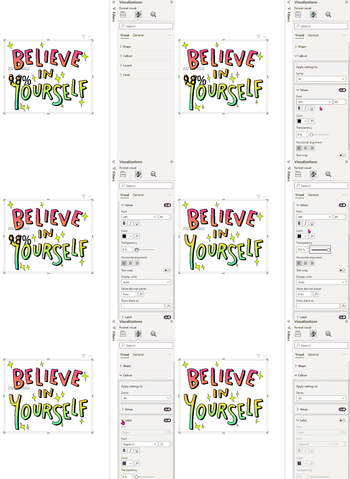
But what just happened here? Along with my background image, I see the value moved in the card visual. But I just want my say gif image. So let’s just do a very simple setting to the callout value and the card label.
What I just did here:
- Callout value setting: I set the transparency = 100% for the value
- Label setting: I disabled this setting
This removed the callout value and the card label from the card and I ended up with just my background gif image.
There are many other formatting options you can use to modify your new card visual and make them more interactive on your reports.
Let me know your views on how this new card visual is treating you. Have you already started using it? Are you planning to use it soon on your reports to enrich them? I look forward to your thoughts here.
Pragati
You must be a registered user to add a comment. If you've already registered, sign in. Otherwise, register and sign in.
- Understanding TMDL in Power BI: A Game-Changer for...
- 🏆 Power BI DataViz World Championships | Week 1 F...
- 🏆 Power BI DataViz World Championships | Week 1 W...
- 🏆 Power BI DataViz Campeonato mundial! Semana 1!
- Fabric Capacity Scaling and Power BI - What happen...
- 🏆 Power BI DataViz World Championships | ¡La sema...
- 🏆 Power BI DataViz World Championships | Week 2 C...
- How to Use Multi-Cursor in Power BI TMDL View
- 🏆 Power BI DataViz World Championships | Meet the...
- Securing Data using Sensitivity Labels in Power BI
-
 Pragati11
on:
🏆 Power BI DataViz World Championships | Week 1 W...
-
 slindsay
on:
🏆 Power BI DataViz World Championships | Week 2 C...
-
 slindsay
on:
🏆 Power BI Data Visualization World Championships...
-
 slindsay
on:
🏆 Power BI DataViz World Championships | Week 1 C...
- Jalə on: Developing an Azerbaijan Shape Map
- ccarawan_1 on: Frequently Asked Questions | Power BI DataViz Worl...
- LYPowerBI on: Using Variables While Creating Custom Columns in P...
- cravity-hub on: Embedding Power BI Report in Web Pages
-
Poweraegg
 on:
Connecting Fact Tables in Microsoft Fabric: A Brid...
-
 PradipVS
on:
Power BI - Powered by Copilot
-
How to
647 -
Tips & Tricks
616 -
Events
121 -
Support insights
121 -
Opinion
80 -
DAX
66 -
Power BI
65 -
Power Query
62 -
Power BI Dev Camp
45 -
Power BI Desktop
40 -
Roundup
37 -
Power BI Embedded
20 -
Time Intelligence
19 -
Tips&Tricks
18 -
Featured User Group Leader
15 -
PowerBI REST API
12 -
Dataflow
9 -
Power Query Tips & Tricks
8 -
finance
8 -
Power BI Service
8 -
Data Protection
7 -
Direct Query
7 -
Power BI REST API
6 -
Auto ML
6 -
financial reporting
6 -
Data Analysis
6 -
Power Automate
6 -
Data Visualization
6 -
Python
6 -
Income Statement
5 -
Dax studio
5 -
powerbi
5 -
service
5 -
Power BI PowerShell
5 -
Machine Learning
5 -
M language
4 -
Paginated Reports
4 -
External tool
4 -
Power BI Goals
4 -
PowerShell
4 -
Desktop
4 -
Bookmarks
4 -
Line chart
4 -
Group By
4 -
community
4 -
RLS
4 -
Visualisation
3 -
Administration
3 -
M code
3 -
Visuals
3 -
SQL Server 2017 Express Edition
3 -
R script
3 -
Aggregation
3 -
calendar
3 -
Gateways
3 -
R
3 -
M Query
3 -
Webinar
3 -
CALCULATE
3 -
R visual
3 -
Reports
3 -
PowerApps
3 -
Data Science
3 -
Azure
3 -
Data model
3 -
Conditional Formatting
3 -
Forecasting
2 -
REST API
2 -
Editor
2 -
Split
2 -
Life Sciences
2 -
measure
2 -
Microsoft-flow
2 -
Paginated Report Builder
2 -
Working with Non Standatd Periods
2 -
powerbi.tips
2 -
Custom function
2 -
Reverse
2 -
PUG
2 -
Custom Measures
2 -
Filtering
2 -
Row and column conversion
2 -
Python script
2 -
Nulls
2 -
DVW Analytics
2 -
parameter
2 -
Industrial App Store
2 -
Week
2 -
Date duration
2 -
Formatting
2 -
Weekday Calendar
2 -
Support insights.
2 -
construct list
2 -
slicers
2 -
SAP
2 -
Power Platform
2 -
Workday
2 -
external tools
2 -
index
2 -
RANKX
2 -
PBI Desktop
2 -
Date Dimension
2 -
Integer
2 -
Visualization
2 -
Power BI Challenge
2 -
Query Parameter
2 -
Date
2 -
SharePoint
2 -
Power BI Installation and Updates
2 -
How Things Work
2 -
Tabular Editor
2 -
rank
2 -
ladataweb
2 -
Troubleshooting
2 -
Date DIFF
2 -
Transform data
2 -
Tips and Tricks
2 -
Incremental Refresh
2 -
Number Ranges
2 -
Query Plans
2 -
Power BI & Power Apps
2 -
Random numbers
2 -
Day of the Week
2 -
Custom Visual
2 -
VLOOKUP
2 -
pivot
2 -
calculated column
2 -
M
2 -
hierarchies
2 -
Power BI Anniversary
2 -
Language M
2 -
inexact
2 -
Date Comparison
2 -
Power BI Premium Per user
2 -
API
1 -
Kingsley
1 -
Merge
1 -
variable
1 -
Issues
1 -
function
1 -
stacked column chart
1 -
ho
1 -
ABB
1 -
KNN algorithm
1 -
List.Zip
1 -
optimization
1 -
Artificial Intelligence
1 -
Map Visual
1 -
Text.ContainsAll
1 -
Tuesday
1 -
help
1 -
group
1 -
Scorecard
1 -
Json
1 -
Tops
1 -
financial reporting hierarchies RLS
1 -
Featured Data Stories
1 -
MQTT
1 -
Custom Periods
1 -
Partial group
1 -
Reduce Size
1 -
FBL3N
1 -
Wednesday
1 -
Power Pivot
1 -
Quick Tips
1 -
data
1 -
PBIRS
1 -
Usage Metrics in Power BI
1 -
Multivalued column
1 -
Pipeline
1 -
Path
1 -
Yokogawa
1 -
Dynamic calculation
1 -
Data Wrangling
1 -
native folded query
1 -
transform table
1 -
UX
1 -
Cell content
1 -
General Ledger
1 -
Thursday
1 -
Table
1 -
Natural Query Language
1 -
Infographic
1 -
automation
1 -
Prediction
1 -
newworkspacepowerbi
1 -
Performance KPIs
1 -
HR Analytics
1 -
keepfilters
1 -
Connect Data
1 -
Financial Year
1 -
Schneider
1 -
dynamically delete records
1 -
Copy Measures
1 -
Friday
1 -
Q&A
1 -
Event
1 -
Custom Visuals
1 -
Free vs Pro
1 -
Format
1 -
Active Employee
1 -
Custom Date Range on Date Slicer
1 -
refresh error
1 -
PAS
1 -
certain duration
1 -
DA-100
1 -
bulk renaming of columns
1 -
Single Date Picker
1 -
Monday
1 -
PCS
1 -
Saturday
1 -
update
1 -
Slicer
1 -
Visual
1 -
forecast
1 -
Regression
1 -
CICD
1 -
Current Employees
1 -
date hierarchy
1 -
relationship
1 -
SIEMENS
1 -
Multiple Currency
1 -
Power BI Premium
1 -
On-premises data gateway
1 -
Binary
1 -
Power BI Connector for SAP
1 -
Sunday
1 -
Training
1 -
Announcement
1 -
Features
1 -
domain
1 -
pbiviz
1 -
sport statistics
1 -
Intelligent Plant
1 -
Circular dependency
1 -
GE
1 -
Exchange rate
1 -
Dendrogram
1 -
range of values
1 -
activity log
1 -
Decimal
1 -
Charticulator Challenge
1 -
Field parameters
1 -
deployment
1 -
ssrs traffic light indicators
1 -
SQL
1 -
trick
1 -
Scripts
1 -
Color Map
1 -
Industrial
1 -
Weekday
1 -
Working Date
1 -
Space Issue
1 -
Emerson
1 -
Date Table
1 -
Cluster Analysis
1 -
Stacked Area Chart
1 -
union tables
1 -
Number
1 -
Start of Week
1 -
Tips& Tricks
1 -
Workspace
1 -
Theme Colours
1 -
Text
1 -
Flow
1 -
Publish to Web
1 -
Extract
1 -
Topper Color On Map
1 -
Historians
1 -
context transition
1 -
Custom textbox
1 -
OPC
1 -
Zabbix
1 -
Label: DAX
1 -
Business Analysis
1 -
Supporting Insight
1 -
rank value
1 -
Synapse
1 -
End of Week
1 -
Tips&Trick
1 -
Showcase
1 -
custom connector
1 -
Waterfall Chart
1 -
Power BI On-Premise Data Gateway
1 -
patch
1 -
Top Category Color
1 -
A&E data
1 -
Previous Order
1 -
Substring
1 -
Wonderware
1 -
Power M
1 -
Format DAX
1 -
Custom functions
1 -
accumulative
1 -
DAX&Power Query
1 -
Premium Per User
1 -
GENERATESERIES
1 -
Report Server
1 -
Audit Logs
1 -
analytics pane
1 -
step by step
1 -
Top Brand Color on Map
1 -
Tutorial
1 -
Previous Date
1 -
XMLA End point
1 -
color reference
1 -
Date Time
1 -
Marker
1 -
Lineage
1 -
CSV file
1 -
conditional accumulative
1 -
Matrix Subtotal
1 -
Check
1 -
null value
1 -
Excel
1 -
Cumulative Totals
1 -
Report Theme
1 -
Bookmarking
1 -
oracle
1 -
mahak
1 -
pandas
1 -
Networkdays
1 -
Button
1 -
Dataset list
1 -
Keyboard Shortcuts
1 -
Fill Function
1 -
LOOKUPVALUE()
1 -
Tips &Tricks
1 -
Plotly package
1 -
Healthcare
1 -
Sameperiodlastyear
1 -
Office Theme
1 -
matrix
1 -
bar chart
1 -
Measures
1 -
powerbi argentina
1 -
Canvas Apps
1 -
total
1 -
Filter context
1 -
Difference between two dates
1 -
get data
1 -
OSI
1 -
Query format convert
1 -
ETL
1 -
Json files
1 -
Merge Rows
1 -
CONCATENATEX()
1 -
take over Datasets;
1 -
Networkdays.Intl
1 -
refresh M language Python script Support Insights
1 -
Governance
1 -
Fun
1 -
Power BI gateway
1 -
gateway
1 -
Elementary
1 -
Custom filters
1 -
Vertipaq Analyzer
1 -
powerbi cordoba
1 -
Model Driven Apps
1 -
REMOVEFILTERS
1 -
XMLA endpoint
1 -
translations
1 -
OSI pi
1 -
Parquet
1 -
Change rows to columns
1 -
remove spaces
1 -
Get row and column totals
1 -
Retail
1 -
Power BI Report Server
1 -
School
1 -
Cost-Benefit Analysis
1 -
DIisconnected Tables
1 -
Sandbox
1 -
Honeywell
1 -
Combine queries
1 -
X axis at different granularity
1 -
ADLS
1 -
Primary Key
1 -
Microsoft 365 usage analytics data
1 -
Randomly filter
1 -
Week of the Day
1 -
Azure AAD
1 -
query
1 -
Dynamic Visuals
1 -
KPI
1 -
Intro
1 -
Icons
1 -
ISV
1 -
Ties
1 -
unpivot
1 -
Practice Model
1 -
Continuous streak
1 -
ProcessVue
1 -
Create function
1 -
Table.Schema
1 -
Acknowledging
1 -
Postman
1 -
Text.ContainsAny
1 -
Power BI Show
1 -
Get latest sign-in data for each user
1
