FabCon is coming to Atlanta
Join us at FabCon Atlanta from March 16 - 20, 2026, for the ultimate Fabric, Power BI, AI and SQL community-led event. Save $200 with code FABCOMM.
Register now!- Power BI forums
- Get Help with Power BI
- Desktop
- Service
- Report Server
- Power Query
- Mobile Apps
- Developer
- DAX Commands and Tips
- Custom Visuals Development Discussion
- Health and Life Sciences
- Power BI Spanish forums
- Translated Spanish Desktop
- Training and Consulting
- Instructor Led Training
- Dashboard in a Day for Women, by Women
- Galleries
- Data Stories Gallery
- Themes Gallery
- Contests Gallery
- Quick Measures Gallery
- Visual Calculations Gallery
- Notebook Gallery
- Translytical Task Flow Gallery
- TMDL Gallery
- R Script Showcase
- Webinars and Video Gallery
- Ideas
- Custom Visuals Ideas (read-only)
- Issues
- Issues
- Events
- Upcoming Events
Calling all Data Engineers! Fabric Data Engineer (Exam DP-700) live sessions are back! Starting October 16th. Sign up.
- Power BI forums
- Forums
- Get Help with Power BI
- Service
- Re: Tooltip value showing on wrong line
- Subscribe to RSS Feed
- Mark Topic as New
- Mark Topic as Read
- Float this Topic for Current User
- Bookmark
- Subscribe
- Printer Friendly Page
- Mark as New
- Bookmark
- Subscribe
- Mute
- Subscribe to RSS Feed
- Permalink
- Report Inappropriate Content
Tooltip value showing on wrong line
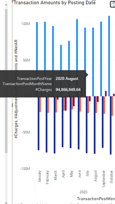
On my visual, the tool tip value is not showing up on the correct line. For example, in the picture below, "August" should be on the TransactionPostMonth Line but shows up on the TransactionPostYear line instead. Is there a way to force August onto the correct row of the tooltip? Any suggestions or help are appreciated.
Solved! Go to Solution.
- Mark as New
- Bookmark
- Subscribe
- Mute
- Subscribe to RSS Feed
- Permalink
- Report Inappropriate Content
Hi @Anonymous ,
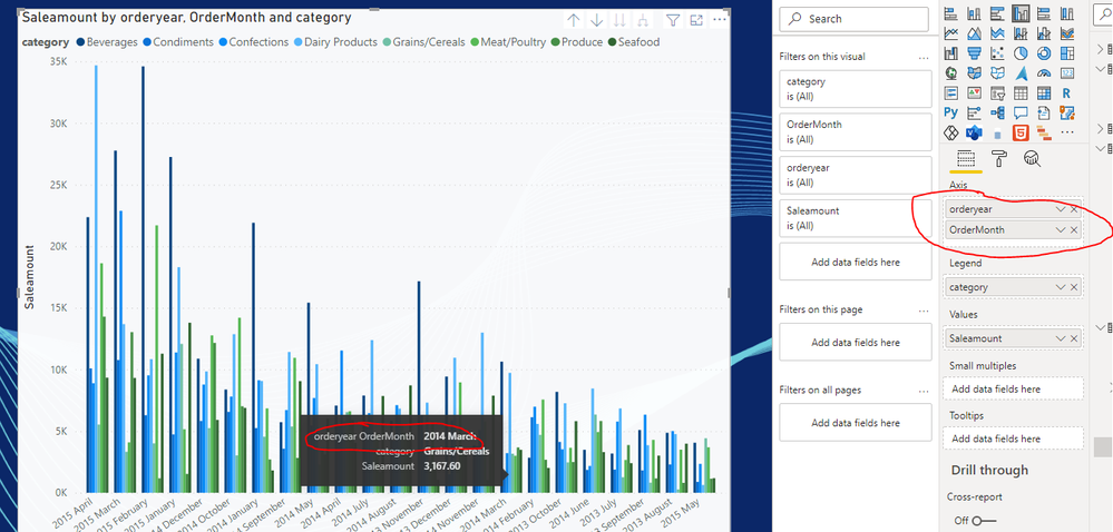
Did you put TransactionPostYear and TransactionPostMonthName in x-axis? Based on my test, it will put all values in x-axis together:
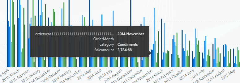
But if you put the field with long name, it will result in line feed.
As a workaround, try to shortened field name.
If this post helps, then please consider Accept it as the solution to help the other members find it more quickly.
Best Regards,
Dedmon Dai
- Mark as New
- Bookmark
- Subscribe
- Mute
- Subscribe to RSS Feed
- Permalink
- Report Inappropriate Content
Your first example where each item on the x axis shows up on a single line is what I'm trying to solve/prevent. I'd like each item on the x axis to be it's own line. Is there a way to do that?
Thanks.
- Mark as New
- Bookmark
- Subscribe
- Mute
- Subscribe to RSS Feed
- Permalink
- Report Inappropriate Content
Hi @Anonymous,
It is designed by default if you put these two column in x-axis,so if you want to show them in different lines, you can't use the default tooltips. There is a workaround, but it is a little complex. you can try to create a custom tootips, with these two fields in different lines. For more details, please refer to https://docs.microsoft.com/en-us/power-bi/create-reports/desktop-tooltips
If this post helps, then please consider Accept it as the solution to help the other members find it more quickly.
Best Regards,
Dedmon Dai
- Mark as New
- Bookmark
- Subscribe
- Mute
- Subscribe to RSS Feed
- Permalink
- Report Inappropriate Content
@Anonymous
You have no control over shifting the place where the Tool Tip appears.
You have used Clustered Column Chart, the light and dark blue values can be on the Primary axis as they are higher and the other two could be on the secondary axis, this way it would not be tiny.
Try Line and Clustered Column Chart.
⭕ Subscribe and learn Power BI from these videos
⚪ Website ⚪ LinkedIn ⚪ PBI User Group
- Mark as New
- Bookmark
- Subscribe
- Mute
- Subscribe to RSS Feed
- Permalink
- Report Inappropriate Content
Thanks for the reply. My question isn't about where the tooltip shows up on the chart but the text inside the tool tip. Currently, the year and month are showing up on the first row of the tool tip even though they are 2 separate data fields. I would like the month (in this case "August") to show up next to the month field inside the tooltip text box. For example:
The text inside the tooltip currently shows:
TransactionPostYear 2020 August
TransactionPostMonthName
#Charge 94,000,000
I'd like it to show:
TransactionPostYear 2020
TransactionPostMonthName August
#Charge 94,000,000
Hope this clarifies my issue.
thanks.
- Mark as New
- Bookmark
- Subscribe
- Mute
- Subscribe to RSS Feed
- Permalink
- Report Inappropriate Content
@Anonymous
In that case, you should go for Report Page Tooltip option:
⭕ Subscribe and learn Power BI from these videos
⚪ Website ⚪ LinkedIn ⚪ PBI User Group
- Mark as New
- Bookmark
- Subscribe
- Mute
- Subscribe to RSS Feed
- Permalink
- Report Inappropriate Content
Thanks. While a report page tooltip is an option, I was hoping that I could figure out how to get the default tooltip to format correctly. Seems to either be a bug or a setting that I have that causes the month name to show up on the wrong line. Any other thoughts on how to fix the default tool tip?
Helpful resources

FabCon Global Hackathon
Join the Fabric FabCon Global Hackathon—running virtually through Nov 3. Open to all skill levels. $10,000 in prizes!

Power BI Monthly Update - October 2025
Check out the October 2025 Power BI update to learn about new features.


