- Power BI forums
- Get Help with Power BI
- Desktop
- Service
- Report Server
- Power Query
- Mobile Apps
- Developer
- DAX Commands and Tips
- Custom Visuals Development Discussion
- Health and Life Sciences
- Power BI Spanish forums
- Translated Spanish Desktop
- Training and Consulting
- Instructor Led Training
- Dashboard in a Day for Women, by Women
- Galleries
- Data Stories Gallery
- Themes Gallery
- Contests Gallery
- QuickViz Gallery
- Quick Measures Gallery
- Visual Calculations Gallery
- Notebook Gallery
- Translytical Task Flow Gallery
- TMDL Gallery
- R Script Showcase
- Webinars and Video Gallery
- Ideas
- Custom Visuals Ideas (read-only)
- Issues
- Issues
- Events
- Upcoming Events
Learn from the best! Meet the four finalists headed to the FINALS of the Power BI Dataviz World Championships! Register now
- Power BI forums
- Forums
- Get Help with Power BI
- Service
- Re: Tooltip adjustments while using New Parameter ...
- Subscribe to RSS Feed
- Mark Topic as New
- Mark Topic as Read
- Float this Topic for Current User
- Bookmark
- Subscribe
- Printer Friendly Page
- Mark as New
- Bookmark
- Subscribe
- Mute
- Subscribe to RSS Feed
- Permalink
- Report Inappropriate Content
Tooltip adjustments while using New Parameter Functionality
Hey everyone,
we have a requirement to make x axis on a bar chart dynamic based on a slicer value.
Lets say slicer has values - "cost per application" and "growth value %". The visual should display either one of these values based on the selection.

This works without any issues.
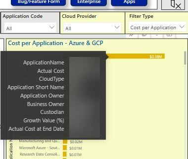
We have an additional requirement to show "growth value (%)" in the tooltip as shown below.
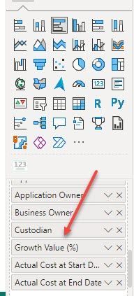
Again, this works fine if we select "cost per application". However, on selecting "growth value(%)", the report starts showing 2 occurrences and on top of the that it doesn't honor the sequence where the tooltip "growth value(%)" was placed.
I believe if we could enforce the tooltip to skip picking up y-axis and x-axis titles, we could be able to achieve the requirement.
Please comment your suggestions/solutions.
Solved! Go to Solution.
- Mark as New
- Bookmark
- Subscribe
- Mute
- Subscribe to RSS Feed
- Permalink
- Report Inappropriate Content
That is beyond current functionality. A short term remedy would be to remove the Growth Value (%) tooltip.
If this is important to you please consider voting for an existing idea or raising a new one at https://ideas.fabric.microsoft.com/?forum=2d80fd4a-16cb-4189-896b-e0dac5e08b41
Helpful resources
| User | Count |
|---|---|
| 26 | |
| 21 | |
| 11 | |
| 10 | |
| 10 |


