FabCon is coming to Atlanta
Join us at FabCon Atlanta from March 16 - 20, 2026, for the ultimate Fabric, Power BI, AI and SQL community-led event. Save $200 with code FABCOMM.
Register now!- Power BI forums
- Get Help with Power BI
- Desktop
- Service
- Report Server
- Power Query
- Mobile Apps
- Developer
- DAX Commands and Tips
- Custom Visuals Development Discussion
- Health and Life Sciences
- Power BI Spanish forums
- Translated Spanish Desktop
- Training and Consulting
- Instructor Led Training
- Dashboard in a Day for Women, by Women
- Galleries
- Data Stories Gallery
- Themes Gallery
- Contests Gallery
- Quick Measures Gallery
- Visual Calculations Gallery
- Notebook Gallery
- Translytical Task Flow Gallery
- TMDL Gallery
- R Script Showcase
- Webinars and Video Gallery
- Ideas
- Custom Visuals Ideas (read-only)
- Issues
- Issues
- Events
- Upcoming Events
Calling all Data Engineers! Fabric Data Engineer (Exam DP-700) live sessions are back! Starting October 16th. Sign up.
- Power BI forums
- Forums
- Get Help with Power BI
- Service
- Re: Stacked Column Chart with tables as axis
- Subscribe to RSS Feed
- Mark Topic as New
- Mark Topic as Read
- Float this Topic for Current User
- Bookmark
- Subscribe
- Printer Friendly Page
- Mark as New
- Bookmark
- Subscribe
- Mute
- Subscribe to RSS Feed
- Permalink
- Report Inappropriate Content
Stacked Column Chart with tables as axis
Hey Guys,
I want to create a stacked column chart with several different tables. The contain the Name of the object (mostly the same for all tables) and the amount of money used for it. But nothing that I could put in the axis, which is why Power BI always stacks up the amount of money and has all the object names side by side. But what I want is a column for every table. Does anybody know a solution?
Greetings,
Nick
Solved! Go to Solution.
- Mark as New
- Bookmark
- Subscribe
- Mute
- Subscribe to RSS Feed
- Permalink
- Report Inappropriate Content
Hi @Nick2,
how can I achieve the same result without doing all the work by hand?
I would say NO. There is no direct way to achieve such a bar chart. You have to combine all datasets into a signle one and add a column to distinguish them.
And Since I'm already asking, is it possible to tell Power BI in which sequence I want the data to be stacked in one Graph?
Please refer to: stacked column chart legend order
Regards,
Yuliana Gu
If this post helps, then please consider Accept it as the solution to help the other members find it more quickly.
- Mark as New
- Bookmark
- Subscribe
- Mute
- Subscribe to RSS Feed
- Permalink
- Report Inappropriate Content
@Nick2 An example will go a long way to resolve this. It sounds like you would be better off merging the datasets using the Power BI Desktop, but I can't say for certain. It is best to have a sample dataset, visual of what you want to have happen, etc.
Looking for more Power BI tips, tricks & tools? Check out PowerBI.tips the site I co-own with Mike Carlo. Also, if you are near SE WI? Join our PUG Milwaukee Brew City PUG
- Mark as New
- Bookmark
- Subscribe
- Mute
- Subscribe to RSS Feed
- Permalink
- Report Inappropriate Content
Hey @Seth_C_Bauer,
so here it comes:
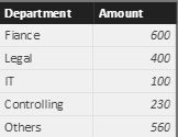
Let say I have three budgetreports of a compay that look something like this:


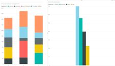
So how can I achieve the same result without doing all the work by hand? And Since I'm already asking, is it possible to tell Power BI in which sequence I want the data to be stacked in one Graph?
Thanks for the help,
Nick
- Mark as New
- Bookmark
- Subscribe
- Mute
- Subscribe to RSS Feed
- Permalink
- Report Inappropriate Content
Hi @Nick2,
how can I achieve the same result without doing all the work by hand?
I would say NO. There is no direct way to achieve such a bar chart. You have to combine all datasets into a signle one and add a column to distinguish them.
And Since I'm already asking, is it possible to tell Power BI in which sequence I want the data to be stacked in one Graph?
Please refer to: stacked column chart legend order
Regards,
Yuliana Gu
If this post helps, then please consider Accept it as the solution to help the other members find it more quickly.
Helpful resources

FabCon Global Hackathon
Join the Fabric FabCon Global Hackathon—running virtually through Nov 3. Open to all skill levels. $10,000 in prizes!

Power BI Monthly Update - October 2025
Check out the October 2025 Power BI update to learn about new features.


