FabCon is coming to Atlanta
Join us at FabCon Atlanta from March 16 - 20, 2026, for the ultimate Fabric, Power BI, AI and SQL community-led event. Save $200 with code FABCOMM.
Register now!- Power BI forums
- Get Help with Power BI
- Desktop
- Service
- Report Server
- Power Query
- Mobile Apps
- Developer
- DAX Commands and Tips
- Custom Visuals Development Discussion
- Health and Life Sciences
- Power BI Spanish forums
- Translated Spanish Desktop
- Training and Consulting
- Instructor Led Training
- Dashboard in a Day for Women, by Women
- Galleries
- Data Stories Gallery
- Themes Gallery
- Contests Gallery
- QuickViz Gallery
- Quick Measures Gallery
- Visual Calculations Gallery
- Notebook Gallery
- Translytical Task Flow Gallery
- TMDL Gallery
- R Script Showcase
- Webinars and Video Gallery
- Ideas
- Custom Visuals Ideas (read-only)
- Issues
- Issues
- Events
- Upcoming Events
Get Fabric Certified for FREE during Fabric Data Days. Don't miss your chance! Request now
- Power BI forums
- Forums
- Get Help with Power BI
- Service
- Re: Slicer/slider for Map
- Subscribe to RSS Feed
- Mark Topic as New
- Mark Topic as Read
- Float this Topic for Current User
- Bookmark
- Subscribe
- Printer Friendly Page
- Mark as New
- Bookmark
- Subscribe
- Mute
- Subscribe to RSS Feed
- Permalink
- Report Inappropriate Content
Slicer/slider for Map
Hi!
I've created a map showing one variable (e.g. Revenue).
I want to have a slicer with a slider that is able to filter in/out values for the variable (e.g. revenue over x), but I do not want to remove values below the given slicer value - they should be shown in a different color.
I've been searching the forum, google, and so on - but no luck yet.
Anyone here able to help me?
Thanks!
- Mark as New
- Bookmark
- Subscribe
- Mute
- Subscribe to RSS Feed
- Permalink
- Report Inappropriate Content
Hi @audune,
I am afraid that you are not able to achieve the above requirement by using slicers.
What you describe is more like cross-highlight feature in Power BI Desktop. You can consider to create a measure which represents revenue over x, then create a chart using the measure and click the section in the chart to highlight the current Map. For more details about cross-highlight in Power BI Desktop, please review this article: https://powerbi.microsoft.com/en-us/documentation/powerbi-service-visual-interactions/ .
Thanks,
Lydia Zhang
- Mark as New
- Bookmark
- Subscribe
- Mute
- Subscribe to RSS Feed
- Permalink
- Report Inappropriate Content
Hi Lydia,
Thanks for your help!
If x is a variable set by the user of the report, how would I set up the measure? I thought DAX did not allow the use of a dynamic variable.
BR
Audun
- Mark as New
- Bookmark
- Subscribe
- Mute
- Subscribe to RSS Feed
- Permalink
- Report Inappropriate Content
Hi @audune,
Please help to post sample data of your tables for us to analyze.
Thanks,
Lydia Zhang
- Mark as New
- Bookmark
- Subscribe
- Mute
- Subscribe to RSS Feed
- Permalink
- Report Inappropriate Content
Here is a sample of the data (as well as long/lat position):
| CustomerID | Revenue |
| 100 | 100000 |
| 101 | 150000 |
| 102 | 200000 |
| 103 | 210000 |
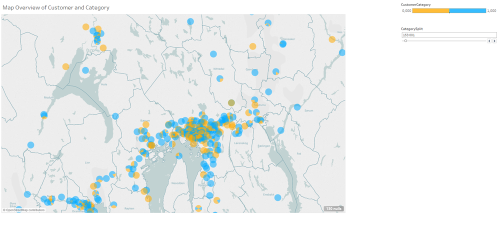
Here is how I eventually solved it using Tableau:
The user can use the slider to change the distribution of customers to each category. The distribution becomes visible in the map.
Can this be done in PowerBI as well somehow? I can imagine several scenarioes were I need to define a variable (in this case "CustomerCategory" using the if-function) in order to let the user perform "what-if" analysis.
Thanks
- Mark as New
- Bookmark
- Subscribe
- Mute
- Subscribe to RSS Feed
- Permalink
- Report Inappropriate Content
Hi @audune,
Could you please post a full table structure with sample data? And we need to know that which field you use to create the slicer in Power BI Desktop and if use the slicer to filter revenue.
Thanks,
Lydia Zhang
- Mark as New
- Bookmark
- Subscribe
- Mute
- Subscribe to RSS Feed
- Permalink
- Report Inappropriate Content
Here is the full table structure:
| CustomerID | Revenue | Lat | Lon |
| 100 | 100000 | 64,0266 | 11,4933 |
| 101 | 150000 | 64,0083 | 11,4952 |
| 102 | 200000 | 64,0083 | 11,4952 |
| 103 | 210000 | 64,0119 | 11,5062 |
I use the filter functionality to create two categories for revenue (that shows up in different colors in the map). The user defines the category split based on a slider for revenue (i.e. a filter).
- Mark as New
- Bookmark
- Subscribe
- Mute
- Subscribe to RSS Feed
- Permalink
- Report Inappropriate Content
Hi @audune,
Do you use category field to create a slicer and use the slicer to filter the map visual? If so, which table does the category field come from?
Thanks,
Lydia Zhang
Helpful resources

Power BI Monthly Update - November 2025
Check out the November 2025 Power BI update to learn about new features.

Fabric Data Days
Advance your Data & AI career with 50 days of live learning, contests, hands-on challenges, study groups & certifications and more!


