A new Data Days event is coming soon!
This time we’re going bigger than ever. Fabric, Power BI, SQL, AI and more. We're covering it all. You won't want to miss it.
Learn more- Power BI forums
- Get Help with Power BI
- Desktop
- Service
- Report Server
- Power Query
- Mobile Apps
- Developer
- DAX Commands and Tips
- Custom Visuals Development Discussion
- Health and Life Sciences
- Power BI Spanish forums
- Translated Spanish Desktop
- Training and Consulting
- Instructor Led Training
- Dashboard in a Day for Women, by Women
- Galleries
- Data Stories Gallery
- Themes Gallery
- Contests Gallery
- QuickViz Gallery
- Quick Measures Gallery
- Visual Calculations Gallery
- Notebook Gallery
- Translytical Task Flow Gallery
- TMDL Gallery
- R Script Showcase
- Webinars and Video Gallery
- Ideas
- Custom Visuals Ideas (read-only)
- Issues
- Issues
- Events
- Upcoming Events
Join the FabCon + SQLCon recap series. Up next: Power BI, Real-Time Intelligence, IQ and AI, and Data Factory take center stage. All sessions are available on-demand after the live show. Register now
- Power BI forums
- Forums
- Get Help with Power BI
- Service
- Re: Single Line Chart with multiple Colours
- Subscribe to RSS Feed
- Mark Topic as New
- Mark Topic as Read
- Float this Topic for Current User
- Bookmark
- Subscribe
- Printer Friendly Page
- Mark as New
- Bookmark
- Subscribe
- Mute
- Subscribe to RSS Feed
- Permalink
- Report Inappropriate Content
Single Line Chart with multiple Colours
Hello all and HAPPY FRIDAY!!!
I'm trying to create a line chart with a single line that has multiple colours to it. Ie. If the line goes up, its red, line goes down, its green, flat lined, yellow! I was expecting this would be as simple as changing the colours and setting up a conditional format like you can with the bar graphs buuuuuuuut, I'm only seeing a single colour selection for line charts.
Am I missing something here because this is something I thought was fairly common when it came to line charts!
Thnks for the response and have an awesome weekend!
Solved! Go to Solution.
- Mark as New
- Bookmark
- Subscribe
- Mute
- Subscribe to RSS Feed
- Permalink
- Report Inappropriate Content
Hi , @KilJhard
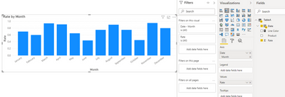
According to my research and testing, there is currently no official visual that supports dividing a line into multiple colors in a line chart in different situations, but as far as I know, the color of the data label corresponding to each line chart's data point is variable, you can simply refer to this example demo: you can first use your line according to your needs Write a measure in the context of the chart grouping to define the corresponding color for each data point, and then create a simple column chart:
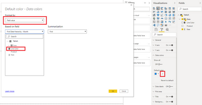
Then under Data colors, set up conditional formatting on the bars:
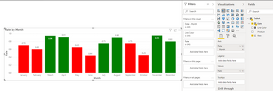
The result is like this:
Now switch the visual to a line chart.
Thank you for your time and sharing, and thank you for your support and understanding of PowerBI!
Best Regards,
Aniya Zhang
If this post helps, then please consider Accept it as the solution to help the other members find it more quickly
- Mark as New
- Bookmark
- Subscribe
- Mute
- Subscribe to RSS Feed
- Permalink
- Report Inappropriate Content
Thanks @v-yueyunzh-msft I had a feeling that was the case but just strange that it's not possible. Obviously something thats used reguarlly of line charts on a wide range of other applications. People love colours and seeing them change! 🙂
Helpful resources

Power BI Monthly Update - April 2026
Check out the April 2026 Power BI update to learn about new features.

New to Fabric Survey
If you have recently started exploring Fabric, we'd love to hear how it's going. Your feedback can help with product improvements.

Power BI DataViz World Championships - June 2026
A new Power BI DataViz World Championship is coming this June! Don't miss out on submitting your entry.

| User | Count |
|---|---|
| 12 | |
| 10 | |
| 10 | |
| 8 | |
| 7 |
| User | Count |
|---|---|
| 46 | |
| 34 | |
| 27 | |
| 20 | |
| 19 |


