Join us at FabCon Vienna from September 15-18, 2025
The ultimate Fabric, Power BI, SQL, and AI community-led learning event. Save €200 with code FABCOMM.
Get registered- Power BI forums
- Get Help with Power BI
- Desktop
- Service
- Report Server
- Power Query
- Mobile Apps
- Developer
- DAX Commands and Tips
- Custom Visuals Development Discussion
- Health and Life Sciences
- Power BI Spanish forums
- Translated Spanish Desktop
- Training and Consulting
- Instructor Led Training
- Dashboard in a Day for Women, by Women
- Galleries
- Data Stories Gallery
- Themes Gallery
- Contests Gallery
- Quick Measures Gallery
- Notebook Gallery
- Translytical Task Flow Gallery
- TMDL Gallery
- R Script Showcase
- Webinars and Video Gallery
- Ideas
- Custom Visuals Ideas (read-only)
- Issues
- Issues
- Events
- Upcoming Events
Compete to become Power BI Data Viz World Champion! First round ends August 18th. Get started.
- Power BI forums
- Forums
- Get Help with Power BI
- Service
- Re: Percentages not plotting properly on Charticul...
- Subscribe to RSS Feed
- Mark Topic as New
- Mark Topic as Read
- Float this Topic for Current User
- Bookmark
- Subscribe
- Printer Friendly Page
- Mark as New
- Bookmark
- Subscribe
- Mute
- Subscribe to RSS Feed
- Permalink
- Report Inappropriate Content
Percentages not plotting properly on Charticulator
Hi All,
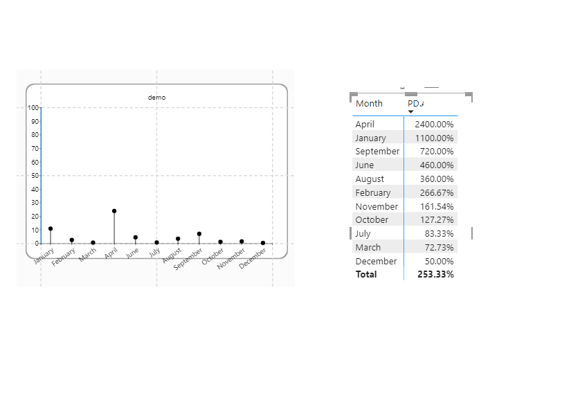
I am trying to plot a table in a chart I c reated on Charticulator but the issue I'm having is that it's plotting the numbers divided by 100. Please see below:
Any suggestions on how I can fix this. Thanks.
Solved! Go to Solution.
- Mark as New
- Bookmark
- Subscribe
- Mute
- Subscribe to RSS Feed
- Permalink
- Report Inappropriate Content
Solved. I went to tick format and typed the following:
{.0%}
Further reading can be found here:
https://charticulator.com/docs/user-interaction.html#text-formatting
- Mark as New
- Bookmark
- Subscribe
- Mute
- Subscribe to RSS Feed
- Permalink
- Report Inappropriate Content
Hey @HamidBee
It must be Charticulator day today, we've worked with it for months and not seen many questions here, now there's two in a day 😁
The issue here is between Data and Format. The column you're sending to Charticulator is formatted as a Percentage. That effectivly formats the underlying data by multiplying it by 100 and adding a % sign when it is displayed. Beyond the formatting the number is "24" but formatting as a percentage shows the number as "2400.00%". When you send the data values to Charticulator it sees the data but not the formatting, so it sees "24" etc. and graphs that.
To see the same values in both PowerBI and charticulator you can..
A) remove the formatting from the Precentage column or measure (In either Column or Measure tools set the format to "Decimal Number" rather than "Percentage". Or...
B) Create a value multiplied by 100 for Charticulator to use. If you're using a Column this would be simply ChartCol=MyColumn] * 100 as a calculated column, if it's a measure it may be more complex depending on the measure and the filter context, but you can try ChartNo=SUM[MyMeasure] * 100.
Either way what you're seeing is formatted data on the report canvas, Charticulator doesn't see that it sees the raw unformatted number.
Hope this helps
Stuart
- Mark as New
- Bookmark
- Subscribe
- Mute
- Subscribe to RSS Feed
- Permalink
- Report Inappropriate Content
Hi Stuart,
Thank you for your detailed response. It's encouraging to see the wealth of knowledge people have in this forum. I look forward to reading your book someday please keep me posted. I've used Python visuals in BI. I was really impressed with the level of freedom one has on it. But, filters and drill downs just aren't compatible on Python visuals. The fact that they are compatible on Charticulator makes it a grand slam for me. Although they do need to fix their user interface it is prone to glitches. I'm confident that will come with time though.
I came across another issue, It really is Charticulator day!
https://community.powerbi.com/t5/Service/The-categories-on-the-chart-suddenly-became-disorganised-as...
- Mark as New
- Bookmark
- Subscribe
- Mute
- Subscribe to RSS Feed
- Permalink
- Report Inappropriate Content
Solved. I went to tick format and typed the following:
{.0%}
Further reading can be found here:
https://charticulator.com/docs/user-interaction.html#text-formatting
Helpful resources
| User | Count |
|---|---|
| 38 | |
| 14 | |
| 12 | |
| 11 | |
| 8 |
| User | Count |
|---|---|
| 49 | |
| 35 | |
| 22 | |
| 21 | |
| 18 |


