Huge last-minute discounts for FabCon Vienna from September 15-18, 2025
Supplies are limited. Contact info@espc.tech right away to save your spot before the conference sells out.
Get your discount- Power BI forums
- Get Help with Power BI
- Desktop
- Service
- Report Server
- Power Query
- Mobile Apps
- Developer
- DAX Commands and Tips
- Custom Visuals Development Discussion
- Health and Life Sciences
- Power BI Spanish forums
- Translated Spanish Desktop
- Training and Consulting
- Instructor Led Training
- Dashboard in a Day for Women, by Women
- Galleries
- Data Stories Gallery
- Themes Gallery
- Contests Gallery
- Quick Measures Gallery
- Notebook Gallery
- Translytical Task Flow Gallery
- TMDL Gallery
- R Script Showcase
- Webinars and Video Gallery
- Ideas
- Custom Visuals Ideas (read-only)
- Issues
- Issues
- Events
- Upcoming Events
Score big with last-minute savings on the final tickets to FabCon Vienna. Secure your discount
- Power BI forums
- Forums
- Get Help with Power BI
- Service
- Re: Issue with personalizing visuals in the worksp...
- Subscribe to RSS Feed
- Mark Topic as New
- Mark Topic as Read
- Float this Topic for Current User
- Bookmark
- Subscribe
- Printer Friendly Page
- Mark as New
- Bookmark
- Subscribe
- Mute
- Subscribe to RSS Feed
- Permalink
- Report Inappropriate Content
Issue with personalizing visuals in the workspace
I have begun to tinker around with the new-ish feature of allowing end users to personalize visuals. I think it's an incredibly powerful idea, but I've run into somewhat of an issue that either I cannot figure out or is what I will consider to be a bug with the implementation of the personalize feature. I'm hoping someone here can help me identify which is the case.
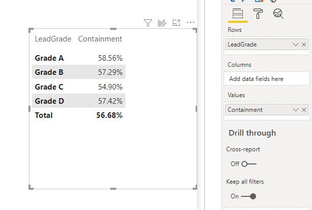
What I've found is that when personalizing a visual, the attributes that you select to add/replace in a visual do not seem to retain the sorting based on other columns as if you had simply edited the visual in the desktop app or used the workspace to edit the visual as a report owner. As an example, below you will see a screengrab of a simple matrix that gives totals for different Grade qualities.
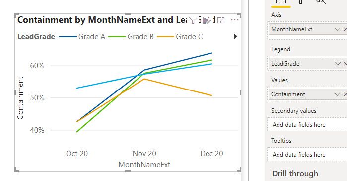
Nothing crazy going on with this visual. However, if I wanted to see what this containment value was like for these grade qualities over the past few months, I can do that by adding in my month names from my datedim table and changing it to a line chart.
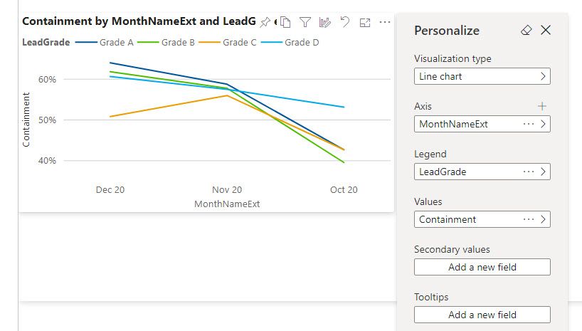
Nothing about this will rock your world, but its accurate. In my data model, I have the MonthNameExt column sorted by my MonthKey column. This results in a logical month order in my chart instead of an alphabetical order. Here is where my issue comes in. If I try to recreate this by using the personalize feature in the published report, this is what happens:
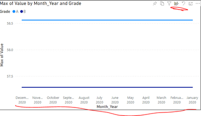
You will notice now that the months, while seemingly being in reverse chronological order and thus making this small view still easily interpreted, are in alphabetic order with no apparent way to adjust the sort of that axis. I've tried this with other fields in my data and the same trend seems to emerge: using a new field results in a basic numerical or alphabetical sort order.
All of this is a long winded way to ask: Am I crazy or is this a very big limitation of the personalize feature? If fields can't hold onto the sort order from the data model, this personalize feature just lost a huge amount of potential for me. I am hoping I'm wrong and there is something obvious, or not obvious, that has escaped me. Any guidance is appreciated. Thanks so much.
- Mark as New
- Bookmark
- Subscribe
- Mute
- Subscribe to RSS Feed
- Permalink
- Report Inappropriate Content
Hi @bdmichael09 ,
This is strange, the "Sort by column" feature works on the data model, so it should also work on the personal visual.
What's your Power BI Desktop version? Try to update to latest version.
Try to publish my .pbix file to the Service and create a personal visual and see if you can use the "Sort by column" feature.
Best regards,
Lionel Chen
If this post helps, then please consider Accept it as the solution to help the other members find it more quickly.
- Mark as New
- Bookmark
- Subscribe
- Mute
- Subscribe to RSS Feed
- Permalink
- Report Inappropriate Content
Hi @bdmichael09 ,
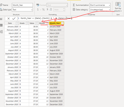
Did you use the 'Sort by column' feature?
As tested, the ‘Sort by column’ feature is still effective in personal visual.
Best regards,
Lionel Chen
If this post helps, then please consider Accept it as the solution to help the other members find it more quickly.
- Mark as New
- Bookmark
- Subscribe
- Mute
- Subscribe to RSS Feed
- Permalink
- Report Inappropriate Content
Hello,
Yes I did use Sort by Column in the desktop app. You can see from the visuals posted that it works as intended in the desktop app but it doesn't seem to persist to the personalize visual feature. That is my issue. I tried alternate fields as my axis in the personalized visual and those too would only be output in alphabetic/numerical order, despite having sorted the field by another column.
