Join us at FabCon Vienna from September 15-18, 2025
The ultimate Fabric, Power BI, SQL, and AI community-led learning event. Save €200 with code FABCOMM.
Get registered- Power BI forums
- Get Help with Power BI
- Desktop
- Service
- Report Server
- Power Query
- Mobile Apps
- Developer
- DAX Commands and Tips
- Custom Visuals Development Discussion
- Health and Life Sciences
- Power BI Spanish forums
- Translated Spanish Desktop
- Training and Consulting
- Instructor Led Training
- Dashboard in a Day for Women, by Women
- Galleries
- Data Stories Gallery
- Themes Gallery
- Contests Gallery
- Quick Measures Gallery
- Notebook Gallery
- Translytical Task Flow Gallery
- TMDL Gallery
- R Script Showcase
- Webinars and Video Gallery
- Ideas
- Custom Visuals Ideas (read-only)
- Issues
- Issues
- Events
- Upcoming Events
Enhance your career with this limited time 50% discount on Fabric and Power BI exams. Ends September 15. Request your voucher.
- Power BI forums
- Forums
- Get Help with Power BI
- Service
- Re: How do you change the data label number format...
- Subscribe to RSS Feed
- Mark Topic as New
- Mark Topic as Read
- Float this Topic for Current User
- Bookmark
- Subscribe
- Printer Friendly Page
- Mark as New
- Bookmark
- Subscribe
- Mute
- Subscribe to RSS Feed
- Permalink
- Report Inappropriate Content
How do you change the data label number format in Power BI Charts?
I can't seem to find out how to change the number formatting for data labels in Power BI charts. It seems to only have the format of "#.##k" (e.g. 100,000 is displayed as 100k).
I have to be overlooking something; this can't be the only data label number format...
Thanks for your help!
Solved! Go to Solution.
- Mark as New
- Bookmark
- Subscribe
- Mute
- Subscribe to RSS Feed
- Permalink
- Report Inappropriate Content
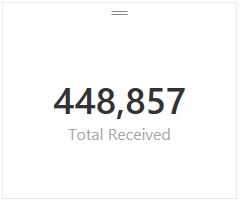
I tried the following with one of my calcuations in "Power BI Desktop" and I was able to get the type of formatting that you were looking for vs. the default #.##K type formatting you had in your screenshot. Unfortuneatly that only works for card style tyles since it changes the numeric format to text (And text style calcs can't be used in bar graphs and other charts)
Total Received = FORMAT(SUM(Receipts[Receipts]),"#,###") -- This measure formula rendered like this:
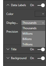
Based on the current version the only changes you can make to label formatting for measures are the following:
Hope this helped. I would expect that we'll see more control for formatting in a future build at some point although I don't know when that will happen.
- Mark as New
- Bookmark
- Subscribe
- Mute
- Subscribe to RSS Feed
- Permalink
- Report Inappropriate Content
This saved me. Thanks.
- Mark as New
- Bookmark
- Subscribe
- Mute
- Subscribe to RSS Feed
- Permalink
- Report Inappropriate Content
This was really helpful. Do you know how can we format multiple columns in Power BI through a single querry?
- Mark as New
- Bookmark
- Subscribe
- Mute
- Subscribe to RSS Feed
- Permalink
- Report Inappropriate Content
I cannot find where, but I read that for the moment it is not possible to skip the auto format/scaling of data in charts.
Pretty much the same pain is described here


