FabCon is coming to Atlanta
Join us at FabCon Atlanta from March 16 - 20, 2026, for the ultimate Fabric, Power BI, AI and SQL community-led event. Save $200 with code FABCOMM.
Register now!- Power BI forums
- Get Help with Power BI
- Desktop
- Service
- Report Server
- Power Query
- Mobile Apps
- Developer
- DAX Commands and Tips
- Custom Visuals Development Discussion
- Health and Life Sciences
- Power BI Spanish forums
- Translated Spanish Desktop
- Training and Consulting
- Instructor Led Training
- Dashboard in a Day for Women, by Women
- Galleries
- Data Stories Gallery
- Themes Gallery
- Contests Gallery
- QuickViz Gallery
- Quick Measures Gallery
- Visual Calculations Gallery
- Notebook Gallery
- Translytical Task Flow Gallery
- TMDL Gallery
- R Script Showcase
- Webinars and Video Gallery
- Ideas
- Custom Visuals Ideas (read-only)
- Issues
- Issues
- Events
- Upcoming Events
The Power BI Data Visualization World Championships is back! Get ahead of the game and start preparing now! Learn more
- Power BI forums
- Forums
- Get Help with Power BI
- Service
- Re: Guage visual does not display properly once pu...
- Subscribe to RSS Feed
- Mark Topic as New
- Mark Topic as Read
- Float this Topic for Current User
- Bookmark
- Subscribe
- Printer Friendly Page
- Mark as New
- Bookmark
- Subscribe
- Mute
- Subscribe to RSS Feed
- Permalink
- Report Inappropriate Content
Guage visual does not display properly once published
My dashboard looks how I want it to, and the guages are all shaded in to the desired amount. However, once I publish the file to the web, the guage visuals in particular seem to readjust and show completely shaded in rather than stopping at the desired spot. Does anyone know how I can fix this or what the cause could be? Like I said, it displays properly when I open the file locally within PowerBI, and only gets disoriented once published.
Solved! Go to Solution.
- Mark as New
- Bookmark
- Subscribe
- Mute
- Subscribe to RSS Feed
- Permalink
- Report Inappropriate Content
Yes, this was my issue. However, I think the error was caused by me using the same field for Max Value and Target Value. In Power BI Service, the chart got misaligned. Once I changed the values to two different fields, the problem was resolved. Thank you for responding.
- Mark as New
- Bookmark
- Subscribe
- Mute
- Subscribe to RSS Feed
- Permalink
- Report Inappropriate Content
Hi @brianwei,
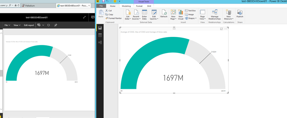
Do you view differences between Guage chart of Power BI Desktop and Guage chart of Power BI Service? If that is the case, I am not able to reproduce your issue. When I publish Guage chart to Power BI service, everything works well, the chart renders same in Power BI Desktop and Service, below is my screenshot.
Could you please share sample data of your scenario and describe details about how to create the Guage visual?
Thanks,
Lydia Zhang
- Mark as New
- Bookmark
- Subscribe
- Mute
- Subscribe to RSS Feed
- Permalink
- Report Inappropriate Content
Yes, this was my issue. However, I think the error was caused by me using the same field for Max Value and Target Value. In Power BI Service, the chart got misaligned. Once I changed the values to two different fields, the problem was resolved. Thank you for responding.
- Mark as New
- Bookmark
- Subscribe
- Mute
- Subscribe to RSS Feed
- Permalink
- Report Inappropriate Content
@brianwei Unless you choose to have RISK, Security etc on y-axis and company / audit on x-axis you will have to choose to drill-down for the visuals.
Helpful resources

Power BI Monthly Update - November 2025
Check out the November 2025 Power BI update to learn about new features.

Fabric Data Days
Advance your Data & AI career with 50 days of live learning, contests, hands-on challenges, study groups & certifications and more!


