- Power BI forums
- Updates
- News & Announcements
- Get Help with Power BI
- Desktop
- Service
- Report Server
- Power Query
- Mobile Apps
- Developer
- DAX Commands and Tips
- Custom Visuals Development Discussion
- Health and Life Sciences
- Power BI Spanish forums
- Translated Spanish Desktop
- Power Platform Integration - Better Together!
- Power Platform Integrations (Read-only)
- Power Platform and Dynamics 365 Integrations (Read-only)
- Training and Consulting
- Instructor Led Training
- Dashboard in a Day for Women, by Women
- Galleries
- Community Connections & How-To Videos
- COVID-19 Data Stories Gallery
- Themes Gallery
- Data Stories Gallery
- R Script Showcase
- Webinars and Video Gallery
- Quick Measures Gallery
- 2021 MSBizAppsSummit Gallery
- 2020 MSBizAppsSummit Gallery
- 2019 MSBizAppsSummit Gallery
- Events
- Ideas
- Custom Visuals Ideas
- Issues
- Issues
- Events
- Upcoming Events
- Community Blog
- Power BI Community Blog
- Custom Visuals Community Blog
- Community Support
- Community Accounts & Registration
- Using the Community
- Community Feedback
Register now to learn Fabric in free live sessions led by the best Microsoft experts. From Apr 16 to May 9, in English and Spanish.
- Power BI forums
- Forums
- Get Help with Power BI
- Service
- Re: Format percentage 9,9,9%
- Subscribe to RSS Feed
- Mark Topic as New
- Mark Topic as Read
- Float this Topic for Current User
- Bookmark
- Subscribe
- Printer Friendly Page
- Mark as New
- Bookmark
- Subscribe
- Mute
- Subscribe to RSS Feed
- Permalink
- Report Inappropriate Content
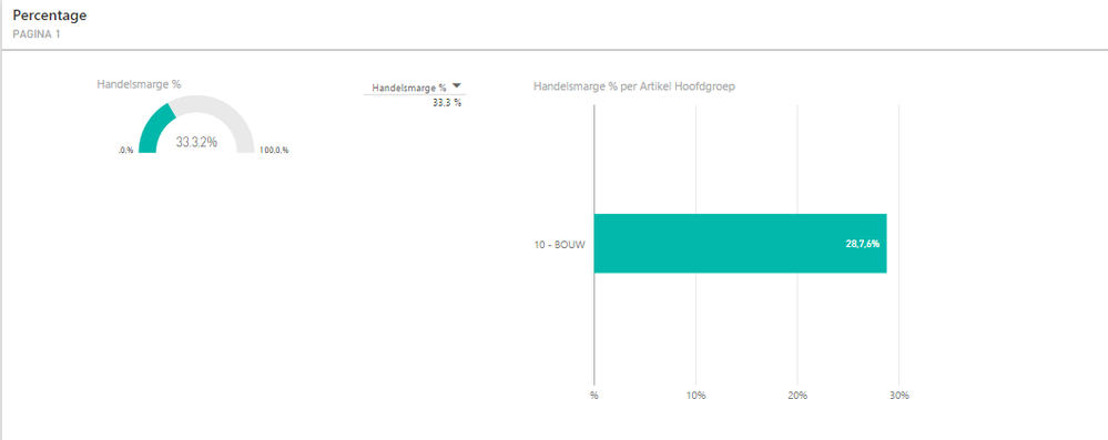
Format percentage 9,9,9%
Since today the format of percentage measures has changed.
It shows 9,9,9% instead of 9,99%.
Anyone facing this issue?
- Mark as New
- Bookmark
- Subscribe
- Mute
- Subscribe to RSS Feed
- Permalink
- Report Inappropriate Content
@v-yuezhe-msft How can we move forward on getting this fixed? Do I need to open a support issue or is the Power BI Team already aware of this issue?
- Mark as New
- Bookmark
- Subscribe
- Mute
- Subscribe to RSS Feed
- Permalink
- Report Inappropriate Content
@rayz I have raised an ticket at Power BI Basic support. It's not a paid support ticket so the priority is not that high.
- Mark as New
- Bookmark
- Subscribe
- Mute
- Subscribe to RSS Feed
- Permalink
- Report Inappropriate Content
- Mark as New
- Bookmark
- Subscribe
- Mute
- Subscribe to RSS Feed
- Permalink
- Report Inappropriate Content
It looks like a localization/language problem; if I switch the Power BI language from Dutch to English, the percentages are displayed correctly.
- Mark as New
- Bookmark
- Subscribe
- Mute
- Subscribe to RSS Feed
- Permalink
- Report Inappropriate Content
I am also facing this problem. Changing the language from dutch to english seem to be a workaround. I'm assuming Microsoft made some behind the scene changes which is causing this.
- Mark as New
- Bookmark
- Subscribe
- Mute
- Subscribe to RSS Feed
- Permalink
- Report Inappropriate Content
Hi @joostraaphorst,
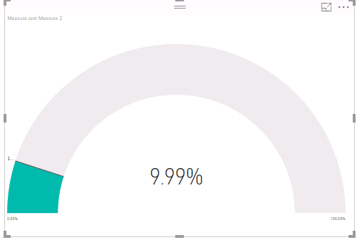
I am not able to reproduce your issue. When I view Gauge Chart in Power BI Desktop and Power BI Service, the percentage measure displays properly as follows. Do you use the latest version of Power BI Desktop(2.37.4464.602) to create Gauge Chart? How do you create your percentage measure?
Thanks,
Lydia Zhang
If this post helps, then please consider Accept it as the solution to help the other members find it more quickly.
- Mark as New
- Bookmark
- Subscribe
- Mute
- Subscribe to RSS Feed
- Permalink
- Report Inappropriate Content
Hi Lydia,
i am facing exactly the same problem with 3 of my (Dutch) customers and my own dashboards. The same problem is also there with the latest Power BI version (2.38.4491.282).
Is there any more information available? 1 of my customers is testing the Board dashboards right now and this was een unpleasant suprise!
- Mark as New
- Bookmark
- Subscribe
- Mute
- Subscribe to RSS Feed
- Permalink
- Report Inappropriate Content
I am currently in the proces of examining the issue with Microsoft. A recent reply i've got indicates that the problem is broad:
Quote:
Microsoft wrote:
Hello Sander,
The issue seems to be known but I would like to do some tests and investigations. Hence please advise your feedback for the questions below.
Unfortunatly i dont have the time to reply Microsoft untill monday, so no solution yet.
- Mark as New
- Bookmark
- Subscribe
- Mute
- Subscribe to RSS Feed
- Permalink
- Report Inappropriate Content
Hi Sander,
Thanx for the update! Good to hear that the problem is under investigation. Happy to hear when there is more information available!
- Mark as New
- Bookmark
- Subscribe
- Mute
- Subscribe to RSS Feed
- Permalink
- Report Inappropriate Content
"Hello Sander,
Hope you are enjoying the weekend. I have communicated with my internal resources and this is a known issue. The product team are currently working on the fix. I will follow up and update you whenever it is resolved. It is needless to keep the case open so I will go ahead and archive it.
Kind regards"
Hoping for a quick fix soon.
- Mark as New
- Bookmark
- Subscribe
- Mute
- Subscribe to RSS Feed
- Permalink
- Report Inappropriate Content
I hope all is well. I called earlier and left a voicemail. It has been confirmed that this is a Product defect. The ETA for the fix is end of September (with the release of PBI Desktop for September). A workaround could be setting three digits of precision for your percent format should cause the commas to align correctly.
I will proceed with closing this ticket at this time. Please feel free to reach out to me if you have any questions. Thanks very much for your patience on this matter.
Sincerely
Wilfred Adelowo
- Mark as New
- Bookmark
- Subscribe
- Mute
- Subscribe to RSS Feed
- Permalink
- Report Inappropriate Content
Thanx for the update Joost!
- Mark as New
- Bookmark
- Subscribe
- Mute
- Subscribe to RSS Feed
- Permalink
- Report Inappropriate Content
Hi Lydia,
thanks for your reaction.
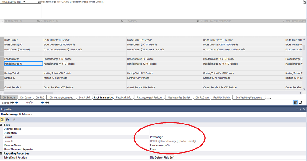
Our dataset is a SSAS tabular model, where we have defined the format of the percentage with 1 decimal.
We are not using Power BI Desktop. We build the dashboard in the PowerBI app in Office 365.
When we select the measure in a table it shows up correct, but in a visual it shows up with 2 decimals and an extra decimal point.
- Mark as New
- Bookmark
- Subscribe
- Mute
- Subscribe to RSS Feed
- Permalink
- Report Inappropriate Content

@v-yuezhe-msft It seems not limited to the gauge visual. I have this problem in the Scroller visual and the line chart visual. In my case the measure is a DAX measure that is formatted as percentage with 2 decimals by Power BI. If you view the data table of the visual, the percentages look fine
- Mark as New
- Bookmark
- Subscribe
- Mute
- Subscribe to RSS Feed
- Permalink
- Report Inappropriate Content
I also have this issue as of today. It only seems to appear in the web application and only affects percentages.
Helpful resources

Microsoft Fabric Learn Together
Covering the world! 9:00-10:30 AM Sydney, 4:00-5:30 PM CET (Paris/Berlin), 7:00-8:30 PM Mexico City

Power BI Monthly Update - April 2024
Check out the April 2024 Power BI update to learn about new features.

| User | Count |
|---|---|
| 58 | |
| 20 | |
| 18 | |
| 18 | |
| 9 |


