A new Data Days event is coming soon!
This time we’re going bigger than ever. Fabric, Power BI, SQL, AI and more. We're covering it all. You won't want to miss it.
Learn more- Power BI forums
- Get Help with Power BI
- Desktop
- Service
- Report Server
- Power Query
- Mobile Apps
- Developer
- DAX Commands and Tips
- Custom Visuals Development Discussion
- Health and Life Sciences
- Power BI Spanish forums
- Translated Spanish Desktop
- Training and Consulting
- Instructor Led Training
- Dashboard in a Day for Women, by Women
- Galleries
- Data Stories Gallery
- Themes Gallery
- Contests Gallery
- QuickViz Gallery
- Quick Measures Gallery
- Visual Calculations Gallery
- Notebook Gallery
- Translytical Task Flow Gallery
- TMDL Gallery
- R Script Showcase
- Webinars and Video Gallery
- Ideas
- Custom Visuals Ideas (read-only)
- Issues
- Issues
- Events
- Upcoming Events
Level up your Power BI skills this month - build one visual each week and tell better stories with data! Get started
- Power BI forums
- Forums
- Get Help with Power BI
- Service
- Filters on multiple 'count' values
- Subscribe to RSS Feed
- Mark Topic as New
- Mark Topic as Read
- Float this Topic for Current User
- Bookmark
- Subscribe
- Printer Friendly Page
- Mark as New
- Bookmark
- Subscribe
- Mute
- Subscribe to RSS Feed
- Permalink
- Report Inappropriate Content
Filters on multiple 'count' values
Hello everyone!
I'm brand new to the Power BI world and have been watching various videos to try and broaden my knowledge of the program and its capabilities, but I seem to have crossed a situation that I can't seem to find answers for. Hoping that someone here can help me out.
I'm attempting to create a report on our monthly audits that are performed at my company. My desire is to use a donut chart to showcase the various development opportunities our group being audited missed for the previous month (i.e. CD 1: Empathy, CD 2: Recap Arrangements, CD 3: Talk Over, etc.) These fields are given either a 'Pass' or 'Fail' by our QA team in the SharePoint form, and I would like to showcase the total number of fails for each particular Call Development, allowing us to show where we may need to focus our trianing efforts for the coming month.
Thus far I've been able to create a donut chart, but each category is only providing the total number of audits that were performed across the board, as seen below with the 944 number, with each Call Development category broken up into its own even section.
I have added a filter for each of these Call Development sections, and when I open up each individual CD, I can see that there were 5 fails for CD 1 last month, which is what I want to show in the donut chart. But when I select 'Fail' as the filter, it changes every single area to 5 as you can see below.
As I mentioned above, my desire would be to see the total number of fails for each area in the donut chart (i.e. CD 1: 5 fails; CD 2: 0 fails; CD 3: 12 fails; CD 4: 8 fails; CD 5: 2 fails; CD 6: 15 fails) and have the chart appropriate showcase where our biggest area of opportunity was. Is this possible with a donut chart? Am I utilizing the Visual level filters improperly? If so, what can I use to provide the desired results in my report? I appreciate any and all help in advance!
Solved! Go to Solution.
- Mark as New
- Bookmark
- Subscribe
- Mute
- Subscribe to RSS Feed
- Permalink
- Report Inappropriate Content
Hi @Anonymous,
Based on my test, you could refer to below steps:
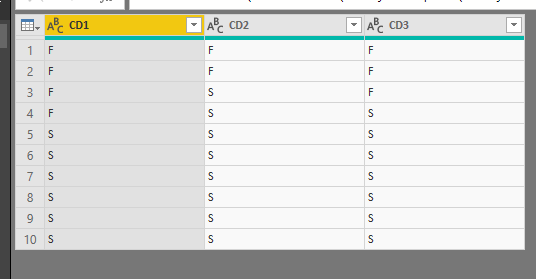
Sample data:
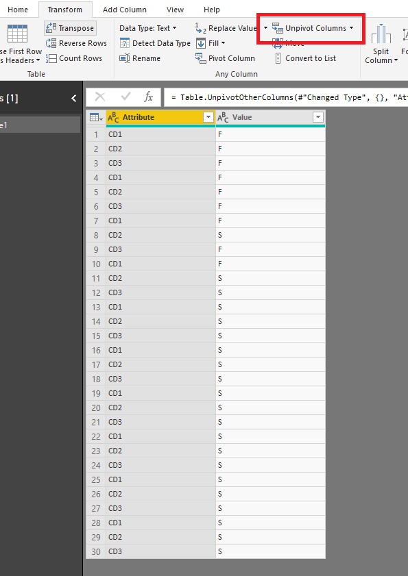
Unpivot all columns in query editor:
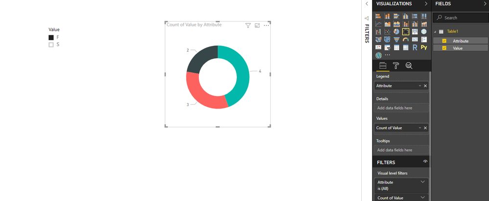
Create a Donut chart and use the [Value] as slicer:
You could also download the pbix file to have a view.
Regards,
Daniel He
If this post helps, then please consider Accept it as the solution to help the other members find it more quickly.
- Mark as New
- Bookmark
- Subscribe
- Mute
- Subscribe to RSS Feed
- Permalink
- Report Inappropriate Content
Hi @Anonymous,
Could you please tell me if your problem has been solved? If it is, could you please mark the helpful replies as Answered?
Regards,
Daniel He
If this post helps, then please consider Accept it as the solution to help the other members find it more quickly.
- Mark as New
- Bookmark
- Subscribe
- Mute
- Subscribe to RSS Feed
- Permalink
- Report Inappropriate Content
Hi @Anonymous,
Based on my test, you could refer to below steps:
Sample data:
Unpivot all columns in query editor:
Create a Donut chart and use the [Value] as slicer:
You could also download the pbix file to have a view.
Regards,
Daniel He
If this post helps, then please consider Accept it as the solution to help the other members find it more quickly.
Helpful resources

Power BI Monthly Update - April 2026
Check out the April 2026 Power BI update to learn about new features.

Data Days 2026 coming soon!
Sign up to receive a private message when registration opens and key events begin.

New to Fabric Survey
If you have recently started exploring Fabric, we'd love to hear how it's going. Your feedback can help with product improvements.

| User | Count |
|---|---|
| 11 | |
| 9 | |
| 9 | |
| 7 | |
| 6 |
| User | Count |
|---|---|
| 38 | |
| 27 | |
| 25 | |
| 22 | |
| 22 |


