FabCon is coming to Atlanta
Join us at FabCon Atlanta from March 16 - 20, 2026, for the ultimate Fabric, Power BI, AI and SQL community-led event. Save $200 with code FABCOMM.
Register now!- Power BI forums
- Get Help with Power BI
- Desktop
- Service
- Report Server
- Power Query
- Mobile Apps
- Developer
- DAX Commands and Tips
- Custom Visuals Development Discussion
- Health and Life Sciences
- Power BI Spanish forums
- Translated Spanish Desktop
- Training and Consulting
- Instructor Led Training
- Dashboard in a Day for Women, by Women
- Galleries
- Data Stories Gallery
- Themes Gallery
- Contests Gallery
- QuickViz Gallery
- Quick Measures Gallery
- Visual Calculations Gallery
- Notebook Gallery
- Translytical Task Flow Gallery
- TMDL Gallery
- R Script Showcase
- Webinars and Video Gallery
- Ideas
- Custom Visuals Ideas (read-only)
- Issues
- Issues
- Events
- Upcoming Events
The Power BI Data Visualization World Championships is back! Get ahead of the game and start preparing now! Learn more
- Power BI forums
- Forums
- Get Help with Power BI
- Service
- Re: Continuous axis publishing as categorical
- Subscribe to RSS Feed
- Mark Topic as New
- Mark Topic as Read
- Float this Topic for Current User
- Bookmark
- Subscribe
- Printer Friendly Page
- Mark as New
- Bookmark
- Subscribe
- Mute
- Subscribe to RSS Feed
- Permalink
- Report Inappropriate Content
Continuous axis publishing as categorical
I refresh a report weekly and have been doing this for 10 months. I have a graph using the continuous x-axis type and never had a problem. Suddenly today, when I published, the published version doesn't look at all like my desktop version. The published version looks like the x-axis has been changed to categorical. Is this a bug? Is anyone else experiencing this?
Solved! Go to Solution.
- Mark as New
- Bookmark
- Subscribe
- Mute
- Subscribe to RSS Feed
- Permalink
- Report Inappropriate Content
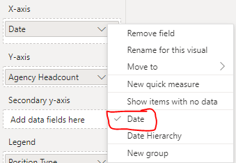
Thanks to all for the responses. I am using the Aug. 2022 version of PowerBI. I also tried taking the legend off. Nothing seemed to fix it. I spent hours trying different things. What finally fixed it for me was changing the date on the x-axis from "date hierarchy" to "date". It has been on hierarchy for 10 months, so not sure why this doesn't work anymore. Anyway, this workaround fixed my issue. Hope it helps others.
- Mark as New
- Bookmark
- Subscribe
- Mute
- Subscribe to RSS Feed
- Permalink
- Report Inappropriate Content
This is still a legit issue with the service. I am contacting my admin to get a PowerBI Pro ticket made, its a real shame that Microsoft is happy to ignore the forums wehn it is not convenient.
The bug can be replicated according to an earlier post I made:
X Axis continuous to categroical bug on publish - ... - Microsoft Power BI Community
- Mark as New
- Bookmark
- Subscribe
- Mute
- Subscribe to RSS Feed
- Permalink
- Report Inappropriate Content
Hello, unfortunately it's not fixed..
Helpful resources

Power BI Dataviz World Championships
The Power BI Data Visualization World Championships is back! Get ahead of the game and start preparing now!


