FabCon is coming to Atlanta
Join us at FabCon Atlanta from March 16 - 20, 2026, for the ultimate Fabric, Power BI, AI and SQL community-led event. Save $200 with code FABCOMM.
Register now!- Power BI forums
- Get Help with Power BI
- Desktop
- Service
- Report Server
- Power Query
- Mobile Apps
- Developer
- DAX Commands and Tips
- Custom Visuals Development Discussion
- Health and Life Sciences
- Power BI Spanish forums
- Translated Spanish Desktop
- Training and Consulting
- Instructor Led Training
- Dashboard in a Day for Women, by Women
- Galleries
- Data Stories Gallery
- Themes Gallery
- Contests Gallery
- QuickViz Gallery
- Quick Measures Gallery
- Visual Calculations Gallery
- Notebook Gallery
- Translytical Task Flow Gallery
- TMDL Gallery
- R Script Showcase
- Webinars and Video Gallery
- Ideas
- Custom Visuals Ideas (read-only)
- Issues
- Issues
- Events
- Upcoming Events
The Power BI Data Visualization World Championships is back! Get ahead of the game and start preparing now! Learn more
- Power BI forums
- Forums
- Get Help with Power BI
- Service
- Re: Concatenate Labels option does nothing?
- Subscribe to RSS Feed
- Mark Topic as New
- Mark Topic as Read
- Float this Topic for Current User
- Bookmark
- Subscribe
- Printer Friendly Page
- Mark as New
- Bookmark
- Subscribe
- Mute
- Subscribe to RSS Feed
- Permalink
- Report Inappropriate Content
Concatenate Labels option does nothing?
Using this option in the service, I don't get any change to take place.
I'm using the area chart.
Anyone else have this issue?
I have Year, then Month in a hierarchy... expanding out still shows 2016 04 not a box with 2016 then inside/above/whatever all the months.
- Mark as New
- Bookmark
- Subscribe
- Mute
- Subscribe to RSS Feed
- Permalink
- Report Inappropriate Content
- Mark as New
- Bookmark
- Subscribe
- Mute
- Subscribe to RSS Feed
- Permalink
- Report Inappropriate Content
Thank you @OneWithQuestion for pointing towards the right direction to solve the problem:
Concatenate Labels option works for the following scenario:
[1] When you first select your clustered column chart and then add your entry to the "value" and then add your fields to the "axis" and then switch your formatting "concatenate label" off
[2] without selecting a chart type, you first select the fields for the "axis" (e.g. month, quarter, year) and then select the measure for value e.g. units sold and then switch your formatting "concatenate label" off
Concatenate Labels option does not work for the following scenario:
without selecting a chart type, you first select the measure for "value" e.g. units sold and then select the fields for the "axis" (e.g. month, uarter, year) and then switch your formatting "concatenate label" off - (nothing happens)
- to me this looks like a bug
I hope that i have been clear on how to work around this problem. I have tested the above 3 appoaches a few times
- Mark as New
- Bookmark
- Subscribe
- Mute
- Subscribe to RSS Feed
- Permalink
- Report Inappropriate Content
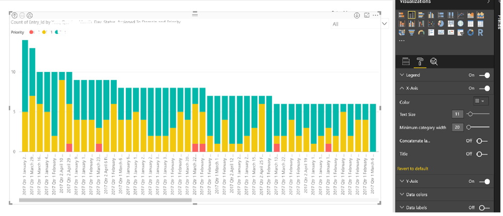
I tried to follow the workaround earlier, but this basic functionality is still broken? See screenshot. I'm using the April update.
- Mark as New
- Bookmark
- Subscribe
- Mute
- Subscribe to RSS Feed
- Permalink
- Report Inappropriate Content
@sykr0n did you do the following order:
step 1: select the stacked columns chart (do not select the fields before selecting the charts)
step 2: select the entry for the "value" field
step 3: select the multiple fields for the "Axis"
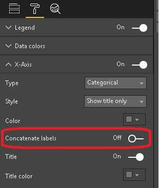
step 4: go to formatting --> x axis --> switch concatenate label to off
- Mark as New
- Bookmark
- Subscribe
- Mute
- Subscribe to RSS Feed
- Permalink
- Report Inappropriate Content
@Anonymous
I just tried the workaround and it still doesn't work. By the way, I'm using the Power BI Desktop client (April Update), not the service. Maybe, it's working in the online service?
- Mark as New
- Bookmark
- Subscribe
- Mute
- Subscribe to RSS Feed
- Permalink
- Report Inappropriate Content
- Mark as New
- Bookmark
- Subscribe
- Mute
- Subscribe to RSS Feed
- Permalink
- Report Inappropriate Content
I kept trying and it looks like for "Concatenate Labels" off to work correctly and show the hierarchy of X-Axis fields, you have to also make sure the chart is NOT sorted by the Value field or by an X-Axis field that is different than the one you have drilled down to. Not sure if the the behavior seemed to be more clear/consistent/intuitive or it's just gotten more complicated with more features.
- Mark as New
- Bookmark
- Subscribe
- Mute
- Subscribe to RSS Feed
- Permalink
- Report Inappropriate Content
- Mark as New
- Bookmark
- Subscribe
- Mute
- Subscribe to RSS Feed
- Permalink
- Report Inappropriate Content
Hi @OneWithQuestion and @sykr0n
The tests i carried out were on power bi desktop. Latest April Version: 2.45.4704.442 64-bit (April 2017)
Have you tried to follow the steps in the exact order to produce the chart as I have provided in the scenarios that worked?
My tests were carried with a simple revenue column in a sales fact table; and month, quarter , year in a date dimension table.
I was able to reproduce the bug and also the work around - multiple times.
following steps produce bug:
I have found that whilst in "report" screen/tab, when you select a measure e.g. sales value before selecting any chart type, power bi automatically selects the "clustered column chart" and then when you select the fields for the "axis", e.g. the month, quarter, year then when you go to formatting to switch off "concatenate label" under "x -axis" then nothing happens. This is the steps that produce the bug.
work around:
So do not do the above. Instead First select the chart (e.g. clustered columns chart) and then select your measure for the "value" field and the columns for the "axis" fields. then when you go to formatting to switch off "concatenate label" under "x -axis" - it works. The order in which you create the chart is important to avoid the bug.
I hope I have left no confusion in the steps. if you wish to call me then pm annd i will provide my number.
- Mark as New
- Bookmark
- Subscribe
- Mute
- Subscribe to RSS Feed
- Permalink
- Report Inappropriate Content
this feature ist still bugy! 😞 Tested with May 2017 release 2.46.4732
- Mark as New
- Bookmark
- Subscribe
- Mute
- Subscribe to RSS Feed
- Permalink
- Report Inappropriate Content
I cannot get concatenation to turn off - I followed your instructions exactly and it worked for two tests where I drilled into a column on a clustered column chart. After this, it then reverted back to concatenation so the x axis titles are meaningless. Even when this did work, it put the highest level label at the bottom of the chart and the 2nd level label as the x axis. When I drilled into the 3rd level, it concatenated everything together in one giant run-on x axis label. This is apparently a bug and it needs to get fixed.
(my x-axis concatenation label option is set to off and I set-up my chart in the order you outlined)
- Mark as New
- Bookmark
- Subscribe
- Mute
- Subscribe to RSS Feed
- Permalink
- Report Inappropriate Content
Same issue. Tried all the suggested. Using April 2017 version
- Mark as New
- Bookmark
- Subscribe
- Mute
- Subscribe to RSS Feed
- Permalink
- Report Inappropriate Content
I managed to somehow make it work, but I couldn't recreate it on a new chart with exactly the same settings.
In my case it turns out, creating a chart first (not selecting a field) and then adding measure, year, month (not a hierarchy), and setting Concatenate Labels to OFF works!
Selecting a measure first (not a blank graph) and following the steps doesn't work!
p.s. I'm using Jan '17 PBI.
Hope that helps others
Emil
- Mark as New
- Bookmark
- Subscribe
- Mute
- Subscribe to RSS Feed
- Permalink
- Report Inappropriate Content
Any update on getting this fixed?
- Mark as New
- Bookmark
- Subscribe
- Mute
- Subscribe to RSS Feed
- Permalink
- Report Inappropriate Content
I am having the same issue. No solution yet?
- Mark as New
- Bookmark
- Subscribe
- Mute
- Subscribe to RSS Feed
- Permalink
- Report Inappropriate Content
I'm having the same issue with stacked bar and column bar charts. Neither provides the contcat label or the hiarchecal label.
- Mark as New
- Bookmark
- Subscribe
- Mute
- Subscribe to RSS Feed
- Permalink
- Report Inappropriate Content
Same here, hope this is fixed in next release. Option appears to have no effect in PBI Desktop.
- Mark as New
- Bookmark
- Subscribe
- Mute
- Subscribe to RSS Feed
- Permalink
- Report Inappropriate Content
I'm having this issue also. Using a clusterd column chart and a stacked column chart with and without hiarchies it doesn't concatenate or create the new non concat view. It just drills down and back up with no extra text on the descriptions.
- Mark as New
- Bookmark
- Subscribe
- Mute
- Subscribe to RSS Feed
- Permalink
- Report Inappropriate Content
- Mark as New
- Bookmark
- Subscribe
- Mute
- Subscribe to RSS Feed
- Permalink
- Report Inappropriate Content
Does it work ok on a Bar or Column chart?
- Mark as New
- Bookmark
- Subscribe
- Mute
- Subscribe to RSS Feed
- Permalink
- Report Inappropriate Content
No it seems to be the same behavior.
I am using a Year and Month hierarchy connected to SSAS Live...but I wouldn't think that would make any difference???
Helpful resources

Power BI Monthly Update - November 2025
Check out the November 2025 Power BI update to learn about new features.

Fabric Data Days
Advance your Data & AI career with 50 days of live learning, contests, hands-on challenges, study groups & certifications and more!


