Join us at the 2025 Microsoft Fabric Community Conference
March 31 - April 2, 2025, in Las Vegas, Nevada. Use code MSCUST for a $150 discount! Early bird discount ends December 31.
Register Now- Power BI forums
- Get Help with Power BI
- Desktop
- Service
- Report Server
- Power Query
- Mobile Apps
- Developer
- DAX Commands and Tips
- Custom Visuals Development Discussion
- Health and Life Sciences
- Power BI Spanish forums
- Translated Spanish Desktop
- Training and Consulting
- Instructor Led Training
- Dashboard in a Day for Women, by Women
- Galleries
- Community Connections & How-To Videos
- COVID-19 Data Stories Gallery
- Themes Gallery
- Data Stories Gallery
- R Script Showcase
- Webinars and Video Gallery
- Quick Measures Gallery
- 2021 MSBizAppsSummit Gallery
- 2020 MSBizAppsSummit Gallery
- 2019 MSBizAppsSummit Gallery
- Events
- Ideas
- Custom Visuals Ideas
- Issues
- Issues
- Events
- Upcoming Events
Be one of the first to start using Fabric Databases. View on-demand sessions with database experts and the Microsoft product team to learn just how easy it is to get started. Watch now
- Power BI forums
- Forums
- Get Help with Power BI
- Service
- Re: Column Chart by Month Not Working
- Subscribe to RSS Feed
- Mark Topic as New
- Mark Topic as Read
- Float this Topic for Current User
- Bookmark
- Subscribe
- Printer Friendly Page
- Mark as New
- Bookmark
- Subscribe
- Mute
- Subscribe to RSS Feed
- Permalink
- Report Inappropriate Content
Column Chart by Month Not Working
Hi all,
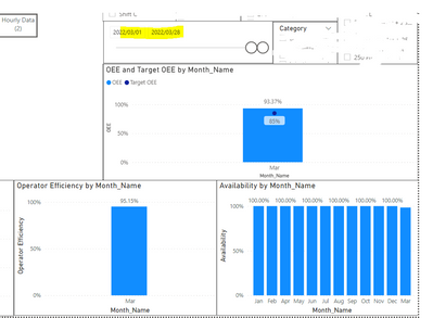
I'm trying to show all the charts on a report by "Month name" on the x-axis, but only showing the months that fall in the date slider period highlighted in yellow (screenshot below).
All three graphs (Operator Efficiency, Availability, OEE) are measures and each of them have the same field, "Month_Name", on the x-axis, however, the Availability graph is showing all months' data (not just the month(s) that fall within the date slider selection).
Any ideas on why this may be? Happy to give more info if required.
- Mark as New
- Bookmark
- Subscribe
- Mute
- Subscribe to RSS Feed
- Permalink
- Report Inappropriate Content
@LiziM It would be great if you can share the Availability Measure . It seems like something need to be check in the measure
- Mark as New
- Bookmark
- Subscribe
- Mute
- Subscribe to RSS Feed
- Permalink
- Report Inappropriate Content
To understand the Availability calculation you will need some background:
The Shift_Data table is used to capture production output, which can either be captured by shift (so once at the end of the day; if two different types of products are made during the shift, there will be two records in this Shift_Data table for that shift) or by hour (so each hour is a new record in the shift data table).
The Availability measure uses the following calulation:
Availability = 1-
(SUM('Shift_Data'[Downtime])
/
(SUM('Shift_Data'[Available_Time]))
)
The "Downtime" shown above is a column from the Shift_Data table, while "Available_Time" is a calculated column shown below ("Type" indicates whether the data was captured hourly or by shift):
Available_Time=
//this is the full hour/shift - planned downtime
if([Type]="Hour",
//Hourly available time:
60-[Planned Downtime],
//Shiftly available time:
if([Find_last_entry_for_same_Shift]="MAX",LOOKUPVALUE('Shift_Setup'[Total Shift time],'Shift_Setup'[ID],[Shift_Setup_ID])-[Planned Downtime]
))
There is another table called "Shift_Setup" which gives the total time for a shift when data is captured by shift, which is what is being referenced above. The "Planned downtime" above comes from the Shift_Data table. The "
- Mark as New
- Bookmark
- Subscribe
- Mute
- Subscribe to RSS Feed
- Permalink
- Report Inappropriate Content
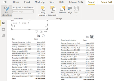
@LiziM Can you please check the Slicer interaction
Select "Date" Slicer, Go to "Format"--> Edit Interactions
- Mark as New
- Bookmark
- Subscribe
- Mute
- Subscribe to RSS Feed
- Permalink
- Report Inappropriate Content
Hi there, Thank for the response!
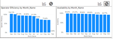
I tried turning off interactions (on two charts for comparison) here:
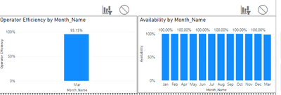
And then turning on (for two charts again) here:
The Availability graph doesn't behave as expected- it appears to change the values in the graph, but the x-axis still displays all months. The Availability measure is a bit complicated, but I can share it if need be. Let me know.
Thanks agin!
Helpful resources
| User | Count |
|---|---|
| 25 | |
| 21 | |
| 11 | |
| 10 | |
| 9 |
| User | Count |
|---|---|
| 48 | |
| 30 | |
| 18 | |
| 17 | |
| 15 |


