A new Data Days event is coming soon!
This time we’re going bigger than ever. Fabric, Power BI, SQL, AI and more. We're covering it all. You won't want to miss it.
Learn more- Power BI forums
- Get Help with Power BI
- Desktop
- Service
- Report Server
- Power Query
- Mobile Apps
- Developer
- DAX Commands and Tips
- Custom Visuals Development Discussion
- Health and Life Sciences
- Power BI Spanish forums
- Translated Spanish Desktop
- Training and Consulting
- Instructor Led Training
- Dashboard in a Day for Women, by Women
- Galleries
- Data Stories Gallery
- Themes Gallery
- Contests Gallery
- QuickViz Gallery
- Quick Measures Gallery
- Visual Calculations Gallery
- Notebook Gallery
- Translytical Task Flow Gallery
- TMDL Gallery
- R Script Showcase
- Webinars and Video Gallery
- Ideas
- Custom Visuals Ideas (read-only)
- Issues
- Issues
- Events
- Upcoming Events
Did you hear? There's a new SQL AI Developer certification (DP-800). Start preparing now and be one of the first to get certified. Register now
- Power BI forums
- Forums
- Get Help with Power BI
- Report Server
- Visualization Formatting Differences between Repor...
- Subscribe to RSS Feed
- Mark Topic as New
- Mark Topic as Read
- Float this Topic for Current User
- Bookmark
- Subscribe
- Printer Friendly Page
- Mark as New
- Bookmark
- Subscribe
- Mute
- Subscribe to RSS Feed
- Permalink
- Report Inappropriate Content
Visualization Formatting Differences between Report Server and Desktop
Hello,
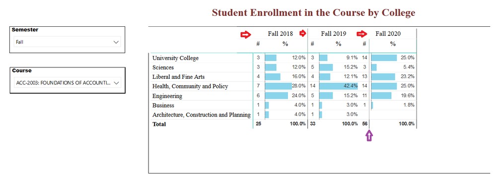
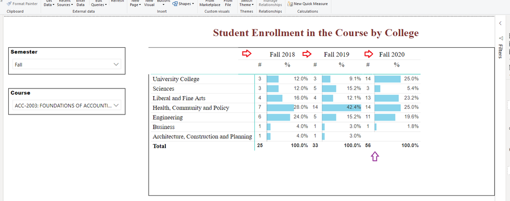
I am adding data to an existing visualization in my organization, but it appears that there are formatting lines that separate the caregories in the Report Server view. I want to figure out how to view these lines on Desktop, and/or remove them entirely.
These lines appear to be somewhat arbitrarily placed. In the screenshot below, in red, you can see that the second arrow shows that the line extends to the top of the visualization, while the third arrow shows that the line stops between the two headers. The purple arrow shows that the line in the third column was improperly placed, after the # column, instead of before it.

The screenshot below shows Power BI Desktop, where these lines do not appear at all.

- Mark as New
- Bookmark
- Subscribe
- Mute
- Subscribe to RSS Feed
- Permalink
- Report Inappropriate Content
Hi @de_Weerd ,
it depends on the Browser you use. In some cases the Edge works better than the Firefox but it always depends. If there are only some small visualization errors you can first testing the diffrent browsers you got. If the error still remain you can try to build a Background picture in which the visual can be embedd. Hope this answer will help 🙂
If this post has helped you, please give it a thumbs up!
Did I answer your question? Mark my post as a solution!
Helpful resources

Power BI Monthly Update - April 2026
Check out the April 2026 Power BI update to learn about new features.

Data Days 2026 coming soon!
Sign up to receive a private message when registration opens and key events begin.

New to Fabric Survey
If you have recently started exploring Fabric, we'd love to hear how it's going. Your feedback can help with product improvements.

| User | Count |
|---|---|
| 4 | |
| 3 | |
| 2 | |
| 2 | |
| 1 |
