Join us in Barcelona for FabCon and SQLCon, September 28 - October 1, 2026.
This is best Fabric, Power BI, SQL and AI community event. How do we know? The last event sold out! Save €200 with code FABCMTY200.
Register now- Power BI forums
- Get Help with Power BI
- Desktop
- Service
- Report Server
- Power Query
- Mobile Apps
- Developer
- DAX Commands and Tips
- Custom Visuals Development Discussion
- Health and Life Sciences
- Power BI Spanish forums
- Translated Spanish Desktop
- Training and Consulting
- Instructor Led Training
- Dashboard in a Day for Women, by Women
- Galleries
- Data Stories Gallery
- Themes Gallery
- Contests Gallery
- QuickViz Gallery
- Quick Measures Gallery
- Visual Calculations Gallery
- Notebook Gallery
- Translytical Task Flow Gallery
- TMDL Gallery
- R Script Showcase
- Webinars and Video Gallery
- Ideas
- Custom Visuals Ideas (read-only)
- Issues
- Issues
- Events
- Upcoming Events
A new Data Days event is coming soon! This time we’re going bigger than ever. Fabric, Power BI, SQL, AI and more. Don't miss out.
- Power BI forums
- Galleries
- R Script Showcase
- Venn Diagram
Your file has been submitted successfully. We’re processing it now - please check back in a few minutes to view your report.


- Mark as New
- Bookmark
- Subscribe
- Mute
- Subscribe to RSS Feed
- Permalink
- Report Inappropriate Content
Venn Diagram
Venn diagrams show overlapping regions based on values within sets. The R visualization code provided in this Power BI desktop file will take a dynamic set of columns (based on the values you add in the fields pane), perform the overlap analysis, and display the diagram. This code will work with up to 5 columns.
Prerequisites (The sample .pbix files will not work without these prerequites completed)
- Install R Engine: Power BI Desktop does not include, deploy or install the R engine. To run R scripts in Power BI Desktop, you must separately install R on your local computer. You can download and install R for free from many locations, including the Revolution Open download page, and the CRAN Repository
- Install the required R packages: VennDiagram
- Mark as New
- Bookmark
- Subscribe
- Mute
- Subscribe to RSS Feed
- Permalink
- Report Inappropriate Content
When I click on your link, ![]() VennDiagramWithR.pbix, Power bi pops up with an error message. Can't see your code. (see attached screenshot) Does this still work or am I just doing it wrong? I wrote code in r that runs beautifully (in r). When I run it inn Power Bi, it gives me the same error message as I get when I click on your link.
VennDiagramWithR.pbix, Power bi pops up with an error message. Can't see your code. (see attached screenshot) Does this still work or am I just doing it wrong? I wrote code in r that runs beautifully (in r). When I run it inn Power Bi, it gives me the same error message as I get when I click on your link.
Any hints anyone?
Here's my code and a screenshot of a small dataset (Venn_dummy)
draw.triple.venn(area1 = nrow(subset(Venn_dummy, Felony == "Yes")), area2 = nrow(subset(Venn_dummy, Misdemeanor == "Yes")), area3 = nrow(subset(Venn_dummy, Ordinance == "Yes")),
n12 = nrow(subset(Venn_dummy, Felony == "Yes" & Misdemeanor == "Yes")), n23 = nrow(subset(Venn_dummy, Misdemeanor == "Yes" & Ordinance == "Yes")),
n13 = nrow(subset(Venn, Felony == "Yes" & Ordinance == "Yes")), n123 = nrow(subset(Venn, Felony == "Yes" & Misdemeanor == "Yes" & Ordinance == "Yes")),
category = c("Felony Offenders", "Misdemeanor Offenders", "Ordinance Offenders"), lty = "blank", fill = brewer.pal(n = 3, name = "Dark2"))
- Mark as New
- Bookmark
- Subscribe
- Mute
- Subscribe to RSS Feed
- Permalink
- Report Inappropriate Content
Hi @Anonymous , I opened the attached PBIX it works fine for me.
1) Make sure you have updated PBI desktop
2) Install install.packages("VennDiagram") from your R IDE
3) If problem persisits look at the Error (See Details)
4) You may debug the code in your R IDE from R Visual

5) If your problem persisits send me your PBIX
boefraty at microsoft com
- Mark as New
- Bookmark
- Subscribe
- Mute
- Subscribe to RSS Feed
- Permalink
- Report Inappropriate Content
Hi Boefraty,
Thank you for your helpful message.
I got the Venn Diagram to work in Power Bi, but I can’t get the slicer to work with it. I’m supposed to do a demonstration on this next week (yikes). I’ve attached a screen shot. Can you give me any tips?
Note: my data file has person-level data (not aggregate), and includes both charge data and demographic data (i.e. race).
Also, 
- Mark as New
- Bookmark
- Subscribe
- Mute
- Subscribe to RSS Feed
- Permalink
- Report Inappropriate Content
PBIX is an extension of file generated in PBI desktop .
If you send it to me I will have no trouble to reproduce your problem on my side.
- Mark as New
- Bookmark
- Subscribe
- Mute
- Subscribe to RSS Feed
- Permalink
- Report Inappropriate Content
Thanks so much!
##This Venn diagram code is for use in the Power Bi demonstration. Run it from R from within Power Bi
#set working directory i.e. the folder you are working out of
setwd("H:/Eliel JBBS Sent")
#set default library path - where to look for packages, which are also called libraries
.libPaths("H:/R/win-library/3.4")
#load Venn Diagram package
library(VennDiagram)
library("RColorBrewer")
library(grid)
library(futile.logger)
#get Java so we can export to Excel
Sys.setenv(JAVA_HOME = "C:/Program Files/Java/jdk1.8.0_151")
library(xlsx)
library(rJava)
Venn <- read.xlsx("Venn.xlsx", sheetName = "Venn", header = TRUE, stringsAsFactors = FALSE)
draw.triple.venn(margin = 0.1, area1 = nrow(subset(Venn, Felony == "Yes")), area2 = nrow(subset(Venn, Misdemeanor == "Yes")), area3 = nrow(subset(Venn, Ordinance == "Yes")),
n12 = nrow(subset(Venn, Felony == "Yes" & Misdemeanor == "Yes")), n23 = nrow(subset(Venn, Misdemeanor == "Yes" & Ordinance == "Yes")),
n13 = nrow(subset(Venn, Felony == "Yes" & Ordinance == "Yes")), n123 = nrow(subset(Venn, Felony == "Yes" & Misdemeanor == "Yes" & Ordinance == "Yes")),
category = c("Felony Offenders", "Misdemeanor Offenders", "Ordinance Offenders"), lty = "blank", fill = brewer.pal(n = 3, name = "Dark2"))
- Mark as New
- Bookmark
- Subscribe
- Mute
- Subscribe to RSS Feed
- Permalink
- Report Inappropriate Content
- Mark as New
- Bookmark
- Subscribe
- Mute
- Subscribe to RSS Feed
- Permalink
- Report Inappropriate Content
Thanks so much.
Yes, my Venn code works great. The slicer does not.
I created a slicer for Race like I do for anything else in Power Bi (see attached screen shots) It's on the same page as my Venn Diagram, which I created in R. I expected that if I selected only "white" in the race slicer, it would filter out all the non-white subjects in my Venn diagram, just like it does for any other Power Bi visual.
Isn't that how it's supposed to work?
Thanks again,
Jennifer
- Mark as New
- Bookmark
- Subscribe
- Mute
- Subscribe to RSS Feed
- Permalink
- Report Inappropriate Content
Try to change your R visual to "Table" visual. See how it responses to slicer.
OR
Run the code with your filtered data in R IDE like RStudio (see my previous reply) and debug it
OR
Send me the PBIX 🙂

- Mark as New
- Bookmark
- Subscribe
- Mute
- Subscribe to RSS Feed
- Permalink
- Report Inappropriate Content
- Mark as New
- Bookmark
- Subscribe
- Mute
- Subscribe to RSS Feed
- Permalink
- Report Inappropriate Content
Hi @Anonymous,
One more tip. You should add more columns to your R visual , so that each row is unique. Otherwise PBI visual (any visual) will remove duplicates and your diagramm will be wrong. Another option is to use ID column. And make sure you do not aggregate fields.
"Do not summarize" for all input fields.
- Mark as New
- Bookmark
- Subscribe
- Mute
- Subscribe to RSS Feed
- Permalink
- Report Inappropriate Content
HI Again Boefraty,
I did everything you asked, but now I'm getting a count of one per category. There is a unique id for each observation, but Power Bi is still deleting "duplicates".
Here's the code and output, as well as a screenshot showing the unique ids.
Many, many, many thanks,
Juniper
#set working directory i.e. the folder you are working out of
setwd("H:/Eliel JBBS Sent")
#set default library path - where to look for packages, which are also called libraries
.libPaths("H:/R/win-library/3.4")
#load Venn Diagram package
library(VennDiagram)
library("RColorBrewer")
library(grid)
library(futile.logger)
#Venn <- read.xlsx("Venn.xlsx", sheetName = "Venn", header = TRUE, stringsAsFactors = FALSE)
Venn = dataset
draw.triple.venn(margin = 0.1, area1 = nrow(subset(Venn, Felony == "Yes")), area2 = nrow(subset(Venn, Misdemeanor == "Yes")), area3 = nrow(subset(Venn, Ordinance == "Yes")),
n12 = nrow(subset(Venn, Felony == "Yes" & Misdemeanor == "Yes")), n23 = nrow(subset(Venn, Misdemeanor == "Yes" & Ordinance == "Yes")),
n13 = nrow(subset(Venn, Felony == "Yes" & Ordinance == "Yes")), n123 = nrow(subset(Venn, Felony == "Yes" & Misdemeanor == "Yes" & Ordinance == "Yes")),
category = c("Felony Offenders", "Misdemeanor Offenders", "Ordinance Offenders"), lty = "blank", fill = brewer.pal(n = 3, name = "Dark2"))
- Mark as New
- Bookmark
- Subscribe
- Mute
- Subscribe to RSS Feed
- Permalink
- Report Inappropriate Content
Hi @Anonymous,
I really need the PBIX to see the problem 😞
Sounds like, you added the unique ID to data table, but you did not add the ID column as input to R visual. Drag the ID column to R visual as you did with "Felony" and the rest.
- Mark as New
- Bookmark
- Subscribe
- Mute
- Subscribe to RSS Feed
- Permalink
- Report Inappropriate Content
- Mark as New
- Bookmark
- Subscribe
- Mute
- Subscribe to RSS Feed
- Permalink
- Report Inappropriate Content

- Mark as New
- Bookmark
- Subscribe
- Mute
- Subscribe to RSS Feed
- Permalink
- Report Inappropriate Content
Hi Boefraty,
How large of a data set can a Venn Diagram handle in Power Bi?
Many thanks,
Juniper
- Mark as New
- Bookmark
- Subscribe
- Mute
- Subscribe to RSS Feed
- Permalink
- Report Inappropriate Content
Hi @Anonymous,
I am glad it worked out for you. Here are limitations of R visuals in PBI:
https://docs.microsoft.com/en-us/power-bi/desktop-r-visuals#known-limitations
- Mark as New
- Bookmark
- Subscribe
- Mute
- Subscribe to RSS Feed
- Permalink
- Report Inappropriate Content
Thank you so much!!!
- Mark as New
- Bookmark
- Subscribe
- Mute
- Subscribe to RSS Feed
- Permalink
- Report Inappropriate Content
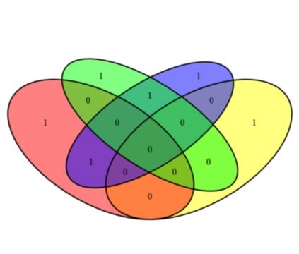
This visual appears to give incorrect results when 4 fields are selected.
I can do 3 just fine but 4 doesn't calculate properly, e.g., a category with 30 items shows 20, 4, 0, 0 instead of adding to 30.
My math could be off, though. I think with 4 categories there's no way to actually show the top & bottom categories (or left & right) intersecting since they already overlap in the middle. Maybe that's just a limitation of Venn diagrams; in that case maybe limit it to 3 categories?


- Mark as New
- Bookmark
- Subscribe
- Mute
- Subscribe to RSS Feed
- Permalink
- Report Inappropriate Content
Hi @spotpuff,
Please make sure all the rows in your input table are UNIQUE. You can do it by adding ID column (but ignore it in R script).
- Mark as New
- Bookmark
- Subscribe
- Mute
- Subscribe to RSS Feed
- Permalink
- Report Inappropriate Content
The rows are unique; I was using an illustrative example but I was using the diagram on a real dataset which has a row ID type field and I was still having problems with the 4 dimensional Venn diagram.
The issue is likely something to do with more than 3 categories requiring strange diagrams:
https://en.wikipedia.org/wiki/Venn_diagram#Extensions_to_higher_numbers_of_sets
The visual doesn't make the 4th category into that "rainbow" type thing, so the math might be off.
Or I might be wrong.
Either way for now I'm sticking with 3 categories as the math works out in that diagram.