FabCon is coming to Atlanta
Join us at FabCon Atlanta from March 16 - 20, 2026, for the ultimate Fabric, Power BI, AI and SQL community-led event. Save $200 with code FABCOMM.
Register now!- Power BI forums
- Get Help with Power BI
- Desktop
- Service
- Report Server
- Power Query
- Mobile Apps
- Developer
- DAX Commands and Tips
- Custom Visuals Development Discussion
- Health and Life Sciences
- Power BI Spanish forums
- Translated Spanish Desktop
- Training and Consulting
- Instructor Led Training
- Dashboard in a Day for Women, by Women
- Galleries
- Data Stories Gallery
- Themes Gallery
- Contests Gallery
- QuickViz Gallery
- Quick Measures Gallery
- Visual Calculations Gallery
- Notebook Gallery
- Translytical Task Flow Gallery
- TMDL Gallery
- R Script Showcase
- Webinars and Video Gallery
- Ideas
- Custom Visuals Ideas (read-only)
- Issues
- Issues
- Events
- Upcoming Events
The Power BI Data Visualization World Championships is back! Get ahead of the game and start preparing now! Learn more
- Power BI forums
- Galleries
- R Script Showcase
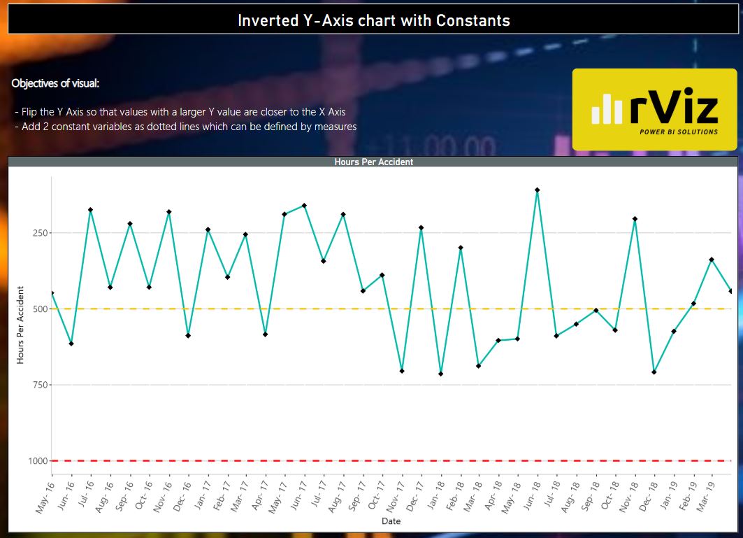
- Inverted Y Axis with Constants
Your file has been submitted successfully. We’re processing it now - please check back in a few minutes to view your report.
Inverted Y Axis with Constants
04-17-2019 03:00 AM - last edited 04-17-2019 03:03 AM


- Mark as New
- Bookmark
- Subscribe
- Mute
- Subscribe to RSS Feed
- Permalink
- Report Inappropriate Content
Inverted Y Axis with Constants
Objective of Visual
- To flip the Y Axis so that values with a larger Y Value are closer to the X Axis rather than the traditional line chart that shows Zero at the X Axis intersection
- Allow the addition of 2 constant dotted line values that can be linked to a measure or parameter.
CRAN Packages used
- ggplot2
- scales
- extrafontdb