Get Fabric or SQL Certified for Free.
Get certified for free when you join Fabric Data Days 2026 and dive into Fabric, Power BI, SQL, AI, and other essential data skills.
Join now- Power BI forums
- Get Help with Power BI
- Desktop
- Service
- Report Server
- Power Query
- Mobile Apps
- Developer
- DAX Commands and Tips
- Custom Visuals Development Discussion
- Health and Life Sciences
- Power BI Spanish forums
- Translated Spanish Desktop
- Training and Consulting
- Instructor Led Training
- Dashboard in a Day for Women, by Women
- Galleries
- Data Stories Gallery
- Themes Gallery
- Contests Gallery
- QuickViz Gallery
- Quick Measures Gallery
- Visual Calculations Gallery
- Notebook Gallery
- Translytical Task Flow Gallery
- TMDL Gallery
- R Script Showcase
- Webinars and Video Gallery
- Ideas
- Custom Visuals Ideas (read-only)
- Issues
- Issues
- Events
- Upcoming Events
Try your skills in the Power BI Dataviz World Championship! Round one ends June 26. Join now
- Power BI forums
- Galleries
- R Script Showcase
- Data Smoothing with Splines
Your file has been submitted successfully. We’re processing it now - please check back in a few minutes to view your report.
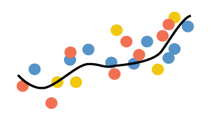
Data Smoothing with Splines
08-15-2016 09:37 AM - last edited 11-16-2016 01:29 AM


- Mark as New
- Bookmark
- Subscribe
- Mute
- Subscribe to RSS Feed
- Permalink
- Report Inappropriate Content
Data Smoothing with Splines

Description
Smoothing helps you to better visualize and understand noisy data
Prerequisites (The sample .pbix files will not work without these prerequites completed)
1. Install R Engine
Power BI Desktop does not include, deploy or install the R engine. To run R scripts in Power BI Desktop, you must separately installR on your local computer. You can download and install R for free from many locations, including the Revolution Open download page, and the CRAN Repository.
2. Install the required R packages.
Download the R script attached to this message and run it to install all required packages on your local machine.
Required R packages:
graphins, spline, scales
Tested on:
CRAN 3.3.1, MRO 3.3.0, powerbi.com
Legal Disclaimers:
Terms of Service and Third Party Programs.
- Mark as New
- Bookmark
- Subscribe
- Mute
- Subscribe to RSS Feed
- Permalink
- Report Inappropriate Content
I have R installed, but I am a rookie. I was able to install all of the necessary packages so that the sample .pbix file provided here loads and works just fine for me. When I try to add the spline visual to my own .pbix file it doesn't want to accept measures in the X and Y axis. Message on the visual simply states "Need numeric X and Y variables". They are numeric, the Data Type is "Decimal Number", but formatted as "Percentage". Why wouldn't I be able to use measures? The data I have works just fine with the built in Power BI "scatter chart". What I really want is the line so that I can keep a National Average line on the visual and cross-highlight by districts to see the distance from a National Average.
Very cool visual, I hope that I can get it working.
- Mark as New
- Bookmark
- Subscribe
- Mute
- Subscribe to RSS Feed
- Permalink
- Report Inappropriate Content
I have a couple of visuals I want to use from R, but when I try to load this visual (and others) I am having issues trying to install the needed libraries I uninstalled the current version or R (3.5.1) and installed the version given in most all the visualizations in this section (3.3.1), but still I can't load most of the required libraries.
You say the visualization you require requires
Required R packages:
graphins, spline, scales
I can load scales, spline is not available for 3.3.1, but I installed splines2 which was available and I assume is similar enough thet I can make it work. However I don't know what to do with graphins. I can't find anything similar at CRAN, CRAN2, R-Forge, or rforge.net. Is there another repository that I should be using?
Thanks!
- Mark as New
- Bookmark
- Subscribe
- Mute
- Subscribe to RSS Feed
- Permalink
- Report Inappropriate Content
hello!
is there a newer version of this? the script to install dependencies is no longer working.
- Mark as New
- Bookmark
- Subscribe
- Mute
- Subscribe to RSS Feed
- Permalink
- Report Inappropriate Content
We love this visual. How should the script read if my dates are formatted as mm/dd/yyyy?
Thanks
- Mark as New
- Bookmark
- Subscribe
- Mute
- Subscribe to RSS Feed
- Permalink
- Report Inappropriate Content
Hi, sorry for the delay in reply.
The X column is of type "numeric". You can convert "date" type to "numeric" in Power Query. Next you need to take care of X-axis ticks labels, to be formatted as you want.
I did something similar in
https://community.powerbi.com/t5/R-Script-Showcase/ARIMA-forecasting/m-p/124237
Please have a look at the R code. If you still have trouble with it, you are welcome to send me the PBIX
- Mark as New
- Bookmark
- Subscribe
- Mute
- Subscribe to RSS Feed
- Permalink
- Report Inappropriate Content
Been looking at this visualization lately as I need to plot some datapoints and need to add regression lines. I'm plotting revenue/sales per day, and using the date as the category/legend. However, I need one line for each of the days, instead of one for all the data points.
How much work am I looking at doing smoething like this in R?
- Mark as New
- Bookmark
- Subscribe
- Mute
- Subscribe to RSS Feed
- Permalink
- Report Inappropriate Content
Hi,
This is quite simple to achieve if you have basic expertise in R.
I'd also recommend you to look at R Custom Visual "Spline" it has regression lines
You can use it as a starting point.
- Mark as New
- Bookmark
- Subscribe
- Mute
- Subscribe to RSS Feed
- Permalink
- Report Inappropriate Content
I actually wrote a script that kinda fixed what I was trying to do, it's not pretty, but it works. Problem I got now is that I'm trying to make a custom visual out of it so I can get the highlighting features you used working. I assume it was plotly? I got multiple regression lines working, but plotly isn't playing along. Tried the RADACAD tutorial a few times, but I'm guessing my code is written in a way that it isn't a simple copy paste job anymore.
library(ggplot2)
p = qplot(1:10, (1:10)^3)
g = ggplot(dataset, aes(x=Price, y=Production, color = Date))+
geom_point() +
theme(axis.text.x = element_text(size=14),
axis.text.y = element_text(size=14),
axis.title.x = element_text(size=16),
axis.title.y = element_text(size=16),
panel.background = element_rect(fill = "white",
colour = "777777",
size = 0.4, linetype = "solid"),
panel.grid.major = element_line(size = 0.08, linetype = 'dashed',
colour = "777777"),
panel.grid.minor = element_line(size = 0.08, linetype = 'dashed',
colour = "777777")) +
theme(legend.position="bottom") +
ylab("Production") +
xlab("Price") +
stat_smooth(method = "lm", formula = y ~ poly(x,2), size = 1, se = FALSE)
g$respect = TRUE
library(grid)
grid.draw(g)
Trying to get it working in this template.
############### Library Declarations ###############
libraryRequireInstall("ggplot2");
libraryRequireInstall("plotly")
####################################################
################### Actual code ####################
g = qplot(Values$Data, data = Values, fill = Values$Type, main = Sys.time());
####################################################
############# Create and save widget ###############
p = ggplotly(g);
internalSaveWidget(p, 'out.html');