FabCon is coming to Atlanta
Join us at FabCon Atlanta from March 16 - 20, 2026, for the ultimate Fabric, Power BI, AI and SQL community-led event. Save $200 with code FABCOMM.
Register now!- Power BI forums
- Get Help with Power BI
- Desktop
- Service
- Report Server
- Power Query
- Mobile Apps
- Developer
- DAX Commands and Tips
- Custom Visuals Development Discussion
- Health and Life Sciences
- Power BI Spanish forums
- Translated Spanish Desktop
- Training and Consulting
- Instructor Led Training
- Dashboard in a Day for Women, by Women
- Galleries
- Data Stories Gallery
- Themes Gallery
- Contests Gallery
- QuickViz Gallery
- Quick Measures Gallery
- Visual Calculations Gallery
- Notebook Gallery
- Translytical Task Flow Gallery
- TMDL Gallery
- R Script Showcase
- Webinars and Video Gallery
- Ideas
- Custom Visuals Ideas (read-only)
- Issues
- Issues
- Events
- Upcoming Events
Learn from the best! Meet the four finalists headed to the FINALS of the Power BI Dataviz World Championships! Register now
- Power BI forums
- Forums
- Get Help with Power BI
- Power Query
- Multi Layer Sanky Chart
- Subscribe to RSS Feed
- Mark Topic as New
- Mark Topic as Read
- Float this Topic for Current User
- Bookmark
- Subscribe
- Printer Friendly Page
- Mark as New
- Bookmark
- Subscribe
- Mute
- Subscribe to RSS Feed
- Permalink
- Report Inappropriate Content
Multi Layer Sanky Chart
Hi All,
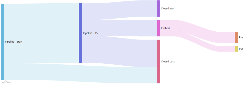
I want to create a multi layer Sanky chart for Sales Pipeline Analysis of Salesforce Data.
I want a Visual to be look like -
Requirement Description-
- Will likely need to utilize the Opportunity Snapshot table
- Pipeline - Start: should show the full pipeline value (incremental ACV) at the start of the quarter that is made up all opportunities with a close date in Q3
- Pipeline - 45: should show the value at the 45 day mark
- This would need to include opps that have already closed won and still open at 45 day mark
- Closed Won: should show value of opps that were closed won in Q3
- Closed Loss: should show value of opps that were closed loss
- Pushed: value of opps that were once set to close in Q3 but now have close date outside of Q3
- Pushed Next Quarter (orange): value of opps that were pushed in to the next quarter
- Pushed 2+ Quarters (yellow): value of opps that were pushed out farther than the next quarter
- Width of bars should be based on Incremental ACV
- Ideally we would have a way to show number of opps as well
- Filters/Slicers that should work
- Region
- Line of Business
- Opportunity Owner
My Data Model Looks Like --
The table That need to be used for the sanky would be Opportunity Snapshot because Opportunity Snapshot contains the following columns -
The Pipeline Start Date
Opportunity Stages - Closed Won, CLosed Loss ( Pushed is not Present in the Stage right now )
Incremental ACV
Last two pillars Push (Yellow Color) and Push(Orange color) are not present in any column of Snapshot table.
Now can anyone suggest the structure of Sanky table . It will help me to do transformation.
Thanks
Solved! Go to Solution.
- Mark as New
- Bookmark
- Subscribe
- Mute
- Subscribe to RSS Feed
- Permalink
- Report Inappropriate Content
Your data rows need to contain "From" and "To" columns. You need to prepare these values outside of Power BI. Usually you would use the Opportunity Field History object data from Salesforce.com directly. It has these fields.
Once that is in place you can use the normal Sankey visual.
- Mark as New
- Bookmark
- Subscribe
- Mute
- Subscribe to RSS Feed
- Permalink
- Report Inappropriate Content
Helpful resources

Join our Fabric User Panel
Share feedback directly with Fabric product managers, participate in targeted research studies and influence the Fabric roadmap.

Power BI Monthly Update - February 2026
Check out the February 2026 Power BI update to learn about new features.


