FabCon is coming to Atlanta
Join us at FabCon Atlanta from March 16 - 20, 2026, for the ultimate Fabric, Power BI, AI and SQL community-led event. Save $200 with code FABCOMM.
Register now!- Power BI forums
- Get Help with Power BI
- Desktop
- Service
- Report Server
- Power Query
- Mobile Apps
- Developer
- DAX Commands and Tips
- Custom Visuals Development Discussion
- Health and Life Sciences
- Power BI Spanish forums
- Translated Spanish Desktop
- Training and Consulting
- Instructor Led Training
- Dashboard in a Day for Women, by Women
- Galleries
- Data Stories Gallery
- Themes Gallery
- Contests Gallery
- QuickViz Gallery
- Quick Measures Gallery
- Visual Calculations Gallery
- Notebook Gallery
- Translytical Task Flow Gallery
- TMDL Gallery
- R Script Showcase
- Webinars and Video Gallery
- Ideas
- Custom Visuals Ideas (read-only)
- Issues
- Issues
- Events
- Upcoming Events
The Power BI Data Visualization World Championships is back! Get ahead of the game and start preparing now! Learn more
- Power BI forums
- Forums
- Get Help with Power BI
- Power Query
- Re: Grouping certain data by month
- Subscribe to RSS Feed
- Mark Topic as New
- Mark Topic as Read
- Float this Topic for Current User
- Bookmark
- Subscribe
- Printer Friendly Page
- Mark as New
- Bookmark
- Subscribe
- Mute
- Subscribe to RSS Feed
- Permalink
- Report Inappropriate Content
Grouping certain data by month
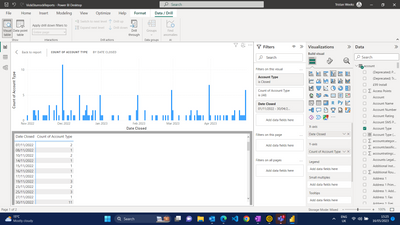
Hello, so i have used directQuery to import data. I want to see Closed Accounts per month. As you can see i am seeing a bar for each individual day during said months. I want to group all of november into one bar, all december into one bar, ect. I have to use Power Query. The filters i have on are Account Type = Closed & Date Closed = last 6 calendar months. So i would like to see 6 bars in my chart not the multiple like below. If anyone has any advice or a solution to this it would be very much appreciatted. Any further info or dat you require can be sent to you. Thank you
Solved! Go to Solution.
- Mark as New
- Bookmark
- Subscribe
- Mute
- Subscribe to RSS Feed
- Permalink
- Report Inappropriate Content
You can add a custom column in the "account" table with below M code to have "YYYYMM" format YearMonth values from [Date Closed] column. Apply the change to Power BI Desktop. Then use this new YearMonth column on X-axis of the column chart to replace the current Date Closed column.
Date.Year([Date Closed])*100+Date.Month([Date Closed])
Best Regards,
Community Support Team _ Jing
If this post helps, please Accept it as Solution to help other members find it.
Helpful resources

Power BI Dataviz World Championships
The Power BI Data Visualization World Championships is back! Get ahead of the game and start preparing now!

| User | Count |
|---|---|
| 19 | |
| 10 | |
| 9 | |
| 7 | |
| 6 |


